The Cass Transportation Index: Interpreting the New Wave of Red
A few months ago, I introduced you to the Cass Transportation Index. If you’d like a refresher on the various time series Cass releases, you can revisit my earlier post here.
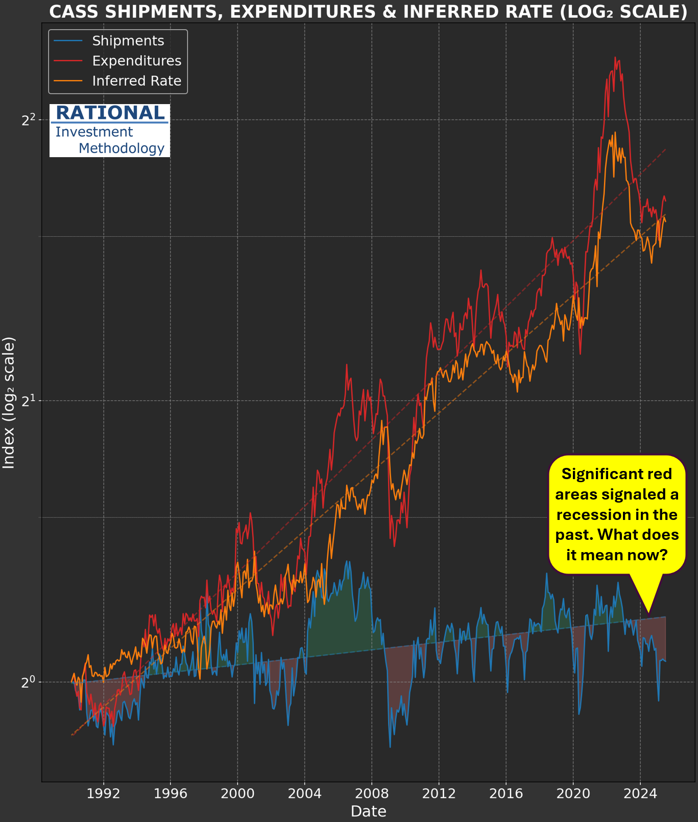
Today, I’m turning the spotlight to the shipments series—take a look at the chart below. The line in blue tracks shipments and has now logged its 29th consecutive negative year-over-year print. For this update, I opted to display the series as-is (in my previous chart, I had multiplied it by three) to emphasize the significant inflation we’ve seen in U.S. transportation services. Simply put, shipment volumes have increased far less than costs (as illustrated by the red line). The primary factor here is the sharp rise in the “inferred rate,” which reflects the actual price that shippers are paying to move goods.
You’ll also notice on the blue series: whenever the data runs above the trendline, the gap turns green. When it dips below, the area is filled with red. Historically, when the red area became substantial, it coincided with recession—think early 1990s, late 2000s, and the coronavirus pandemic period. Conversely, a dominant green area marked periods of above-trend economic activity, most notably in the early/mid-2000s during the first housing bubble.
So, what should we make of the fact that the red area is now so pronounced? Is this recession territory? If so, why don’t GDP figures show a slowdown? At first, you could argue it’s the economy “working off” the excesses of the pandemic. But this red patch is already much larger than the green area seen when government stimulus was being poured out. Even if we start to see a recovery in transportation volumes, the size of the red area will continue to grow for some time yet.
As earnings season gets underway, I’ll be watching closely for commentary from companies regarding overall activity levels. I sense that few will sound especially optimistic about the landscape in their sector.
