Charter at $125: A 32% Implied IRR, or a Company the Market Expects to Disappear?
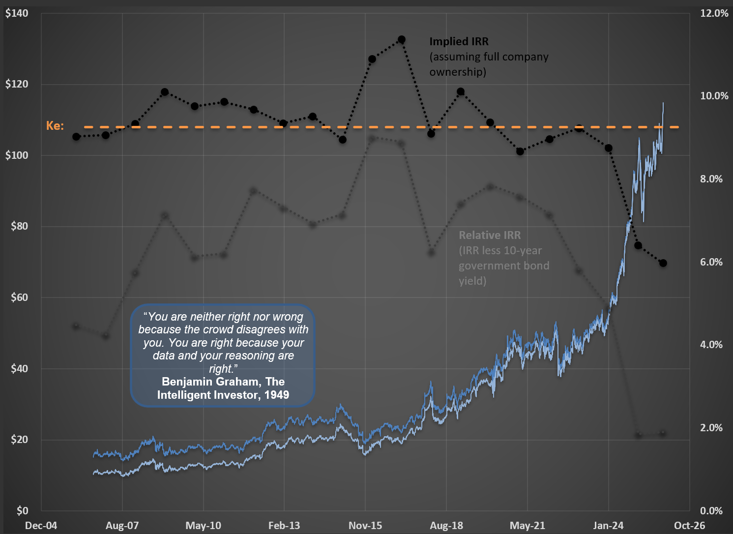
Shares of Charter Communications [CHTR] have fallen hard over the past several months. In my previous post (the Polaroid piece, here), I made an argument that applies to every company, all of the time: a share price is never just a number—at any given moment, it carries an implied Internal Rate of Return (IRR), the return a long-term owner signs up for if he buys at that price and then collects the business’s cash flows over its entire life. Charter is a vivid, live example of the very same idea. When its shares traded near $125, the implied IRR on RIM’s base-case scenario climbed above 32% per year. To put that in human terms: achieving such a level of return is the equivalent of doubling your money every 2.7 years. (I walk through how a given IRR translates into real, compounded returns over time here.)
A number like that should make any rational investor stop and ask the obvious question: what would have to be true for it to be deserved?
What Counts as a Base-Case Fair Value
The whole exercise hinges on this, because an implied IRR is only as meaningful as the cash-flow forecast standing behind it. So before anything else, what does a reasonable base case for Charter look like?
Start by being honest about what Charter is. Like every cable operator, it is no longer in the television business in any meaningful sense—it is a data provider that happens to own a coaxial network. The relevant arena, then, is broadband, and broadband is genuinely contested. I recently laid out how the alternatives stack up on the two variables a customer actually cares about—internet speed and cost—across fiber, cable, 5G (and 4G LTE) fixed wireless, and Starlink-style low-earth-orbit satellite. The conclusion is not the one the share price implies. Fiber is faster, but it is expensive to build and remains far from universal. Fixed wireless from the mobile carriers (T-Mobile, Verizon, AT&T) is cheap and simple to install, but it is capacity-constrained—a real threat in specific pockets rather than a wholesale replacement. Satellite is a genuine answer for the rural edge that wire and tower never reach, at a price and latency that keep it a niche. Against all three, cable still delivers fast, low-latency, near-ubiquitous service at a competitive price. This is a maturing business facing real competition—not a melting ice cube.
You can see the maturity directly in the chart below. Internet penetration—the line that matters—has plateaued near 50% after years of climbing. Video and voice keep doing what they have done for a decade (fading), and mobile is the one product still gaining. In my Charter work I already carry a roughly 500-basis-point loss of internet penetration to competition inside the base case. In other words, the saturation the Market is anxious about is not a surprise to the forecast; it is built into it.
The Market Is Pricing Charter to Disappear
It is entirely reasonable to assume that internet penetration eventually stabilizes—every adoption curve does. What is not reasonable is the conclusion the current price draws from that. The Market, at these levels, is effectively assuming Charter will cease to exist.
Here is the arithmetic that exposes it. In RIM’s base case, once Charter’s capital spending falls back to a normal maintenance level—the heavy build-out phase of any network is finite, by definition—the free-cash-flow yield on the shares is over 40%. Read that one more time: a single year of free cash flow would buy back almost half the entire company, if the shares simply stayed where they are today. A 40%-plus FCF yield is not the price of a slow-growing, mature business; it is the price of a business the Market expects to vanish. And even when I press the model harder—stripping out another 500 basis points of internet penetration on top of the loss already embedded in the base case—the implied IRR still lands squarely in the range of a typical undervalued position at RIM.
The Market Exists to Serve You, Not to Teach You
This is a very unusual price distortion, and it is worth naming the instinct it triggers. When a stock falls this far, the comfortable assumption is that “the Market knows best”—that the price is telling you something you have missed. I would gently push back on that, because it is simply not a reasonable approach to investing. The same Market was happy to pay more than $800 for a share of Charter at the end of 2021—for a business that, operationally, looks much the same today as it did then. A mechanism that prices the identical company above $800 and then below $125 in the span of a few years is not a teacher. It is a counterparty in a mood.
That is the entire point: the Market does not exist to teach you; it exists to serve you. It will swing wildly from greed to despair and back, and each swing is an offer—to buy, or to sell, on favorable terms. The challenge, as always, and as is the case with any genuine investment rather than speculation, is not to interpret the Market’s mood. It is to do the harder, quieter work of correctly forecasting the financial future of the company in front of you. Get that right, and the price is simply the opportunity the Market happens to be handing you while you wait.
A Polaroid Redux? What the $5.7 Trillion Chip Rally Forgets to Ask
A colleague recently sent me a Wall Street Journal article asking how much further the chip rally can run, now that US chipmakers are collectively worth around $5.7 trillion (here). It is a well-written piece, and worth reading. But, as is almost always the case with this kind of coverage, it frames the whole debate around the wrong question.
The article does what most market commentary does: it debates forward price-to-earnings multiples, contrasts bull and bear price targets, and tries to decide whether the rally has been “earnings-driven” or “multiple-driven.” These are useful shortcuts. But they are only shortcuts. Not once does the article ask the one question that should matter to anyone actually buying these businesses: at today’s price, what Internal Rate of Return (IRR) is an owner signing up for, if he holds the company and collects its cash flows over its entire life?
That omission is not a small one. A multiple is a simplification—a single number standing in for an entire stream of future cash flows, growth assumptions, margins, and capital needs. It can be a handy reference, but it tells you almost nothing about the return embedded in a price. I made this exact point a few months ago when the WSJ ran a similar piece on Walmart (here): the author leaned entirely on forward P/E, when what an investor should care about is the IRR the price implies. The names change—Walmart, chipmakers—but the analytical gap is identical.
A Small Example With an Enormous Lesson
To show what I mean, let me use a company that operated on a far smaller scale than today’s AI giants but illustrates the very same concept: Polaroid.
In the early 1970s, the media and analysts were amazed by Polaroid’s new “high-tech” camera, the SX-70. Magazine after magazine described it as a “pocketful of miracles”—a constellation of technical triumphs in optics, dye chemistry, and micro-electronics. Sound familiar? Replace “camera” with “accelerator” or “GPU,” and you could be reading this morning’s coverage of the chip sector.

The enthusiasm pushed Polaroid’s shares to roughly $70 in those years. Here is the uncomfortable part—and the reason this example is so instructive. We now have something we never have in real time: Polaroid’s entire life is over (the company went bankrupt in 2001). That means we know every single dollar of cash flow it ever delivered to its owners. With that complete record in hand, I can calculate what I call the “perfect-knowledge price”—the price you would have had to pay back in 1970 to earn a normal long-term IRR (the 10%–11% I keep coming back to) by owning the business outright. That price was about $15 per share. At $70, the stock was the very definition of a bubble.
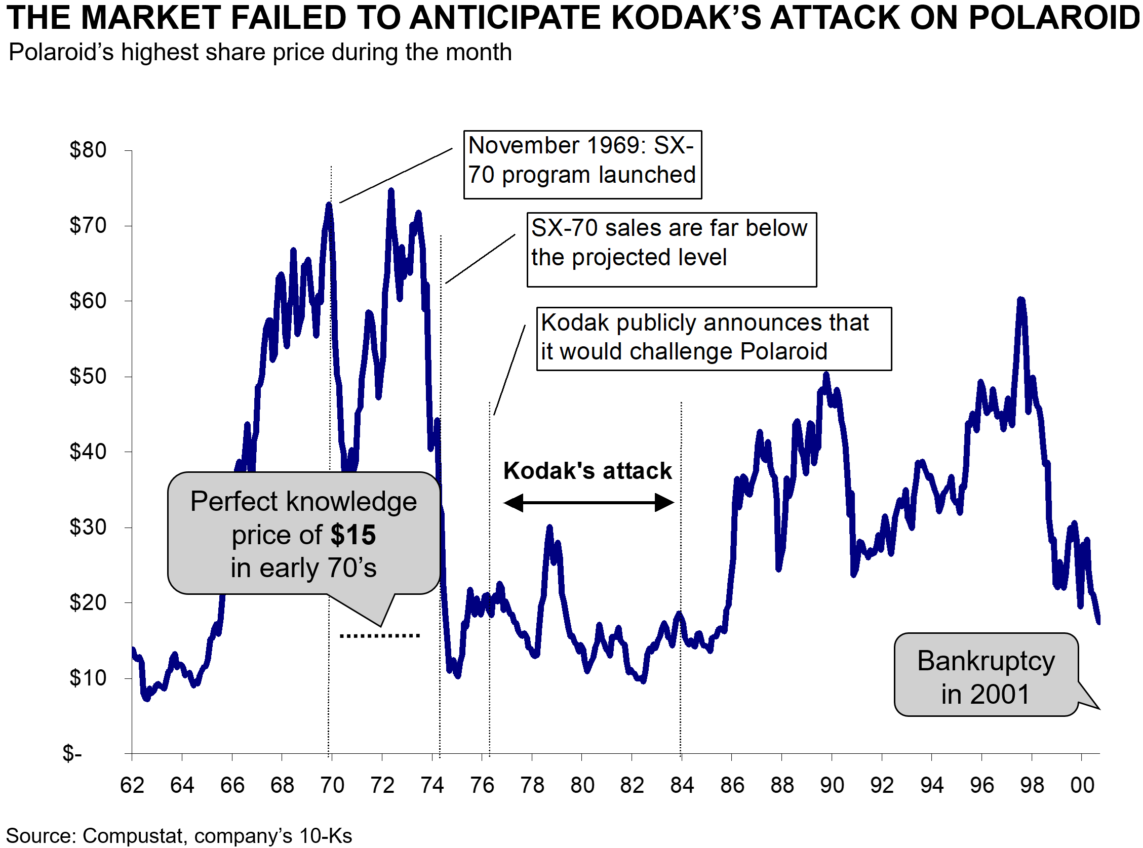
These two Polaroid charts, by the way, are not new to me. They come from a case competition I worked on at McKinsey in 2001—a full 25 years ago. I keep them around as a reminder of something I find worth saying out loud: I have been applying this very same concept—comparing a share price to its perfect-knowledge value—across my entire finance career.
Notice what the second chart also shows: the Market completely failed to anticipate Kodak’s attack on Polaroid’s franchise. This is the rule, not the exception. Narratives about a dominant, world-changing technology almost never price in the competitor, the substitute, or the cycle that eventually arrives. (I wrote about a near-identical pattern—Beyond Meat—in my post on speculation versus investment, here.)
What a Share Price Should Actually Reflect
Here is the principle, and it applies to 100% of companies—public or private, AI-related or not. The perfect-knowledge price of any business is the price that, given everything the company will ever pay its owners, produces an IRR in line with what is observed across comparable companies in the same “system” (say, the US). For the names in RIM’s Circle of Competence, that observed IRR clusters tightly: the average across the companies I follow is 10.7%, with a standard deviation under 2%. And, as you would expect, it correlates with each company’s cost of equity (Ke). It is a distribution, not a single magic number—but it is a narrow one.
That last point is what makes the exercise so powerful, and so deflating for bubble enthusiasts. If company after company, across decades and across industries, ends up delivering owners something close to 10%–11%, it is simply illogical to assume that a basket of stocks priced today to deliver far less than that is “normal” or “fairly valued.” The perfect-knowledge price is calculable: it is the cash flow to the shareholder discounted at something near 10%–11%. (Those figures are nominal, so they embed inflation; in a higher-inflation regime, the number may run a touch higher in the coming years. I walk through how a given IRR translates into real, compounded returns over time here.)
Back to the Chips
So the right way to read the $5.7 trillion headline is not “how much further can the multiple expand?” It is: at today’s prices, what IRR is an owner of these businesses actually accepting? I have little doubt that several AI-related names are in a bubble today—Polaroid-style, just with more zeros (the memory makers being an obvious candidate). They could even keep climbing another 5,000x; manias are not bound by arithmetic in the short run. But the long run is different. One day we will know each of these companies' full cash-flow history, just as we now know Polaroid’s. On that day, someone will be able to draw the same chart I drew above—the share price against the perfect-knowledge price—and the gap will speak for itself. “We will know”—someone, someday, will. I already plan to be retired by then.
I would rather not wait that long to find out whether I overpaid. That is why I spend my days estimating, company by company, what the price implies for the owner—rather than arguing over whether 28x or 35x forward earnings is “cheap.” As I have shown before with the 1990s tech bubble (here), the investors who waved away rich valuations because the “technology” was real still earned poor returns. The technology being real was never the question. The price always was.
$VMC [Vulcan Materials]: A $20/Ton Promise—and a Few Reasons for Skepticism
Last week, Vulcan Materials hosted its 2026 Investor Day. The headline number? Management told investors they see a path to $20 per ton of aggregates cash gross profit—roughly double where they are today. Standing on the floor of the NYSE, the CEO put it this way: “just two and a half years ago, our average selling price was less than $20.” Now they expect to make that much in profit per ton.
That deserves a closer look.
The Long, Slow March from $7 to $11
Before getting excited about the next double, it’s worth remembering the journey to where they are. The picture below summarizes it nicely.
It took Vulcan roughly seven years to go from $7 of cash gross profit per ton (in the pre-housing-crisis days) to $8. That period included the housing collapse, a multi-year recovery, and a meaningful tailwind from low diesel prices. Diesel matters here—it’s directly about 10% of operating costs and indirectly much more (trucking, asphalt, plant power). The black/gray line on the chart is diesel inverted: when diesel is cheap, aggregates margins benefit, and you can see the two lines move together for long stretches.
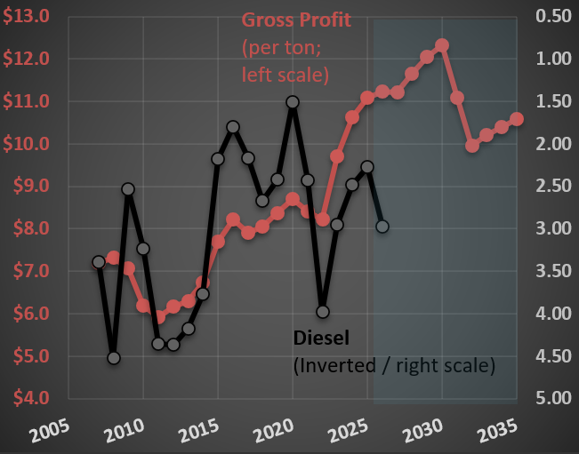
Then came the pandemic. Inflation everywhere—fuel, parts, labor. Aggregates producers responded by raising prices aggressively, and Vulcan rode that wave from $8 to $11 in just a few years. To management’s credit, they handled the inflation passthrough well. But it’s worth being honest about what drove the jump: it wasn’t structural genius—it was a once-in-a-generation inflationary environment that gave the entire industry cover to push prices simultaneously.
Now Comes the $20 Target
So what’s the path to $20? Management says high-single to low-double-digit annual growth in cash gross profit per ton, against demand growing at “low single digits.” They’ve promised more real price improvement than historical averages and lower real cost increases than historical averages. Both at the same time. The implied adjusted EBITDA roughly doubles to $4.5–5.0 billion (from $2.3 billion in 2025).
Two things make me skeptical:
First, every aggregates producer—and a few new entrants—is busy expanding capacity. Read any of Vulcan’s competitors' transcripts and you’ll find the same enthusiasm and the same playbook. When everybody and their mother is pouring capital into the same business, the historical pricing discipline that supports those margins gets harder to defend, not easier. Vulcan itself has acquired 36 aggregate operations and completed 7 greenfields in the past 3.5 years. They’re not the only ones.
Second, the demand story leans heavily on two narratives that have become load-bearing in nearly every industrial company presentation: AI and data centers. These terms came up at the Investor Day 28 times! The CEO described energy projects “to feed data centers and support the age of artificial intelligence” as a coming tailwind to aggregates intensity.
I’ve written before about why I think this is mostly a story, not a number. In this post, I showed that data center construction—even at its current historical peak—accounts for slightly above 2% of total US construction spending. The money in data centers is in the chips and servers inside the buildings, not in the aggregates underneath them. That doesn’t make data centers irrelevant to the broader economy; it means they’re nowhere near large enough, on the construction side, to move the needle for a company like Vulcan Materials.
The Familiar Pattern
This isn’t unique to Vulcan. I noted something similar with $FLS recently (here), where mentioning “nuclear” 25 times in an earnings deck added 30% to the share price for a company with roughly 3.5% nuclear exposure. The mechanic is the same: associate the business with a hot narrative and let multiples do the work.
To be fair, Vulcan is a quality company with irreplaceable assets, real pricing power in concentrated markets (while the FTC is sleeping at the wheel), and a management team that has executed well over a long stretch. Going from $11 to $20 requires some combination of (i) sustained broad-based inflation that the whole industry gets to ride, (ii) genuinely structural improvements in unit economics that haven’t quite shown up in 70 years of company history, and (iii) a demand environment meaningfully better than what management itself describes as “low single digits.”
The history of capital-intensive cyclical businesses hitting targets that depend on simultaneously beating both real price and real cost expectations is not encouraging.
$PII [Polaris]: Rig Counts, a Weak Yen, and Two Headwinds Management Can't Control
Polaris Inc. ($PII) designs, manufactures, and markets powersports vehicles: off-road vehicles (ORVs), snowmobiles, moto-roadsters, boats, and related parts, garments, and accessories (PG&A). It operates in three segments—Off Road (80% of sales), On Road (13%), and Marine (7%)—and sells through approximately 2,400 dealers in North America and over 1,500 internationally.
The chart below is from my valuation analysis. The top panel tracks revenue growth and share price; the bottom panel shows EBITDA and operating margin trends alongside two external variables I find revealing: the US rig count and the USD/Yen exchange rate.
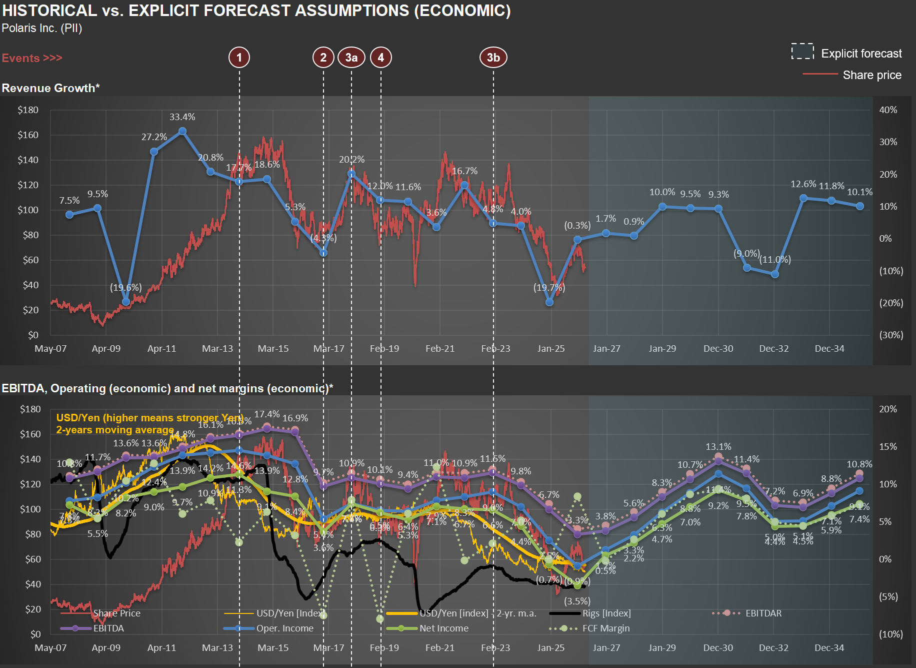
The Rig Count Connection
Take a look at the bottom chart. The black line represents the US rig count, which began a steep decline around 2015. Why should this matter for a powersports company?
First, there’s a direct commercial channel. ORVs like the RANGER are genuine work vehicles on oil and gas sites, used for transporting personnel and equipment across remote locations. Polaris has a dedicated commercial business—the ProXD with approximately 250 dealers and more than 25 commercial ORV models.
But the second-order effect is arguably more significant. The oil and gas workforce is concentrated in exactly the regions where powersports culture thrives—West Texas, the Permian Basin, Oklahoma, North Dakota’s Bakken region, Louisiana, Wyoming, parts of Appalachia. These are communities where hunting, trail riding, ranch work, and outdoor recreation are central to the lifestyle. When rig counts collapse, the economic multiplier is severe: workers lose high-paying jobs, local businesses suffer, and discretionary spending on $15,000 recreational vehicles evaporates.
The rig count isn’t just a proxy for commercial demand—it’s a proxy for the purchasing power of a core Polaris demographic. The timing in the chart aligns with the period when Polaris’s revenue growth decelerated and margins came under pressure.
The Yen as a Competitive Weapon
Now focus on the yellow line—an index for the USD/Yen exchange rate. Polaris’s primary ORV competitors include Honda, Yamaha, and Kawasaki—all Japanese manufacturers. The company’s 10-K explicitly acknowledges that foreign competitors who manufacture in their home countries can sell at lower prices.
When the Yen weakens against the dollar, those manufacturers' cost base becomes cheaper in dollar terms, giving them room to cut prices and gain share. The Yen moved from roughly 80 per dollar in 2012 to 120+ by 2015, and has been close to 160 more recently (i.e., one USD now buys twice as many Yen as it did in 2012). That’s a massive structural cost advantage for Japanese OEMs. Polaris, manufacturing primarily in the US and Mexico with a dollar-denominated cost base, doesn’t get that benefit.
Notice in the chart how periods of Yen weakness tend to coincide with margin pressure at Polaris. The company’s response has been to lean into innovation and premium products—bigger screens, new models, more trim levels—rather than competing on price. But that only works until the price gap gets too wide for consumers.
The Pincer Effect
The combination of both factors—depressed energy-region economies reducing demand from a core customer base AND Japanese competitors gaining a structural cost advantage—creates a pincer effect that helps explain the margin compression visible in the chart from roughly 2015 onward. Neither is within management’s control, yet both materially affect the business. Without recognizing these dynamics, one might mistakenly attribute the compression entirely to execution issues or cyclical softness. With them, the picture becomes clearer—and the analytical challenge becomes knowing when, if ever, these headwinds will reverse.
$LOW [Lowe's] and the Visible Impact of Tax Policy
A company’s tax rate is often modeled as if it were broadly stable over time. Lowe’s shows that public policy can alter that baseline in a way that materially changes reported economics.
The chart below tracks Lowe’s GAAP and cash tax rates, adjusted for unusual items and pension-related distortions. For many years, both series sat at materially higher levels, generally in the high-30s to low-40s. Then the range broke lower.

That is not a minor fluctuation. It is a regime change. And the most obvious explanation is the Tax Cuts and Jobs Act, the late-2017 reform that cut the federal corporate tax rate to 21% for tax years beginning in 2018.
The distinction between GAAP taxes and cash taxes matters here. Cash taxes can run below GAAP taxes for meaningful stretches because companies work hard to defer payment, but the longer-run picture is more revealing: the 5-year moving averages in the chart show cash taxes tending to move back toward GAAP taxes over time. In other words, companies can often change the timing of taxes, but they have a harder time escaping the underlying economics indefinitely.
That is why the chart is so useful. It does not just show that Lowe’s cash taxes fell. It shows that both the accounting burden and the cash burden eventually reset lower, which makes the policy effect much harder to dismiss as temporary noise.
This also ties naturally to my recent post on the CHIPS Act, data centers, and semiconductors (here). The channel is different, but the lesson is the same: government decisions can leave visible fingerprints on corporate results. Here, that fingerprint runs through the tax line.
The real takeaway: good analysis is not just about reading reported numbers; it is about recognizing when those numbers are being shaped by a change in the rules of the game.
CHIPS Act, Data Centers, and the Shape of Policy-Driven Construction Booms
In July of last year, I did a post on construction spending in the USA due to an abnormal spike in manufacturing (here). I thought it would be interesting to complement that analysis now that I’ve added another layer of data.
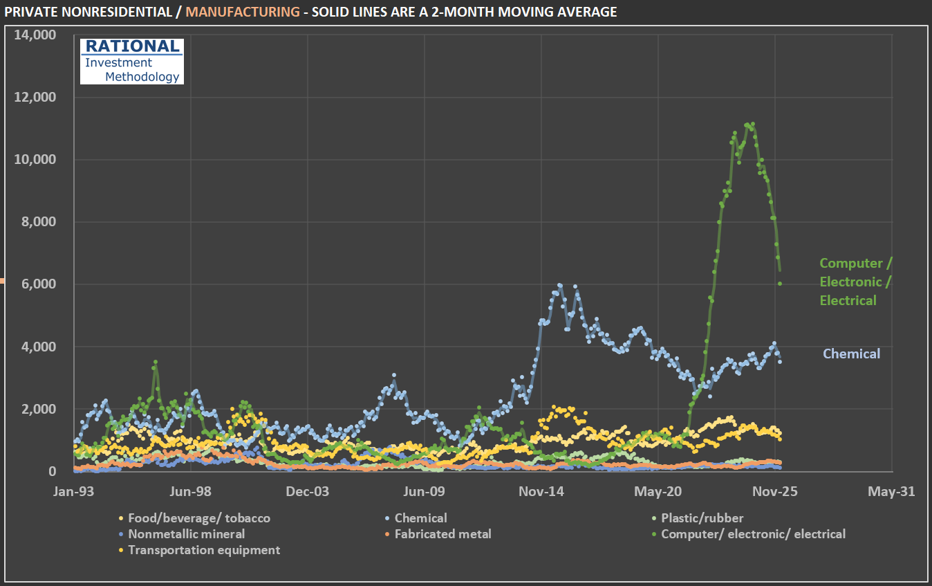
The figure that caught my attention at the time was the spike in construction related to manufacturing. The first chart shows a further split of this category. Note that the recent spike was mostly in the Computer / electronic / electrical sub-segment. Why is it so concentrated in this segment? And why was there such rapid growth followed by a steep decline?
The shape you see — a near-vertical spike followed by a rapid pullback — is the signature of a massive, concentrated, policy-driven investment wave: billions in subsidies triggered hundreds of billions in commitments, construction broke ground on dozens of mega-projects nearly simultaneously, and then spending naturally rolled off as the largest projects progressed beyond the heavy-construction phase, compounded by political uncertainty around future subsidies. In other words, this is the shape of the CHIPS Act incentives, ironically directed at an industry that is making billions in abnormal profits due to the AI boom.
Also notice the (older) spike in chemical (plants) investments. After the shale gas revolution — in the mid-2010s — made US ethane reliably cheaper than oil-based feedstocks used in Asia and Europe, chemical makers embarked on the largest building boom in the industry’s history. Cheap natural gas serves both as fuel (for heat-intensive processes like cracking) and as feedstock (ethane → ethylene → polyethylene and other derivatives). The industry rule of thumb is that when the ratio of international oil prices to local natural gas prices exceeds about 10, ethane-based chemical producers enjoy a significant cost advantage — and that ratio surged above 40 by 2012 and stayed above 20 for much of the decade.
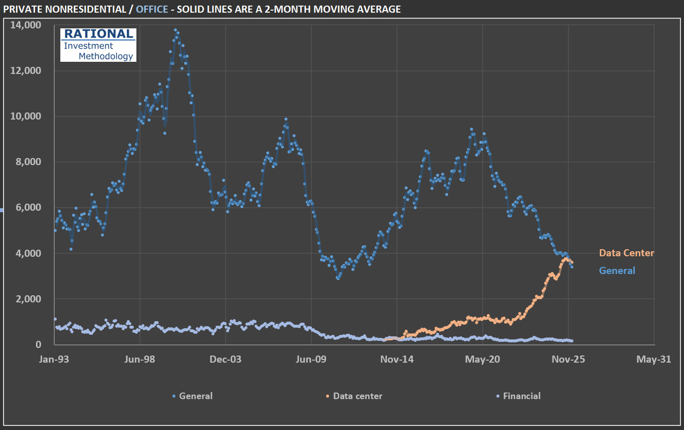
However, the most interesting data from the additional breakdown is in the office segment. Office spending, given the impact from the “work from home” phenomenon, appeared suspiciously stable. Therefore, I also split this segment. Notice in the second chart that core office investments (labeled “General” in the chart) have in fact collapsed. However, “data centers,” which have historically been categorized alongside office construction, have increased dramatically due to the AI boom. Time will tell if there was an overinvestment in this asset class. History is full of examples of overinvestment in new technologies — not because they were useless; it is quite the contrary. It is precisely because they are economy-changing events (think railroads and the internet) that overinvestment followed.
Last, note that construction-related investment in data centers pales in comparison to overall construction spending. The USA invests close to $185 billion a month in construction. Data centers, even at this new historical peak, represent slightly above 2% of the total. In other words, the money spent on data centers is in the computers inside them, not the buildings themselves. But that doesn’t prevent CEOs of companies that sell aggregates, for instance, from mentioning data centers multiple times in their earnings calls!
PS: all figures are adjusted for (i) inflation and (ii) population. The inflation adjustment is by far the biggest. But adjusting for population also gives a better idea of construction activity “as if the country had the same population”. In series that span for such a long time (more than 30 years in this case), it also makes a difference.
Investment vs. Speculation: Why $AMZN's [Amazon] Whole Foods Deal Reveals the Difference
When Amazon announced its $13.7 billion acquisition of Whole Foods in June 2017, the market greeted it with the kind of excitement typically reserved for transformative events. Headlines proclaimed a “radical disruption” of retail. Analysts spun scenarios of Amazon dominating the grocery industry. The chatter was intoxicating—the sort of “super-fantastic” narrative that gets investors excited and stock prices buoyed. Eight years later, a great WSJ article (here) revealed some key figures for Whole Foods. They now operate 547 stores and employ 106,000 people. It’s time to ask a more grounded question: What did Amazon actually get for its money? This is where the distinction between speculation and investment becomes crystal clear.
The Difference Between Betting on a Story and Buying a Business
Speculation is what happens when someone hears “Amazon is buying a grocer” and immediately imagines Amazon cornering the entire grocery market, margins expanding magically, and hypercompetitive Walmart getting crushed. These narratives feel plausible. They’re seductive. They create urgency. But they’re built on imagination, not analysis.
Investment is different. It involves doing the unglamorous work of understanding what you’re actually buying. In the case of Whole Foods, that means understanding historical store productivity, typical operating margins in the organic grocery space, and whether a premium grocer can realistically achieve transformational growth in a mature, hypercompetitive market. It means calculating what return the price paid actually implies—and asking whether that return justifies the risk.
What the Numbers Suggest
Back in June 2017, I made my last update on my model of Whole Foods - I had been following the company for years (see first picture below - relevant figures highlighted by red rectangles). That model projected where the company would be in the ensuing years. The results, which have now been partially validated by eight years of reality, are instructive.
On store count, my forecast proved remarkably prescient: I projected 541 stores by September 2025; the company now operates 547. On headcount, I forecasted 112,000 employees; the current figure stands at 106,000. On sales, I modeled total growth of 42% from 2017 to 2025; Amazon reported more than 40% sales growth since the acquisition. These aren’t accidents. They reflect the reality that Whole Foods operates in a mature business in which productivity per square foot, per employee, and per store tends to fall within predictable boundaries.
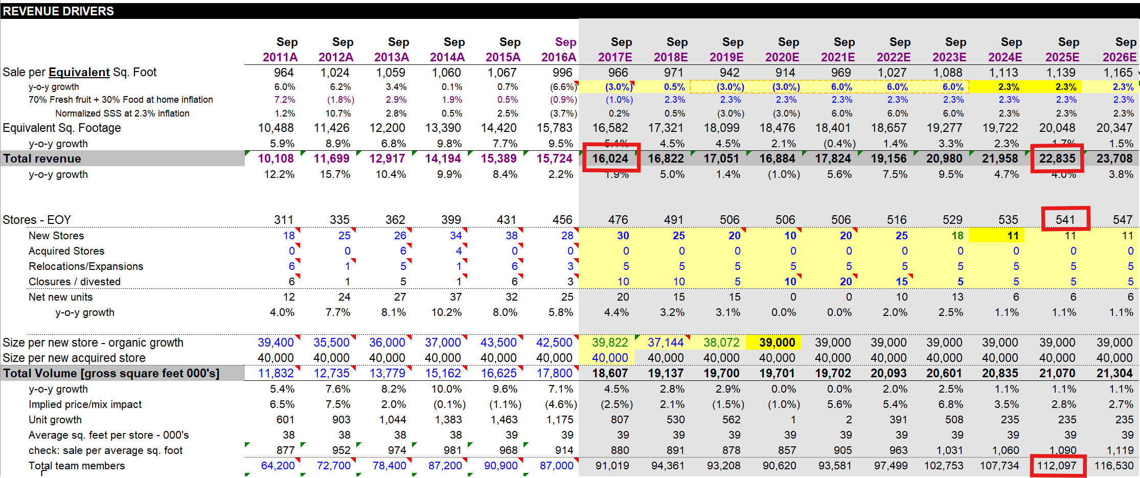
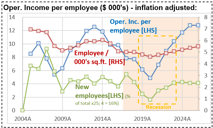
But here’s what’s remarkable: these projections also revealed something uncomfortable. When I calculated the Internal Rate of Return (IRR) that Amazon achieved on its Whole Foods investment—assuming the company’s margins remain consistent with historical patterns—the IRR comes in at approximately 8.8%. And by “historical patterns,” I meant reaching an operating profit per employee consistent with times when the company was operating very efficiently (see second chart - focus on the blue line).
Why 8.8% Should Matter
Eight point eight percent is a respectable return in many contexts. It’s better than Treasury bonds. It beats inflation. But for Amazon—a company that commands extraordinary capital and pricing power, with a cost of capital (Ke) that reflects its dominant market position—8.8% is mediocre. It’s below the historical hurdle rates that truly accretive acquisitions typically exceed.
To put it another way: Amazon paid $13.7 billion for a business that, if it performed exactly as my 2017 model suggested (and the evidence suggests it has), would compound capital at a rate that fails to fully reflect the premium one should demand for deploying that much capital in such a capital-intensive, hypercompetitive industry.
This doesn’t mean the deal was a disaster. Amazon hasn’t destroyed value. But it hasn’t also created the spectacular value-creation story that the initial narrative promised. The company moved 40% more merchandise through 547 stores and 106,000 employees—an outcome you could have forecast by looking at historical productivity metrics and applying straightforward extrapolation.
The Broader Lesson
This distinction between investment and speculation explains why some investors thrive while others repeatedly lose money. Speculators heard “Amazon buys grocery” and imagined Disney-like returns. Investors asked: Given what we know about this industry, what return does this price actually imply? And if the market is correct about Amazon’s strategic brilliance here, shouldn’t the returns exceed our cost of capital? The tragedy is that poor answers to this question have led many investors into situations far worse than Amazon’s Whole Foods deal.
Take Beyond Meat, which at its peak was valued at nearly $4 billion, pricing in a future where plant-based meat would capture vast market share and command premium margins. Those who bought at peak valuation didn’t lose 30% of their capital. They lost 95%+. The difference? Beyond Meat’s valuation required speculative assumptions about market size and profitability that had virtually no historical precedent. Whole Foods, by contrast, sits in a known market with knowable economics.
What This Means for Your Investing
When you encounter a story about a company acquiring another, a new technology, or a business entering a hot new market, resist the urge to extrapolate linearly from enthusiasm. Instead, ask yourself: What is the IRR this price actually implies? Does that IRR compensate me for the risk and the opportunity cost of deploying capital elsewhere? What assumptions about margins, growth, and competitive dynamics does this valuation require? Have those assumptions been validated by history, or am I betting on a discontinuity?
For Whole Foods, Amazon’s price implied an 8.8% IRR. That’s a fact you could have calculated the day the deal closed. Everything that followed—the 40% sales growth, the store expansion, the employee base—was largely predictable, given straightforward assumptions about retail productivity. The surprise, if you were paying attention to the math rather than the narrative, wouldn’t have been that Amazon “succeeded” with Whole Foods. The surprise would have been to discover that the deal represented anything other than a competent, if uninspiring, deployment of capital into a mature, slow-growth business.
That distinction—between imagining what might happen and calculating what should happen given your purchase price—is the difference between speculation and investing. Amazon, for all its brilliance, chose the latter path on Whole Foods. And it got what 8.8% annual returns suggest you should expect: a reasonable but unremarkable business.
How This Relates to My 2017 Model
I want to emphasize something important for anyone reading this: my 2017 Whole Foods forecast was built on understanding store economics, not on believing in a transformational narrative. The model assumed:
- Whole Foods would add stores at rates consistent with past expansion plans
- Per-store productivity would remain within historical bands
- Margins would not dramatically improve (a conservative assumption, but crucial to disciplined valuation)
- Growth would be gradual, not exponential
Eight years later, nearly every projection has held. I wasn’t prescient—I was simply careful about what I assumed. And that carefulness is what separates the investors who sleep well at night from the speculators who wake up wondering where their Beyond Meat investment went.
A 1990s Redux? Comparing Walmart’s Current Valuation to the Tech Bubble
A recent article in the Wall Street Journal highlighted concerns regarding the potential overvaluation of Walmart. The article can be accessed here. The author primarily focuses on the forward price-to-earnings ratio, contrasting Walmart’s metrics with those of various technology firms, a clever comparison intended to suggest that there may be an issue with WMT’s stock valuation. Are Walmart’s shares overpriced? Indeed, they are; however, at RIM, given the thoroughness and sophistication of our proprietary models, we rely on more than just multiples, which serve as a simplified valuation reference.
What should be of primary interest to investors is the Internal Rate of Return (IRR) that an investment can generate. Naturally, purchasing an asset at a low price and selling it at a higher price without fully understanding the underlying value may yield a high IRR, but this is not investing—it is merely a fortunate chance. True investing requires acquiring assets only when one believes the underlying business can deliver a historically high IRR, assuming reasonable operational performance.
I dedicate extensive time to researching and modelling companies because I aim to invest in businesses where the implied IRR is substantial—approximately 15% annual gains if one were to acquire the entire business, based solely on genuine cash flow to the owner. Where does Walmart stand on this measure today? The first chart provides the answer: Walmart currently offers an IRR close to 6%, the lowest at any fiscal year-end in the past twenty years (indicated by the dark-dotted line). Historically, Walmart shareholders have enjoyed an implied IRR of around 9.2%. This 3.2% difference significantly impacts cumulative returns over time (the calculations are detailed in this post).
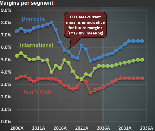
The implied IRRs presented above are derived from RIM’s base-case scenario, which assumes Walmart will improve its margins going forward. The second chart illustrates Walmart’s margins across various segments. It is noteworthy that Walmart’s CFO discussed the prospect of higher margins (approximately 6%) for its domestic business as early as 2017. Except for a few pandemic years, the company has not consistently achieved such margins. Thus, assuming margins increase to levels not regularly seen in over a decade is quite optimistic.
Equally critical to IRRs is the amount of capital expenditure required to attain these margins. The final chart displays Walmart’s capital expenditures over the past two decades and projections for the next ten years. The recent surge in investments is substantial, implying that, all else being equal, higher investment levels reduce cash available to shareholders.
When considering all factors—share price, margins, growth (which has been limited for a mature business like Walmart), and investments—the implied IRR for Walmart stands at a modest 6%. Some may argue that valuations are irrelevant; however, I disagree. As demonstrated in this post, during the 1990s tech bubble, Walmart shares—and a few others—were highly valued. Shareholders who disregarded these elevated valuations at that time experienced poor returns, a scenario that is quite plausible for current Walmart investors purchasing at today’s prices.
$FLS Share Price Surge: Nuclear Hype Meets AI Mania
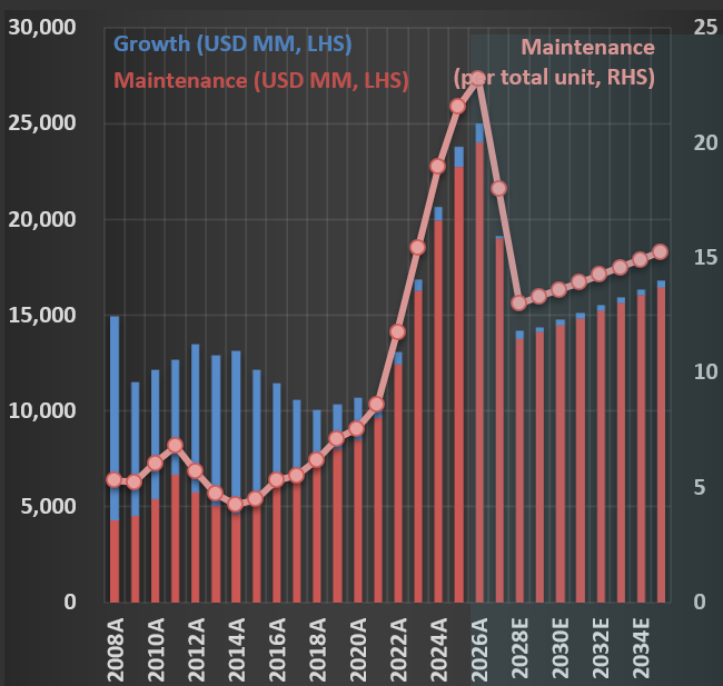
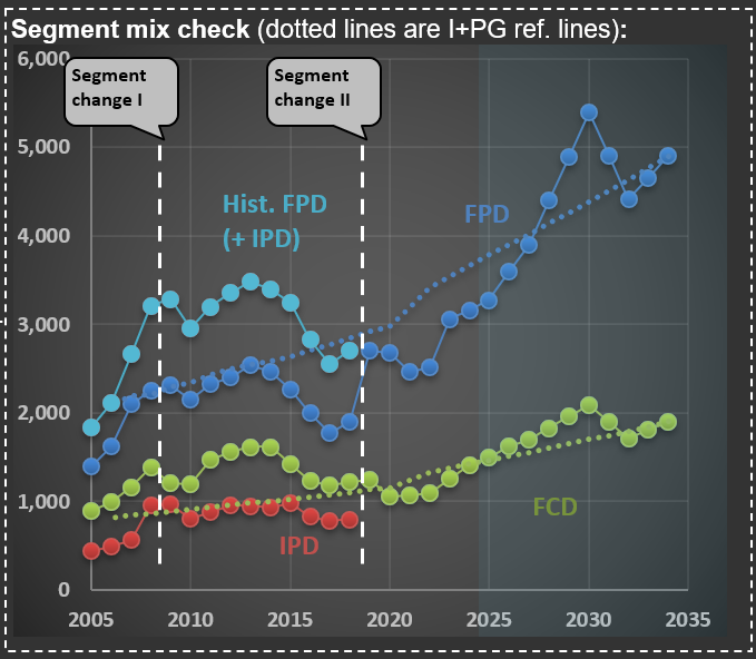
This past week, $FLS (Flowserve Corporation) released earnings that clearly illustrate how the AI race and associated mania can spill over into even traditional companies, particularly in the industrial sector. Flowserve is a classic industrial company that sells technical equipment to its corporate clients. It specializes in precision-engineered equipment that manages the movement, control, and protection of industrial fluids and gases in critical infrastructure applications. The company operates through two primary business segments: the Flowserve Pumps Division (FPD), which focuses on highly custom-engineered pumps, and the Flow Control Division (FCD), which designs, manufactures, and services industrial valves.
The first chart shows sales over the two main segments. But you can also see a line that ends abruptly—that is their IPD (Industrial Products Segment; the red dotted line in the chart), which was merged into FPD. It isn’t uncommon for companies to change segments—Flowserve did so twice in the past 20 years. I find it challenging when this happens, as it makes it harder to track the progression of sales and margins over the years.
A case in point is what happened when they released their earnings for 3Q 2025. Shares jumped more than 30%. This is more than three times what was observed during earnings releases when the company surprised the market positively over the past decade. The reason: the focus on nuclear energy. At the end of the post, you see the cover of their earnings release presentation—that is a nuclear power plant.
The word “nuclear” was mentioned 25 times in its earnings presentation and 59 times during the conference call transcript. And the market was excited with phrases like “we believe that nuclear flow control opportunity set could be $10-billion-plus over the next decade,” pushing share prices up abnormally. Now, do you know how much nuclear-related sales Flowserve has? They sold $160 million in pumps and valves in 2024, somewhat related to nuclear facilities. This is 3.5% of their sales (of $4.6 billion). So, do you think that a company that isn’t relevant in the nuclear space should increase in value by more than 30% because they mentioned the word “nuclear” in their earnings release?
Because of AI’s high electricity consumption, there is widespread speculation that countries like the US will reignite their nuclear power programs. First, a long-term renewed interest in nuclear energy is already a speculative assumption. Second, nuclear facilities construction takes years (usually measured in decades) to complete. And even if it does happen, the chances of Flowserve meaningfully participating are small.
The mere mention of a word in a release leading to significant share price appreciation reminds me of 1999, when companies were adding “.com” to their names and instantly increasing in value. What happened with Flowserve might be something similar. A company that only tangentially touches the nuclear space increased its valuation by disproportionately associating itself with this field. This is what a mania looks like.

Government Spending and Mortgage Rates: Understanding the Connection That Matters
One of the key variables for the housing market is the 30-year mortgage rate. It isn’t uncommon to see posts on social media about the movement of such a rate in a single day. However, rates like this need to be viewed over a much longer timeframe. Below is a chart showing key series over three decades. In green is the 30-year mortgage rate. Note how it maintains a particular spread from the 10-year Treasury note (in magenta). Also interesting is the blue line—the Fed Funds Rate—which shows a more step-like pattern as the Federal Reserve uses it to achieve its dual mandate of inflation control and employment.
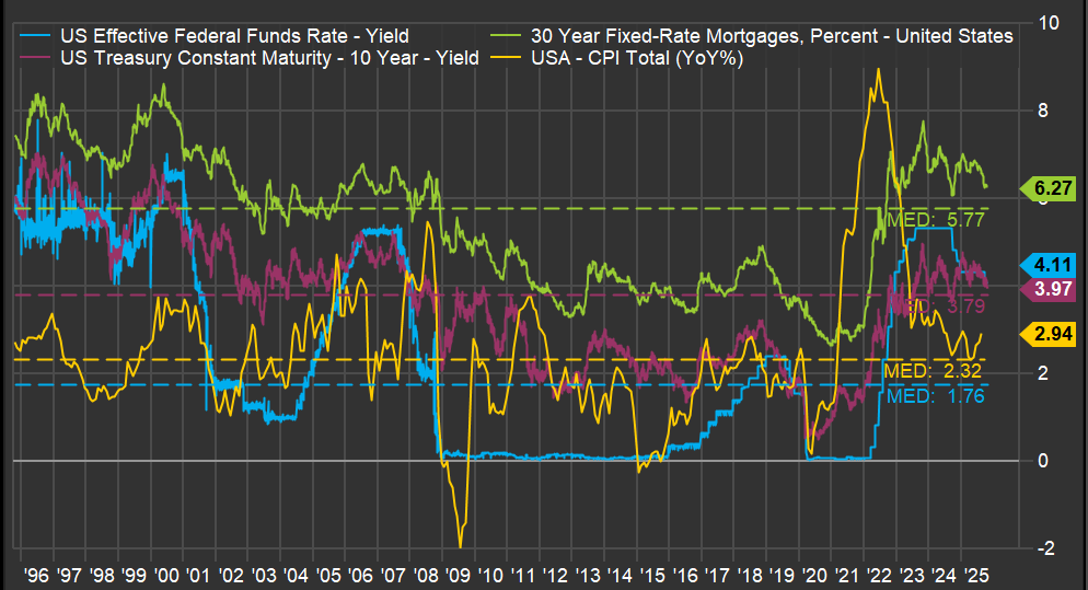
But the most critical line is the yellow one: inflation. A spike in inflation drove the jump in the 30-year mortgage rate, which had a profound impact on the existing home sales market, as I discussed in a previous post (here). But what caused such a sudden spike in inflation? The ferocious money-printing during the pandemic years.
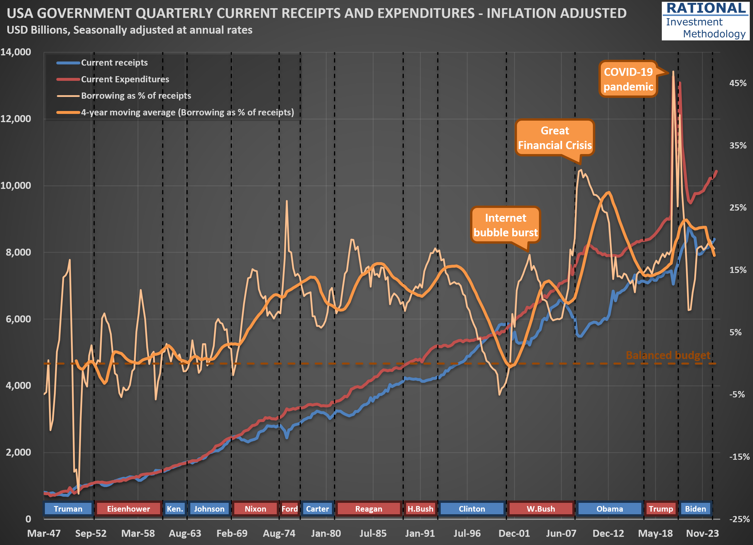
The question one needs to answer regarding the 30-year mortgage rate isn’t what it will do today, or even next year. The driver of all the lines you see in the first chart is how much the US government continues spending above its tax receipts. And the trend isn’t encouraging. The second chart shows (in orange) how much the US government has borrowed to cover its expenses, which include all transfers—think Social Security, Medicare, and Medicaid. Note how spending increases with each crisis, with a massive 47% ratio (meaning the government spent 47% above its income) during the acute phase of the COVID-19 pandemic.
What is particularly concerning is that, apart from the late years of the Clinton administration when receipts increased substantially due to the internet bubble, the US has largely ignored fiscal discipline since the 1970s. One might argue, “Well, the US can do it because its currency is the global reserve.” However, no government in history has managed to abuse the monetary system indefinitely. The question is not “if” but “when” we will see stress on government bond yields. When that happens, the housing market will suffer significantly, and we will likely embark on another recession led by the housing market—which, as I’ve shown, has been part of many US economic crises (see here).
So what should an investor do? Focus on companies that, over decades, have navigated crises and emerged fully operational on the other side. Not necessarily unscathed—it is common for a company’s earnings to suffer during a recession—but healthy enough to continue business as usual after the storm passes. That is what I work on every day (for the past 20 years), spending countless hours running company-specific analyses. It isn’t fun or easy, but it is necessary.
When “Hedges” Hurt: Lessons from $GLD and $SLV Cycles
Clients, friends, and anyone who knows I work with investments often ask for a view on the price of gold. The answer is consistent: not much, because gold prices sit outside my circle of competence. To have a view on any commodity, it is essential to know who the suppliers are, how much they can produce, and at what cost—in other words, to build a cost curve for the commodity in question. Without that information, any allocation to such a commodity could be too speculative, even if the true intention is to provide a hedge against inflation or as a diversification within a broader portfolio.
However, a long-term perspective on how gold prices (and their often-mentioned companion, silver) behaved—particularly during the U.S. inflation run-up in the 1970s and 1980s—can still be useful; look at the chart, which shows gold (dark blue), gold adjusted for inflation (light blue), silver (dark green), and silver adjusted for inflation (light green).
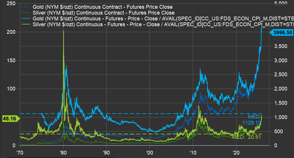
First, on gold: when inflation was rampant in the late 1970s, gold, in today’s dollars, reached roughly $2,800 per ounce; today’s level sits about 43% above that prior peak. However, that peak was 45 years ago, implying a real return close to 1% per year since then. What followed should give current gold holders pause: prices declined for roughly 20 years, reaching around $500 per ounce in the early 2000s—an 82% drawdown, leaving about 18% of the original investment two decades later.
Silver is even more extreme. It is around $50 per ounce today, after having surpassed $200 per ounce (in today’s dollars) in 1980; by the 2000s, it traded near $8 per ounce—a roughly 96% decline from that earlier level. Imagine looking at an “inflation hedge” bucket and finding only 4% of it remained.
That’s as far as this analysis goes for these two precious metals: invest with care, recognizing that prices can always rise, but extended speculative phases can produce negative returns for decades. In silver’s case, the closest it came to its 1980 record was about $60 per ounce in the early 2010s—still roughly 70% below the peak.
Why $HSY Defies Conventional Forecasting Wisdom
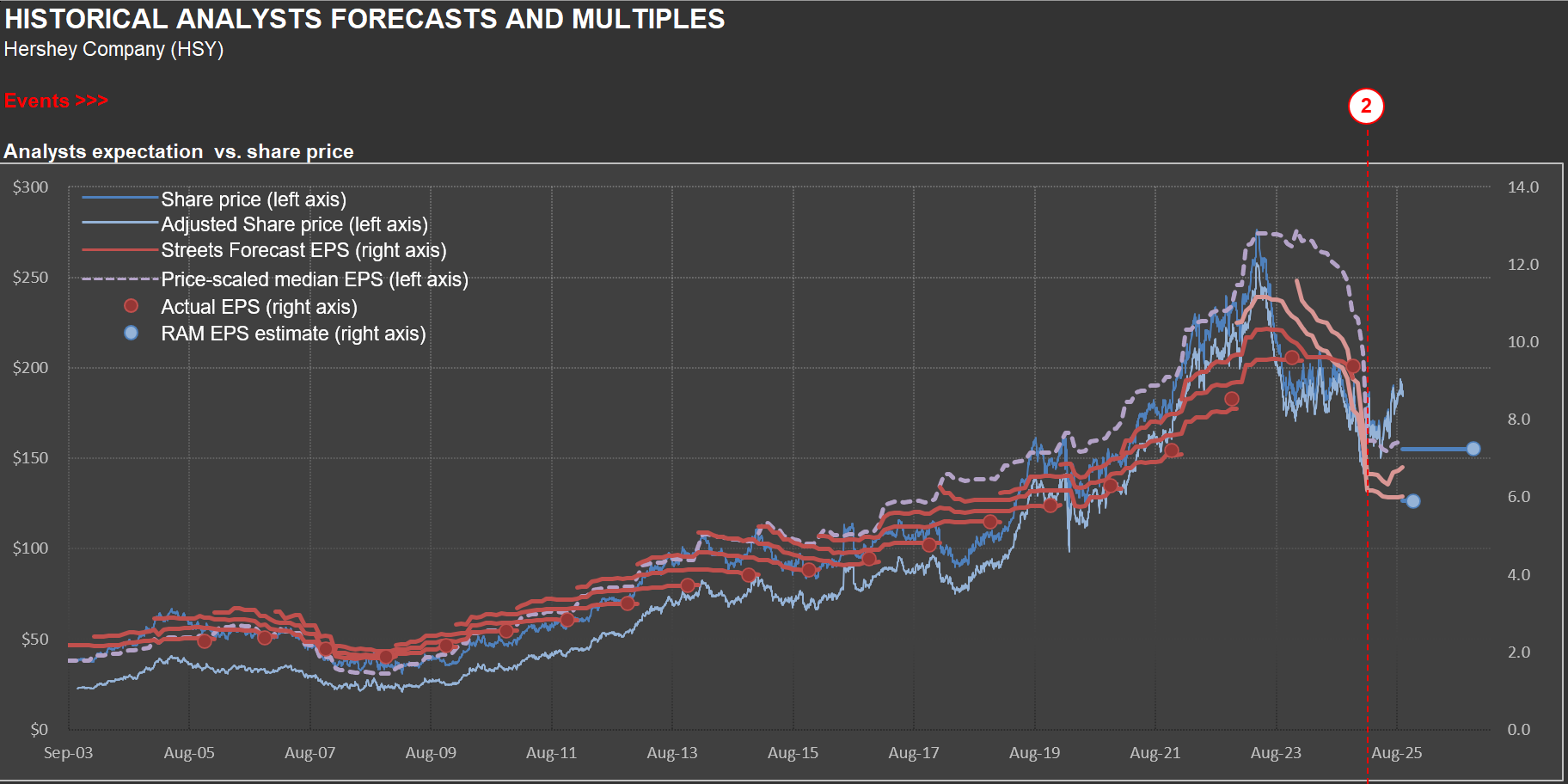
In early 2023, Hershey’s shares were trading near $275—the same vicinity where RIM’s short position kicked off (the position has since been closed). By Q1 2025, they’d slumped below $150, underscoring the perils of overconfidence in a seemingly stable business. Nowhere was this more evident than in 2Q 2024, when Hershey reported its worst quarterly sales decline in twenty years: a steep −16.7%.
Management broke down the drivers of that plunge as follows: ERP-driven inventory cuts (approximately 9 points), retailer timing shifts (approximately 6–7 points), discretionary spending pullback, channel migration, merchandising cuts, and category softness.
Just as sales surprises can upend forecasts for a chocolate maker, cost fluctuations add another layer of uncertainty. In 2Q 2025, Hershey’s adjusted gross margin plunged 510 basis points, driven by cocoa price spikes, elevated manufacturing costs, and tariffs. Those headwinds largely offset price increases, productivity gains, and transformation savings. Looking ahead, management projects full-year gross margin erosion of 675–700 basis points—an eye-watering swing that few analysts anticipated twelve months prior - the chart above shows how fast earnings were revised down (dragging with it HSY’s shares).
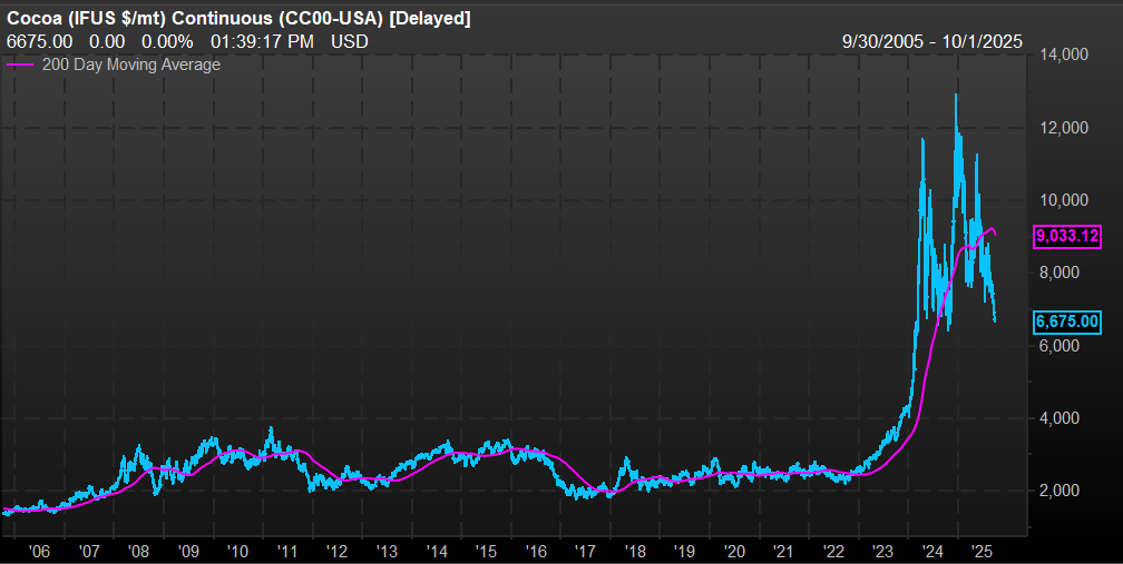
The Hershey’s saga offers a cautionary tale for forecasting any business: even “mundane” companies confront complexity at every turn, exposing how little control companies might have over outcomes. A case in point is the price of cocoa (see the second chart). Prices surpassed $12,000 per metric ton in late 2014, from an average of around $2,500 per metric ton in prior years. Hershey uses derivatives to try to control commodity price volatility, but something of that magnitude, impacting the most important commodity used in their manufacturing process, can’t be neutralized.
If projecting Hershey’s sales and profits—with its nearly century-old brands and predictable seasonality—can trip up analysts, imagine the challenge of forecasting fast-evolving technology ventures. So approach new and uncharted territories carefully.
Forecasting $EXP Sales: How Home Starts and Industry Behavior Intersect
Sometimes clients wonder why I devote so much time to producing (and updating) a wide array of industry-wide analyses. For example, you’ve likely seen the posts I’ve published covering the housing (here) or transportation (here) sectors. The reason is simple: industry dynamics are typically the critical force shaping sales for any individual company.
Take today’s focus: $EXP (Eagle Materials), a leading U.S. producer of wallboard and cement, with additional operations in concrete and aggregates. See the first scatter plot. 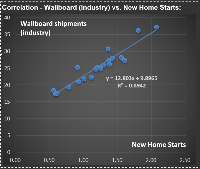 It highlights the strong correlation between U.S. wallboard sales and new home starts (that is, newly constructed houses). While not all wallboard goes into new housing, this single variable explains nearly 90% of total sales, reflecting the interconnectedness of adjacent areas within the housing complex.
This is why understanding the cycles of new home starts in the U.S. is essential for accurately forecasting sales for Eagle Materials’ wallboard segment. From there, it’s a straightforward process to estimate $EXP’s market share and, with further analysis, explore the dynamics between capacity utilization and wallboard pricing—take a look at the second chart for a visual depiction. 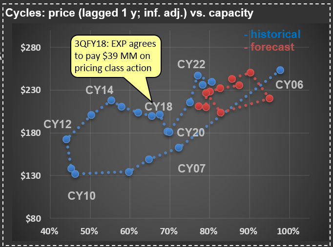
During the mid-2000s housing boom, capacity utilization at $EXP and its competitors reached very high levels (as did the price of wallboard). As the cycle turned and housing starts collapsed, utilization rates dropped—and prices followed. Then, something unusual happened: in the early 2010s, wallboard prices climbed sharply, even though the industry’s fundamentals seemed weak. For a while, my analysis questioned its relevance—until, almost a decade later, Eagle Materials (along with USG, the market leader) was fined tens of millions of dollars in a class action for price-fixing. In short, the major players had been colluding.
Looking ahead, pricing should remain relatively disciplined, especially with fewer homes expected to be built in the coming years (see my recent analysis on U.S. Census Bureau data and future new home starts - here). That said, if significant industry players resume collusive behavior, all bets are off—so I’ll be keeping a close eye on price developments in this segment.
Did $EXPD Miss the Storm? Lessons from Their Q&A
As I updated my work on $EXPD (Expeditors; I discussed the company’s business in a prior post—here), I searched for their latest Q&A documents. Expeditors doesn’t host analyst conference calls, but you can send them questions that management periodically responds to. The most intriguing responses came from their January 13, 2025, Q&A.
What stood out was how a group of logistics specialists didn’t anticipate the tariff storm that was about to hit the industry. Here’s the exchange:
Question: Regarding Trump 2.0, what concerns are you hearing from customers? How are things different this time around? Has your perspective changed on the likelihood of increased tariffs and a possible trade war? And is there an upside with regard to additional complexity being good for Expeditors?
Answer: Our perspective is that shippers now know what to expect from a Trump administration. Tariffs were certainly a very real issue during his first term, when it often seemed that new rules were being issued nearly every day. But the reality is that many of the tariffs implemented during the first Trump administration were continued and, in some cases, tightened under the Biden administration. Historically, complexity has usually been very good for Expeditors. We are experts at helping our customers navigate complex environments.
At the time, they didn’t know that the tariff changes in Trump’s first term would pale in comparison to what followed. It’s a reminder of how unpredictable economic cycles can be—and how companies must adapt swiftly. Below is a chart showing $EXPD’s historical and forecast net margin. 2021 and 2022 stand out as exceptional years; 2025 is projected to align closer to their long-term average. So far, the current tariff complexity hasn’t been “very good” for margins, but it hasn’t derailed the company, either.
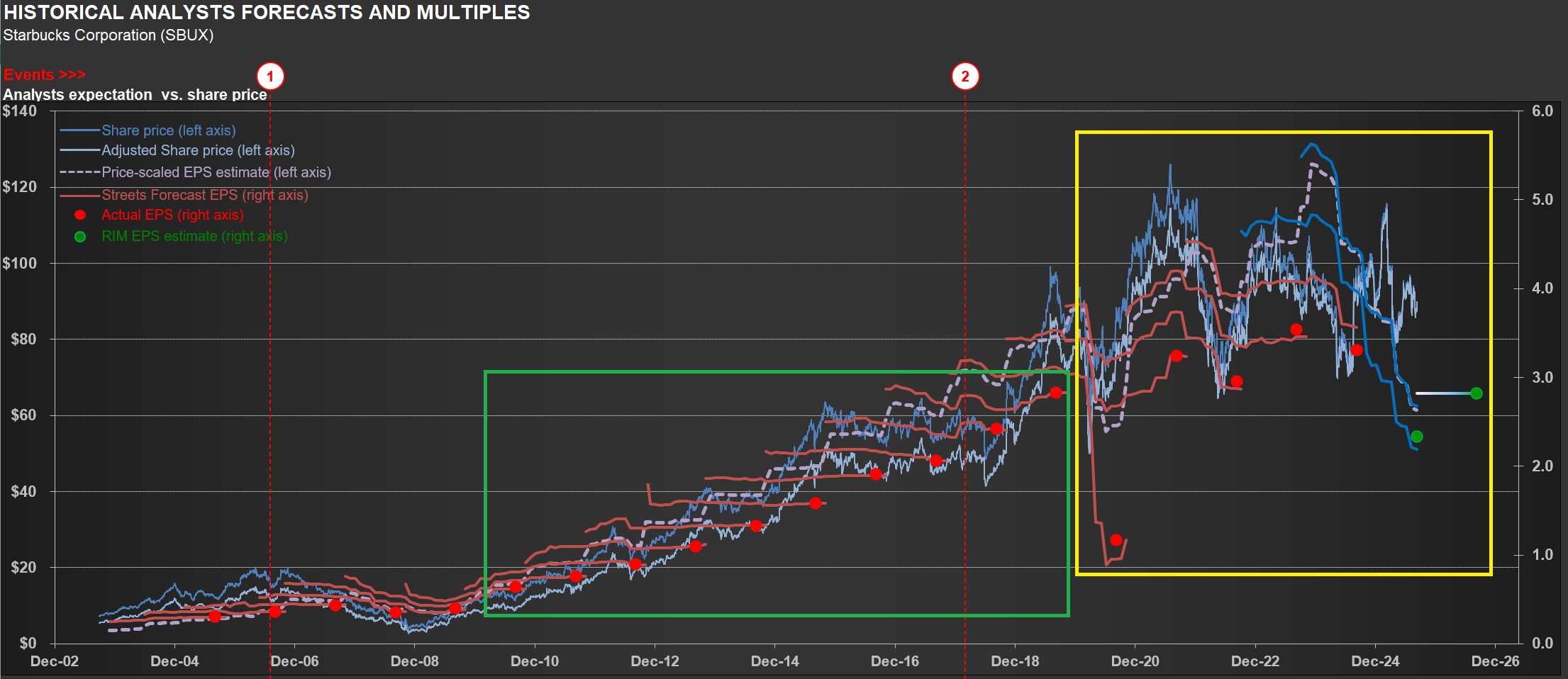
From Shorts to Opportunity: Tracking $SBUX's Turnaround Journey
$SBUX (Starbucks) finds itself in a turnaround phase, and management’s language on the latest conference call was telling. They repeatedly described this as the “early stages of our turnaround in the US”—part of a “multiyear effort” to “rebuild” and get “Back to Starbucks.” When executives use words like “rebuild,” it signals they’re addressing fundamental challenges rather than operating from a position of strength.
The company’s financials clearly reflect this reality. Take a look at the chart below—one you’ll recognize from my previous analyses. It tracks the company’s earnings versus share price over time. Notice how earnings estimates have become much more volatile recently (yellow rectangle) compared to the pre-pandemic, post-GFC period (green rectangle). While volatility during the pandemic’s peak was understandable, why the continued decline now?
The EPS drop stems primarily from significant operating margin contraction, driven by deleverage and substantial strategic investments in the “Back to Starbucks” initiative. Management describes this as a comprehensive plan aimed at transforming both the business and its culture—ultimately building a stronger, more resilient, and consistently growing company. Chairman and CEO Brian Niccol calls it “the right plan,” grounded in customer and partner feedback and rooted in the company’s core identity as a welcoming coffeehouse serving fine coffee handcrafted by skilled baristas.
But transformation comes with costs. The effort includes over $0.5 billion in additional labor hours for the Green Apron Service rollout and significant spending on Leadership Experience 2025—an event that brought together 14,000 coffeehouse leaders. Will it work? Time will tell, but we should expect continued volatility in earnings expectations along the way.
Here’s what makes this interesting from an investment perspective: if the turnaround succeeds, this volatility could create opportunities to acquire shares at a substantial margin of safety. The last time I owned $SBUX shares was back in 2009. My last three positions on the name were shorts—all successful trades, but that’s the past.
The key question now is whether management can execute on its vision while navigating the inevitable bumps ahead.
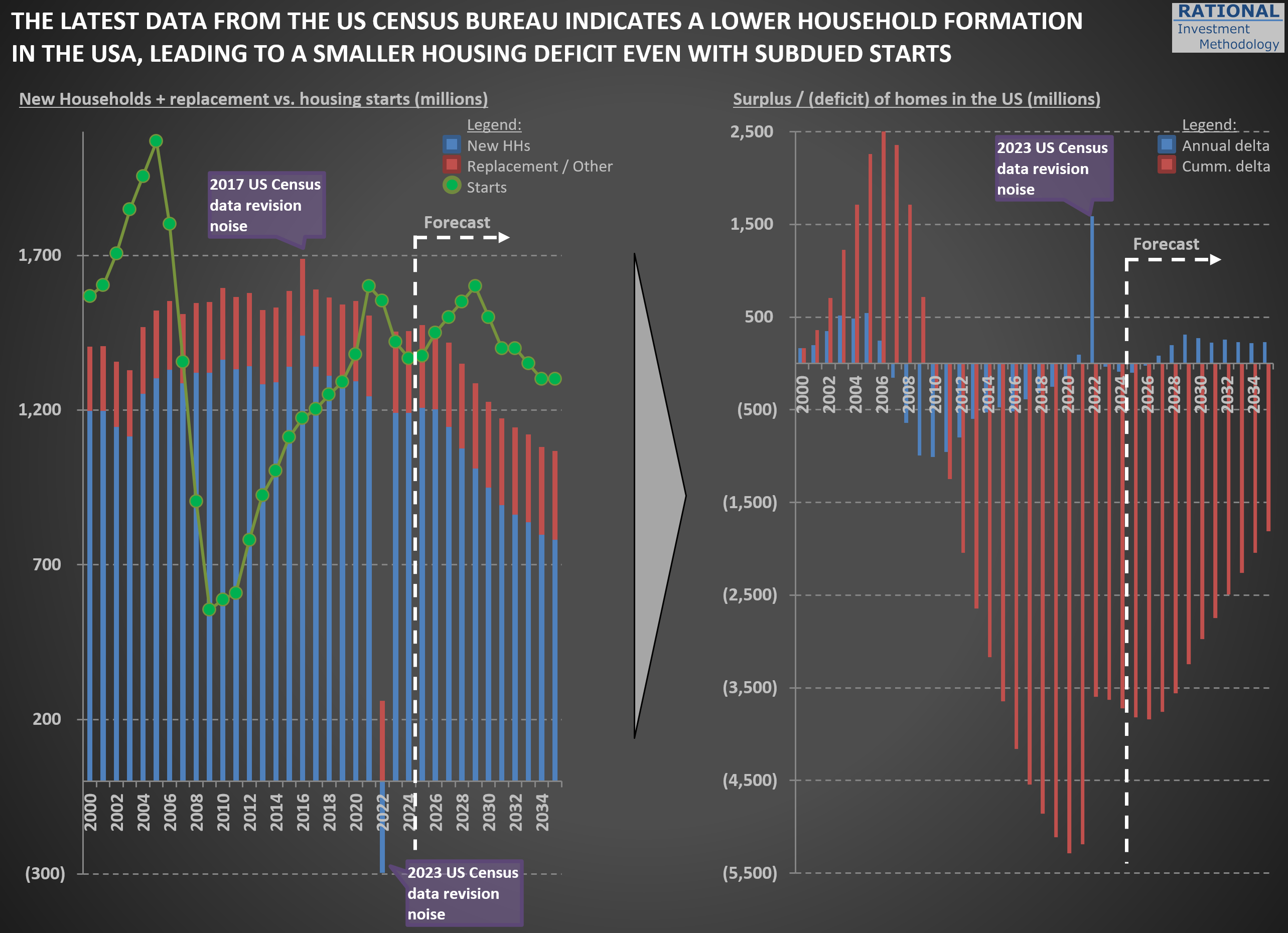
Census Bureau’s 2023 Data Points to Weaker Household Growth—A Closer Look
I’ve incorporated the US Census Bureau’s 2023 National Population Projections (you can explore the full dataset here) into my estimates of new household formation in the US. Typically, these revisions are minor—but not this time. Back in February, I highlighted the shrinking cohort of young families when discussing challenges for Carter’s ($CRI) in this post. The new projections, however, point to a broader slowdown in household formation.
The chart below reflects these updates. First, you’ll notice a spike in “noise” around the 2022 figures (and a much smaller one in 2016). Although the data was published in 2023, the Census Bureau sometimes revises prior-year numbers—and I always use the most recent figures available, even for past years.
The key takeaway is that new household formation will grow much more slowly than it has over the past 25 years. That suggests future New Home Starts (green dots) may be lower than in recent decades. Even with subdued starts, any lingering home‐building deficit from the Global Financial Crisis will shrink significantly—so there won’t be a significant unmet demand waiting to be filled.
In my models, I’ve adjusted the normalized New Home Starts assumption from 1.5 million per year to 1.3 million per year. That change implies slightly lower long-term sales for housing‐related materials. While the valuation impact is modest—given how gradually this trend unfolds—it’s crucial to incorporate these shifting demographics when projecting decades‐ahead performance. I will also eagerly wait for data revisions given recent changes in immigration dynamics, as scenarios the US Census Bureau calls “low immigration” and “zero immigration” might become the new reality.
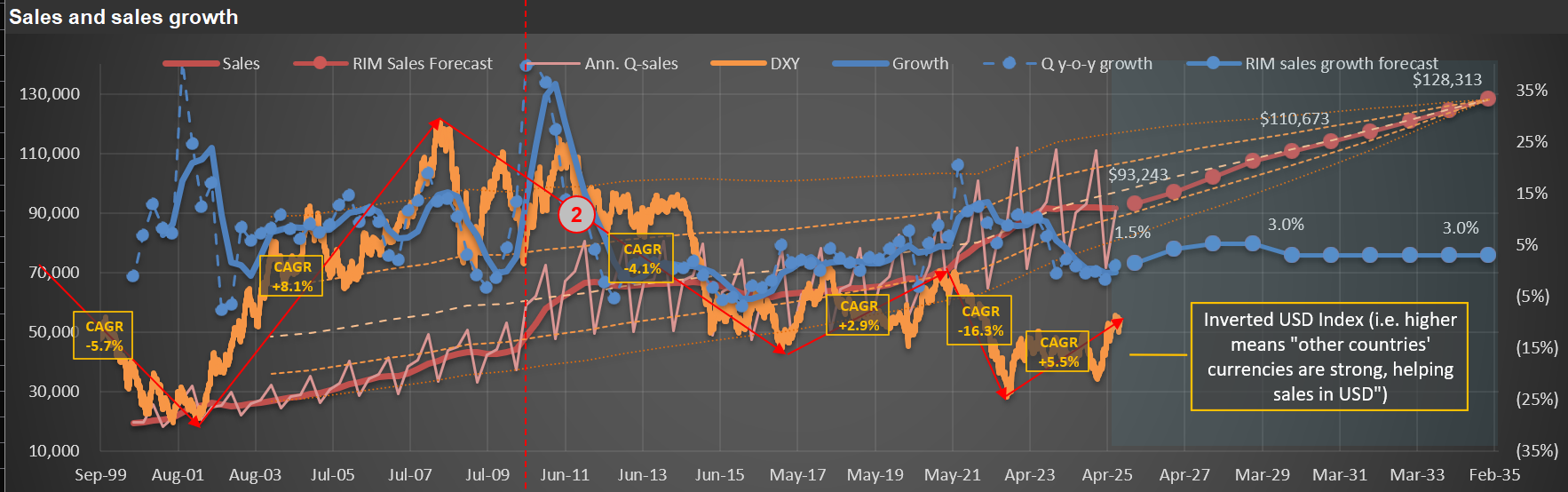
Seeing Through Currency Noise: Interpreting $PEP Sales Trends
In many of my sales charts for companies with significant international exposure, I include a “USD index”—like the orange line on the chart below. In this case, the chart is for $PEP (PepsiCo). The annotations and text box on the chart highlight periods of substantial change in the USD’s value versus a currency basket (I use the DXY, which includes the EUR, JPY, GBP, CAD, SEK, and CHF). The accompanying table below the chart details the specific dates and quantifies the total and annual appreciation or declines during each cycle.
The index is “inverted,” so it moves higher as foreign currencies strengthen against the USD. It means that when the orange line rises, companies like Pepsi—which report sales in USD—get a boost from currency translation on their international sales. Conversely, when the line declines, it acts as a headwind for reported international sales.
I don’t use this chart to make predictions. Instead, it’s a tool for context. If international sales, reported in USD, look strong, it’s worth checking whether this is due to real underlying growth or simply a weaker dollar. That was certainly the case in the early 2000s. But since mid-2008, the USD has strengthened considerably against other major currencies, so international sales growth, in USD terms, has slowed or even reversed.
Last, there’s been plenty of commentary in 2025 about the “unprecedented” weakness of the USD. While there’s some truth to that, the DXY index is not far from its late-2016 peak—and, in fact, the USD only reached a higher high (represented by a lower point for the orange line) in 2022.
The takeaway? It’s essential to maintain a long-term perspective on FX rates. As the table below demonstrates, cycles of appreciation and depreciation can persist for many years (see the years and months for each cycle listed in the table).
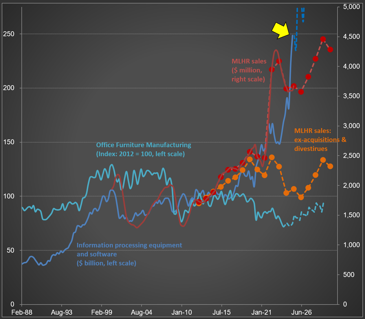
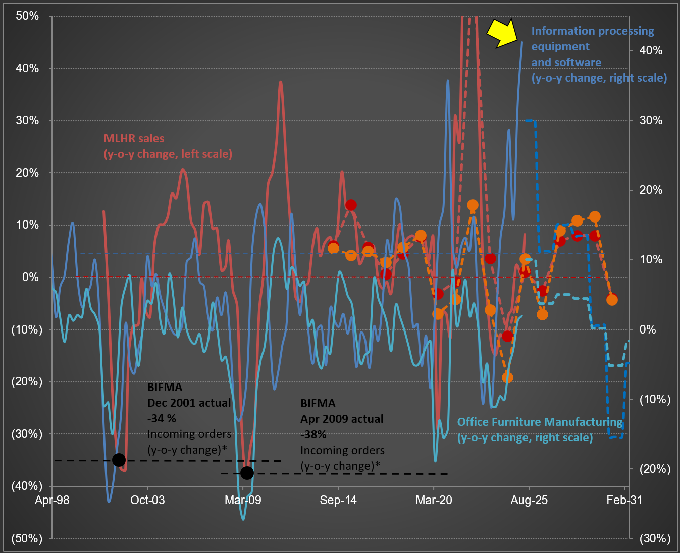
$MLKN and the “AI Arms Race”: Why Tech Spend and Furniture Sales No Longer Move Together
While updating my analysis for $MLKN (MillerKnoll; the largest office furniture company in the Western hemisphere), I was struck by the sharp rise in Information Processing Equipment and Software spending (dark blue line)—take a look at the first chart below. The most recent datapoint, highlighted by the yellow arrow, shows annualized sales reaching $250 billion.
The second chart, which tracks year-over-year changes, illustrates why I’ve included not only MillerKnoll’s sales but also two broader industry data series (including Office Furniture Manufacturing). Notice how the volatility in the blue lines closely mirrors the swings in MillerKnoll sales (in red), and even lines up with significant industry downturns reported by BIFMA (the Business and Institutional Furniture Manufacturers Association) in both 2001 and 2009.
Perhaps someday, Information Processing Equipment and Software spending will once again move in step with office furniture sales. For now, though, it seems primarily driven by today’s “AI arms race.” The latest year-over-year increase surpassed 41%—the highest on record for this data series. It’s also striking that if you adjust for inflation, this series remained at a similar level from the post-Internet 1.0 bust in 2002 up until early 2020. The dramatic surge started only after that point. It will be interesting to see in the coming years how sustainable (or not) this pace really is.
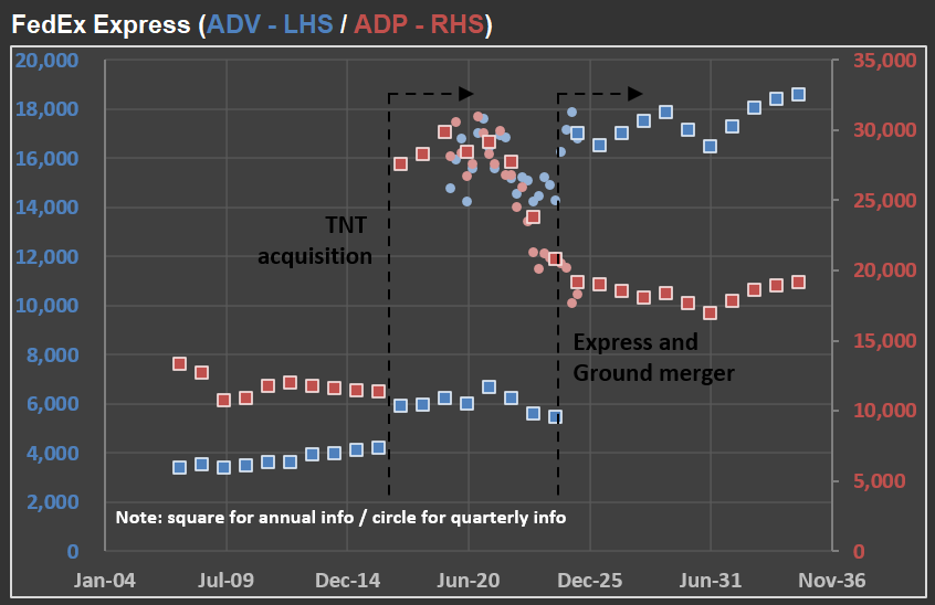
Why “Simple” Numbers Lie: Lessons from $FDX and the Art of Financial Analysis
Why do I devote so much effort to detailed financial analysis of the companies in RIM’s CofC(*)? It’s because companies are constantly evolving, and off-the-shelf calculations like “sales growth” or “margin trends” frequently become meaningless in the real world.
Take $FDX (FedEx) as an example. In the picture below, you’ll see how FedEx has reported ADV (Average Daily Volume) and ADP (Average Daily Packages) for their Express segment over the last 20 years, along with “base case scenario” forecasts for the coming decade.
First, notice the significant jump in ADP in 2017. That spike came right after the acquisition of TNT Express—a major European operator. The timing, however, was unfortunate: only months later, FedEx was hit by the NotPetya ransomware attack, which severely impacted TNT’s IT systems. Nearly every hub, facility, and depot had to have its systems rebuilt from scratch. The recovery was extensive, and FedEx estimated immediate losses of at least $300 million due to reduced shipping volumes, lost revenue, and higher remediation costs.
Fast-forward to recent years, and the numbers became complicated again. FedEx has merged its Ground and Express segments, moving closer to the model used by UPS (which already operates a unified network) and adjusting to changing parcel volumes after the ecommerce surge. Although no new company was acquired this time, the way FedEx reports its numbers has changed—once again making direct year-over-year comparisons challenging.
That’s why I continuously adapt my valuation models to account for these reporting changes. If I don’t understand exactly what changed (and when), the risk of producing misleading forecasts rises dramatically. Back to the model…
(*) CofC = Circle of Competence
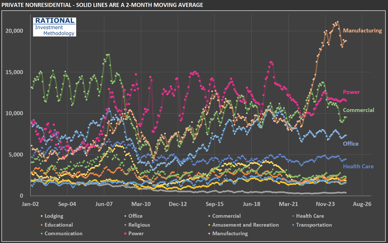
The Manufacturing Construction Surge: Signal or Noise for $FAST?
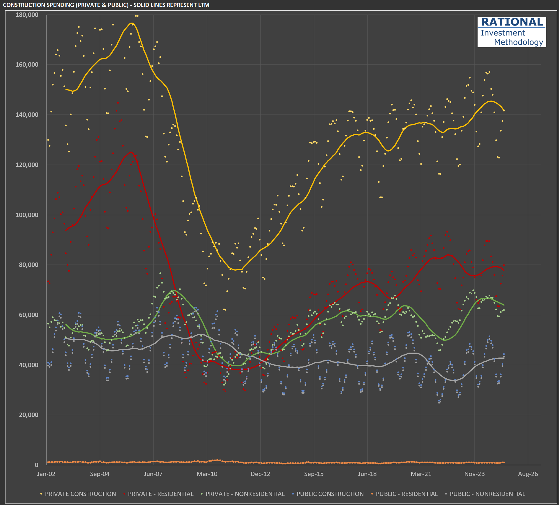
As I work on my analysis of $FAST (Fastenal)—a major industrial and construction supply distributor specializing in fasteners and related maintenance, repair, and operations (MRO) products—I’ve decided to update my analysis tracking construction spending in the USA. After all, the more activity there is in this sector, the more demand Fastenal might see for its products.
The data, from the US Census Bureau, begins in the early 2000s. The first chart below shows subcategories of a broader category: private non-residential construction. I’m highlighting this first because it reveals the abnormal increase in manufacturing-related construction. Manufacturing spending, measured in millions of dollars per month, doubled from around $10 billion to almost $20 billion per month in just a couple of years[*]. The increase starts in 2022 for a clear reason: the CHIPS and Science Act, the Inflation Reduction Act (IRA), and the Infrastructure Investment and Jobs Act (IIJA) provided substantial federal subsidies, tax credits, and direct funding specifically aimed at boosting domestic manufacturing, particularly in sectors such as semiconductors and clean energy technologies.
However, it’s essential to put this increase in a broader context, hence the second chart. The green line represents the sum of all private non-residential investments, totaling more than $60 billion per month—a level it has maintained since recovering from the significant decline during the GFC[**]. Notice, however, that private residential construction (in red) is the most prominent subcategory in this chart, with almost $80 billion in monthly spending. When you combine both private-residential and private-nonresidential, you get more than $140 billion in monthly construction spending. The other lines refer to public construction, which is dominated by nonresidential projects (such as highways, sewage, and water treatment). However, this represents a relatively minor component of construction spending, totaling approximately $40 billion per month.
So, is a $10 billion increase in manufacturing-related construction significant? When you combine both private and public spending (totaling around $185 billion), it represents slightly more than 5% of the total. It’s not nothing, but it shouldn’t be the reason for someone to expect a massive increase in construction activity nationwide. The government might intervene even further with additional subsidies. However, the country’s level of debt and current twin deficit should make it more challenging to do so. But we live in times where fiscal restraint appears irrelevant to governments, so time will tell how much more abnormal activity we’ll see in this subsegment of the construction space.
[*] All figures in this chart are adjusted for inflation and population growth [**] Global Financial Crisis