Why Existing Home Sales Are Stuck at 1995 Levels
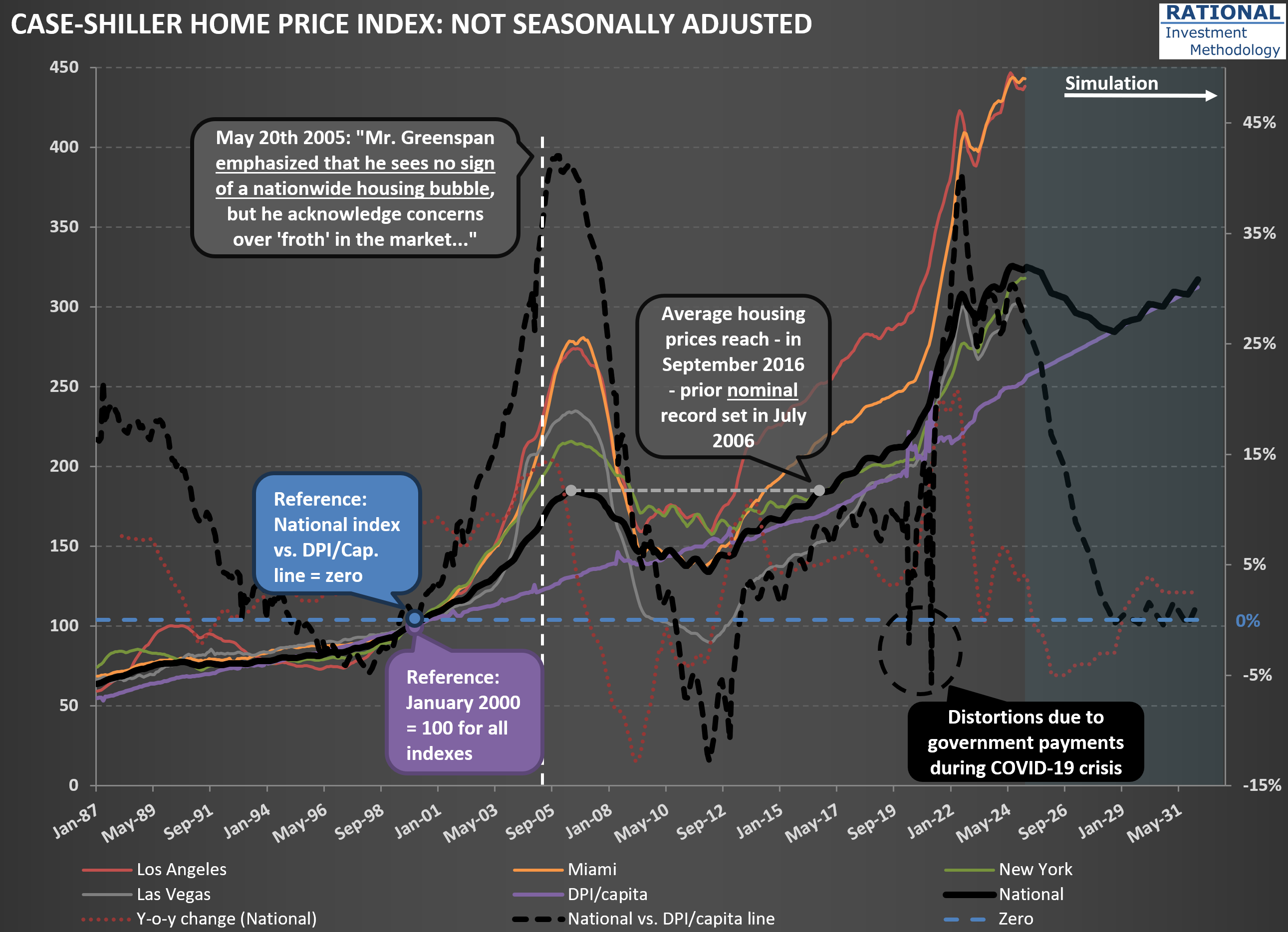
I’ve just updated my charts with the latest US housing price data. I’m sharing one here that highlights some key trends—see the first chart below. As usual, there are plenty of lines, but let’s focus on a few important ones. The solid black line represents the National Case-Shiller index. You’ll also notice other indices in color, tracking New York, Las Vegas, Miami, and Los Angeles.
Pay particular attention to the purple line, which shows disposable personal income (DPI) per capita. Since home purchases ultimately depend on what’s left after covering essentials, this is a crucial metric. The gap between the Case-Shiller index and DPI per capita is shown by the dashed black line. This makes the mid-2000s housing bubble and the pandemic peak stand out clearly. Currently, the delta between house prices and DPI/capita sits at 27%—a significant spread.
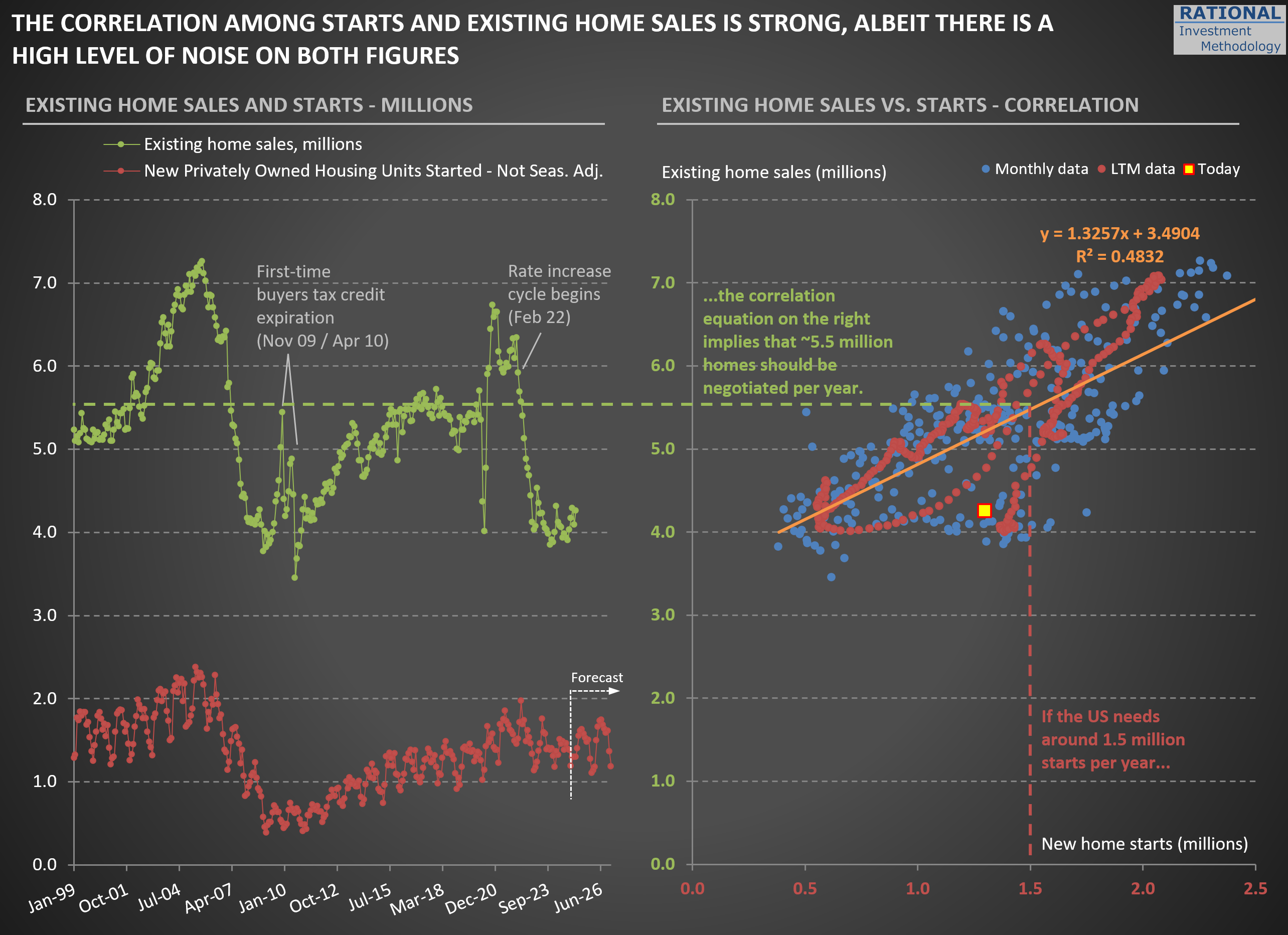
Now, take a look at the second chart. On the left, you’ll see two key figures: new home starts (in red) and existing home sales (in green). What stands out is how low existing home sales are. In 2024, the number of homes sold in the US dropped to levels last seen in 1995.
What’s driving this? It’s a combination of (i) high home prices—in most, though not all, regions—and (ii) mortgage rates that have returned to more typical levels. Together, these factors make it tough for first-time buyers, such as new couples, to enter the market. At the same time, many current homeowners are “locked in” to their low-rate mortgages. For example, trading a 2.75% mortgage for a new one at 7.00% often means paying more each month for a smaller place. Even if you pocket the difference in home values, the prospect of a higher payment for less space is a tough psychological hurdle. As a result, supply remains tight and market activity is subdued.
If tariff issues persist and inflation picks up—pushing mortgage rates even higher—we could see this slow pace in existing home sales drag on. That would be a headwind for the broader economy.

