Seeing Through Currency Noise: Interpreting $PEP Sales Trends
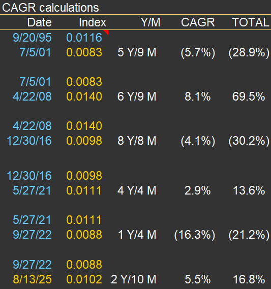
In many of my sales charts for companies with significant international exposure, I include a “USD index”—like the orange line on the chart below. In this case, the chart is for $PEP (PepsiCo). The annotations and text box on the chart highlight periods of substantial change in the USD’s value versus a currency basket (I use the DXY, which includes the EUR, JPY, GBP, CAD, SEK, and CHF). The accompanying table below the chart details the specific dates and quantifies the total and annual appreciation or declines during each cycle.
The index is “inverted,” so it moves higher as foreign currencies strengthen against the USD. It means that when the orange line rises, companies like Pepsi—which report sales in USD—get a boost from currency translation on their international sales. Conversely, when the line declines, it acts as a headwind for reported international sales.
I don’t use this chart to make predictions. Instead, it’s a tool for context. If international sales, reported in USD, look strong, it’s worth checking whether this is due to real underlying growth or simply a weaker dollar. That was certainly the case in the early 2000s. But since mid-2008, the USD has strengthened considerably against other major currencies, so international sales growth, in USD terms, has slowed or even reversed.
Last, there’s been plenty of commentary in 2025 about the “unprecedented” weakness of the USD. While there’s some truth to that, the DXY index is not far from its late-2016 peak—and, in fact, the USD only reached a higher high (represented by a lower point for the orange line) in 2022.
The takeaway? It’s essential to maintain a long-term perspective on FX rates. As the table below demonstrates, cycles of appreciation and depreciation can persist for many years (see the years and months for each cycle listed in the table).

