Valuation Distributions: Why 'Is the Market Cheap?' is the wrong question and how to use it to spot recessions
Frequently I’m asked if I think “The Market” is expensive or cheap. I know the person asking the question wants a yes/no answer. Still, I must explain that - although you could provide a single number - it would be a very incomplete as any market is a distribution of under/over valuations of all the companies in that market. So if you want to know if the S&P500 is cheap/expensive, you have to have an assessment of the under/over valuation of 500 companies!
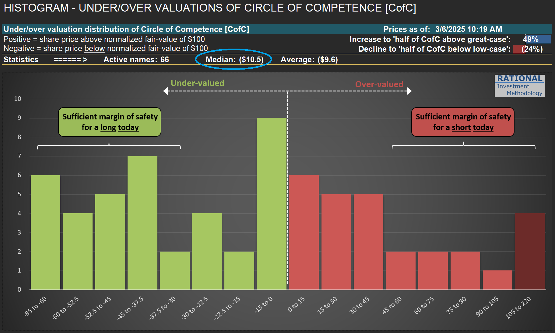
What I do day in and day out at RIM is to update and polish reference fair values for all the companies on my CofC (Circle of Competence). By normalizing these fair values to $100/share, I can build the histogram in the first picture below. So for “RIM’s market”, the average company is undervalued by ~10% (see figure circled in blue on the chart). But this is an average. Reality is much more complex - some companies are cheap while others are expensive. Hence, it is crucial to see the data in a histogram.
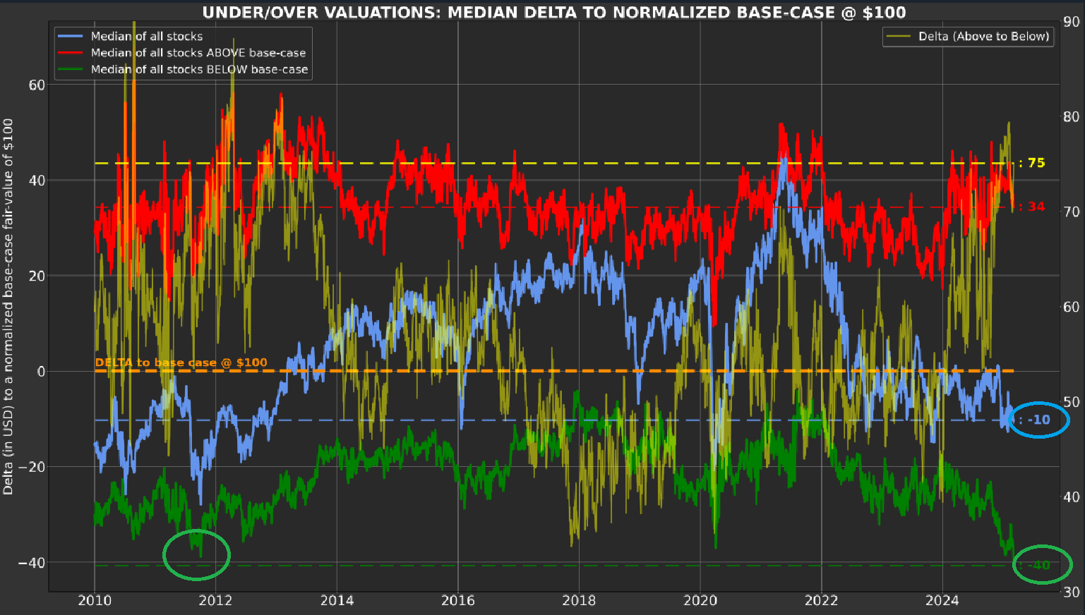
But we can do better (as long as you have a sophisticated tool like Odysseus - RIM’s portfolio construction, trading and reporting tool). Take a moment to review the second chart below. It shows the averages, over time, of all companies (in blue), the expensive ones (in red—they are also in red in the histogram), and the cheap ones (in green—they correspond to the ones also in green in the histogram).
I want to bring to your attention the green line—cheap companies are now undervalued by 40%! See the -40 figure circled on the right side of the chart. This is more extreme than what was observed in the summer of 2011 (period circled in green). Can it get worse (i.e., more undervalued)? Of course - the second chart starts in 2010 because I want to exclude 2009, as undervaluation at that period was almost surreal. But understand this - the US is in a full-blown recession for some industries. Look at the post I did for $BC (Brunswick) here and $HOG (Harley Davidson) here. Sales figures at these industries (per capita) are at 2009 levels. The same is true for anything discretionary, from mattresses to toasters.
So, are we in a recession? I won’t debate potential distortions to broad GDP figures—that define whether the country is in a recession or not—with its multiple adjustments, as macro-economics is not my specialty. However, the American consumer is definitely in a recessionary mood. That is why we have so many cheap stocks (and by an uncommon amount) - they are primarily in the consumer/housing segments.
Last, you can see that the red line on the second chart is still relatively high. That is because some industrial names, which have a delayed cycle compared to consumers, are only now showing a substantial correction in sales and margins. However, valuations in the sector will eventually reflect the harsh reality for some companies in this group.
So what should one do out of this long blog? I hope it will help by reminding you to discuss more precisely what it means to say “the market is expensive” (or cheap). I want you to think about distributions. Moreover, also to think about the possibility of someone really having an assessment for all the companies that are part of whatever market they are referring to. So next time someone tells you “I think the S&P500 will go up” (implying they think it is cheap), you can tongue-in-cheek say “Wow, I didn’t know you had 500 valuations!” Otherwise, any opinion is nothing more than a blind guess.

