Understanding Transportation Trends Through Cass Index Charts
I’m writing a Portfolio Action [PA] to RIM’s clients and referencing the chart below. I’m posting it here so my clients can see a more complete explanation of the Cass Transportation Indexes and—if on a computer—zoom in on the chart itself. As always, here is a disclaimer: the charts I share with you are for my professional use. I share them “as is” because I want you to know what I do daily. Therefore, they are not “presentation ready” charts. They are busy, with a lot of lines. However, they serve their purpose well: quickly displaying information (lots of it) to me. So take the time to analyze the charts I’m sharing with you, so you can absorb all the information they portray.
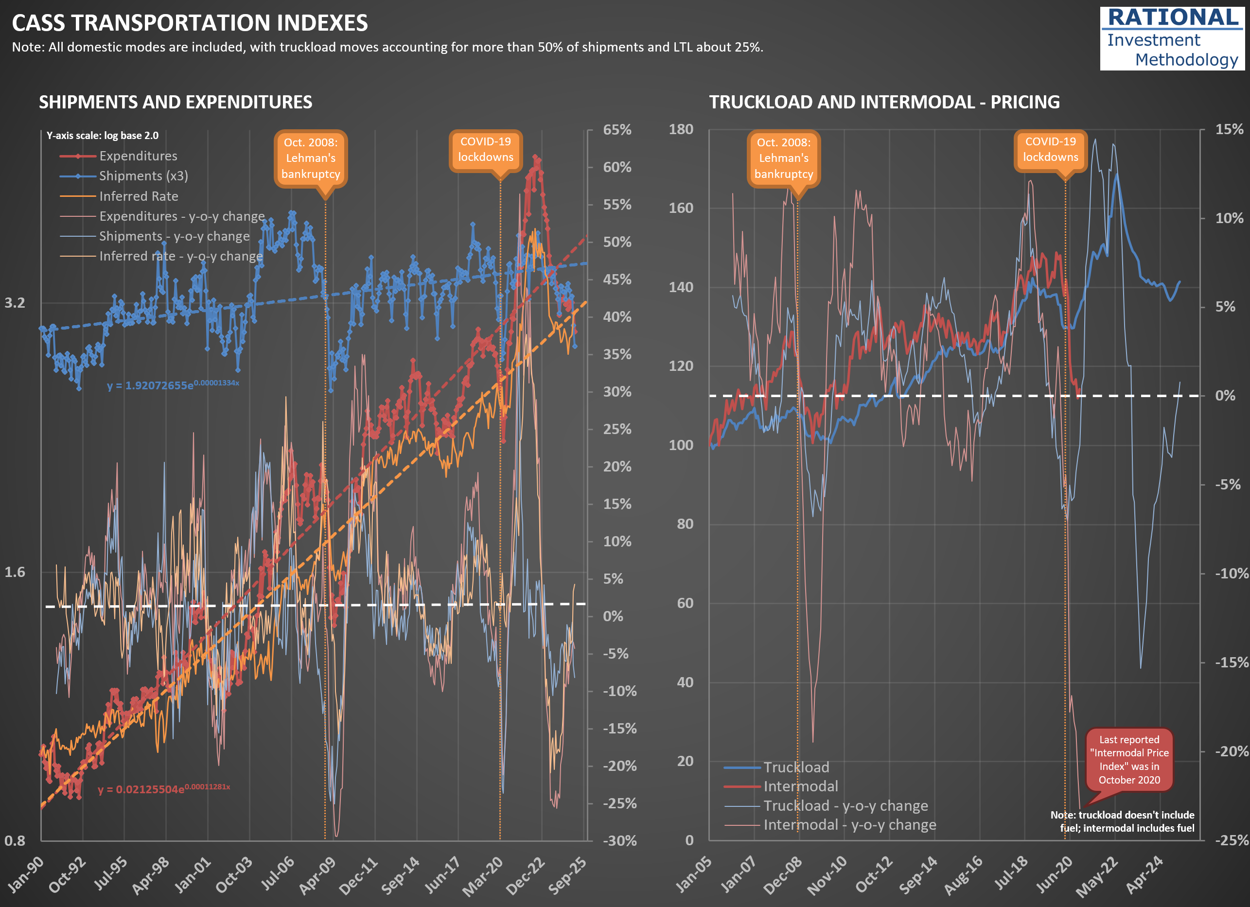
Let’s go to the charts themselves. On the left, the most crucial series are the shipments (dark blue) and expenses (dark red). The series covers all modes of domestic transportation, but truckload shipments account for more than 50% of the index. LTL (Less Than Truckload) is close to 25%. So, this is mostly a trucking-related index.
Note that “expenses” in this context means how much the user of trucking services paid trucking companies for their services. In other words, expenses equal revenue to trucking companies. Also note that these two series are on a log scale base 2. Why a log scale? Because the series is so old, you would be unable to see variations in the distant past (as older values - especially for the expense series - are much smaller than newer ones).
I also added to the charts a reference to two important events: the month Lehman Brothers went bankrupt, significantly exacerbating the economic downturn in 2008, and the lockdowns in March 2020. Also note that both series have a dashed line crossing them—they are exponential trendlines (which in a log scale appear as a straight line). They help gauge where we are in a cycle.
For instance, observe how much expenses were over its trendline during the pandemic, while shipments - albeit above the trendline - had a much smaller peak. This is because shippers were willing to pay a lot to secure transportation capacity due to the abnormal consumption triggered by excessive government stimulus. Observe how the light-orange line - showing a year-over-year [y-o-y] delta in the inferred rates charged - had its most significant spike ever during the pandemic.
Last, the light-red and light-blue lines show y-o-y changes in the shipments and expenses series. Note how both have been in negative territory for a while. In January 2025, they completed 24 months of continuous decline, the most prolonged period since the series started in 1990. A few crises got close, but none reached the 2-year mark. That is why trucking company CEOs say we are in a “freight recession.”
The chart on the right shows a couple of series trying to isolate prices for (i) truckload and (ii) intermodal. They will show cycles similar to those in the series on the left. However, Cass claimed they had difficulty measuring intermodal prices during the pandemic and interrupted the series' release. I hope one day they return to reporting it.
The Cass Transportation Indexes are a fantastic source of insights on the transportation industry. To complement it, I also like to see what the American Trucking Association [ATA] data tells us. You should check the post I made a few days ago using the ATA data (here).
