The Magnificent-7 and the Rest: What History Suggests for Investors
As some broad indexes (like the Nasdaq and S&P 500) approach all-time highs, I wanted to share a few thoughts on what’s driving these moves. We’re living through a highly unusual period, where a small group of companies have achieved extraordinary scale, profitability, and market valuations. I’m referring to the Magnificent-7 ($AAPL, $MSFT, $GOOGL, $AMZN, $NVDA, $META, and $TSLA), whose performance has had an outsized impact on the indexes mentioned above.
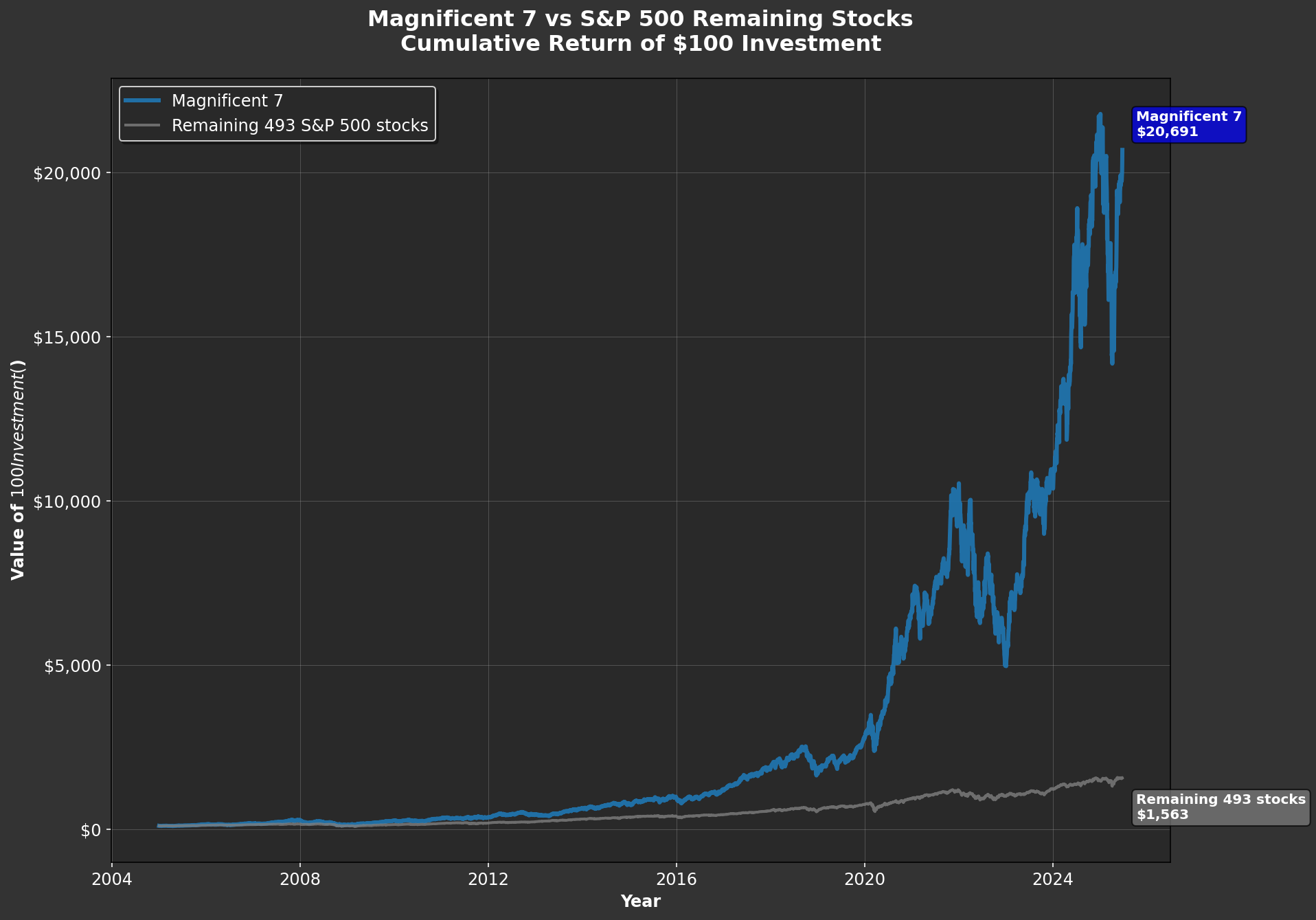
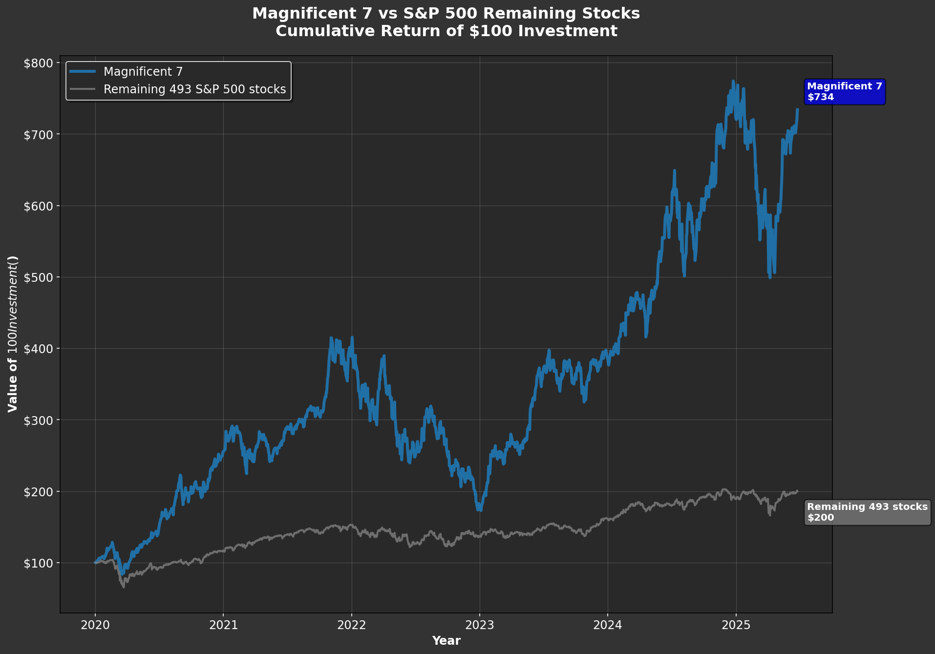
The first chart below highlights just how significant this has been: it shows the cumulative performance of the Magnificent-7 compared to the other 493 companies currently in the S&P 500(*). The gap is remarkable—since 2005, the Magnificent-7 have outperformed the rest by a factor of 13.7. It’s easy to forget how difficult it would have been to predict, twenty years ago, just how dominant these businesses would become. But what about more recently? Take a look at the second chart, which starts the clock in January 2020. Even over this shorter period, the Magnificent-7 outpaced the rest of the S&P 500 by 3.7 times—surpassing their outperformance during the entire prior 15 years (which was 3.6 times).
I’m not here to tell you whether these companies are overvalued—that’s outside my “Circle of Competence,” and I have no stake in whether their valuations are justified. However, I do worry about the potential consequences if their valuations were to come under pressure. The best parallel I can draw is with what happened after the Internet Bubble burst in 2000.
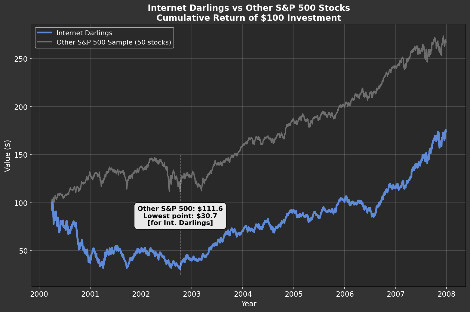
The third chart below compares two groups. In blue, the “Internet Darlings”: Amazon, eBay, Microsoft, Cisco Systems, Intel, Oracle, Apple, Qualcomm, Adobe, and Priceline (now Booking Holdings). These are all survivors—I’ve excluded any high-flyers that later imploded, which actually improves the group’s performance. The grey line represents 50 companies that could be considered “value names”—think Coca-Cola, Pepsi, Home Depot, Walmart, Pfizer, and so on. I’ve even included some companies in this group that were expensive at the time (as I discussed in a previous post here), so the comparison is not stacked in their favor.
The results are striking. Over the next two and a half years, the Internet Darlings declined by 70%. Meanwhile, holders of the more “mundane” companies saw their investments appreciate by 11%—not spectacular, but certainly preferable to being left with only 30% of your capital. Will history repeat itself? There’s no way to know for sure. Still, I find some comfort in knowing that my investments today are much more closely aligned with the kinds of companies represented by the gray line in the early 2000s.
(*) All calculations are performed using Python—let me know if you’d like a copy of the code. All figures include dividends.


