
Housing
Government Spending and Mortgage Rates: Understanding the Connection That Matters
One of the key variables for the housing market is the 30-year mortgage rate. It isn’t uncommon to see posts on social media about the movement of such a rate in a single day. However, rates like this need to be viewed over a much longer timeframe. Below is a chart showing key series over three decades. In green is the 30-year mortgage rate. Note how it maintains a particular spread from the 10-year Treasury note (in magenta). Also interesting is the blue line—the Fed Funds Rate—which shows a more step-like pattern as the Federal Reserve uses it to achieve its dual mandate of inflation control and employment.
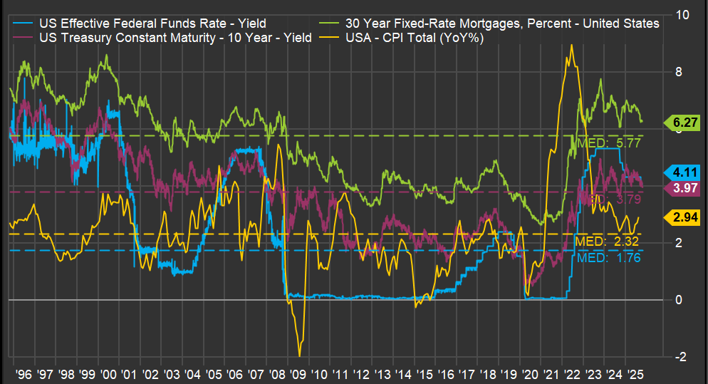
But the most critical line is the yellow one: inflation. A spike in inflation drove the jump in the 30-year mortgage rate, which had a profound impact on the existing home sales market, as I discussed in a previous post (here). But what caused such a sudden spike in inflation? The ferocious money-printing during the pandemic years.
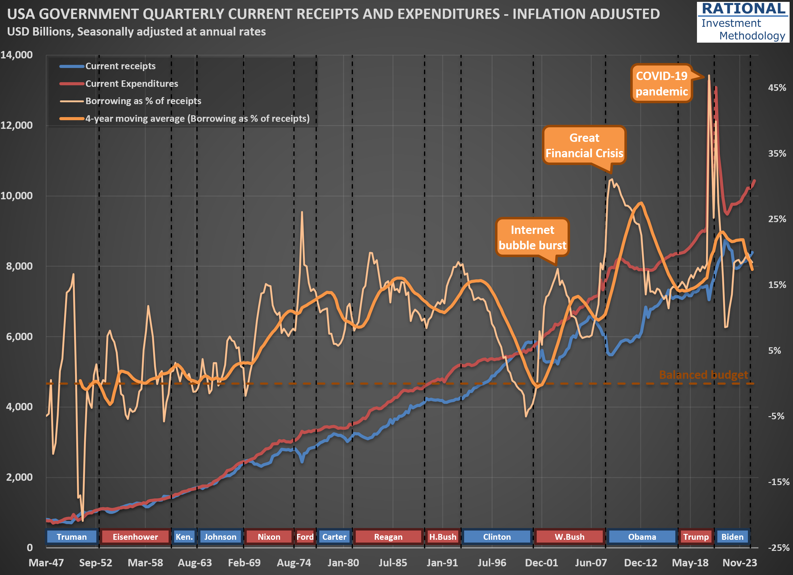
The question one needs to answer regarding the 30-year mortgage rate isn’t what it will do today, or even next year. The driver of all the lines you see in the first chart is how much the US government continues spending above its tax receipts. And the trend isn’t encouraging. The second chart shows (in orange) how much the US government has borrowed to cover its expenses, which include all transfers—think Social Security, Medicare, and Medicaid. Note how spending increases with each crisis, with a massive 47% ratio (meaning the government spent 47% above its income) during the acute phase of the COVID-19 pandemic.
What is particularly concerning is that, apart from the late years of the Clinton administration when receipts increased substantially due to the internet bubble, the US has largely ignored fiscal discipline since the 1970s. One might argue, “Well, the US can do it because its currency is the global reserve.” However, no government in history has managed to abuse the monetary system indefinitely. The question is not “if” but “when” we will see stress on government bond yields. When that happens, the housing market will suffer significantly, and we will likely embark on another recession led by the housing market—which, as I’ve shown, has been part of many US economic crises (see here).
So what should an investor do? Focus on companies that, over decades, have navigated crises and emerged fully operational on the other side. Not necessarily unscathed—it is common for a company’s earnings to suffer during a recession—but healthy enough to continue business as usual after the storm passes. That is what I work on every day (for the past 20 years), spending countless hours running company-specific analyses. It isn’t fun or easy, but it is necessary.
Forecasting $EXP Sales: How Home Starts and Industry Behavior Intersect
Sometimes clients wonder why I devote so much time to producing (and updating) a wide array of industry-wide analyses. For example, you’ve likely seen the posts I’ve published covering the housing (here) or transportation (here) sectors. The reason is simple: industry dynamics are typically the critical force shaping sales for any individual company.
Take today’s focus: $EXP (Eagle Materials), a leading U.S. producer of wallboard and cement, with additional operations in concrete and aggregates. See the first scatter plot.  It highlights the strong correlation between U.S. wallboard sales and new home starts (that is, newly constructed houses). While not all wallboard goes into new housing, this single variable explains nearly 90% of total sales, reflecting the interconnectedness of adjacent areas within the housing complex.
This is why understanding the cycles of new home starts in the U.S. is essential for accurately forecasting sales for Eagle Materials’ wallboard segment. From there, it’s a straightforward process to estimate $EXP’s market share and, with further analysis, explore the dynamics between capacity utilization and wallboard pricing—take a look at the second chart for a visual depiction. 
During the mid-2000s housing boom, capacity utilization at $EXP and its competitors reached very high levels (as did the price of wallboard). As the cycle turned and housing starts collapsed, utilization rates dropped—and prices followed. Then, something unusual happened: in the early 2010s, wallboard prices climbed sharply, even though the industry’s fundamentals seemed weak. For a while, my analysis questioned its relevance—until, almost a decade later, Eagle Materials (along with USG, the market leader) was fined tens of millions of dollars in a class action for price-fixing. In short, the major players had been colluding.
Looking ahead, pricing should remain relatively disciplined, especially with fewer homes expected to be built in the coming years (see my recent analysis on U.S. Census Bureau data and future new home starts - here). That said, if significant industry players resume collusive behavior, all bets are off—so I’ll be keeping a close eye on price developments in this segment.
Census Bureau’s 2023 Data Points to Weaker Household Growth—A Closer Look
I’ve incorporated the US Census Bureau’s 2023 National Population Projections (you can explore the full dataset here) into my estimates of new household formation in the US. Typically, these revisions are minor—but not this time. Back in February, I highlighted the shrinking cohort of young families when discussing challenges for Carter’s ($CRI) in this post. The new projections, however, point to a broader slowdown in household formation.
The chart below reflects these updates. First, you’ll notice a spike in “noise” around the 2022 figures (and a much smaller one in 2016). Although the data was published in 2023, the Census Bureau sometimes revises prior-year numbers—and I always use the most recent figures available, even for past years.
The key takeaway is that new household formation will grow much more slowly than it has over the past 25 years. That suggests future New Home Starts (green dots) may be lower than in recent decades. Even with subdued starts, any lingering home‐building deficit from the Global Financial Crisis will shrink significantly—so there won’t be a significant unmet demand waiting to be filled.
In my models, I’ve adjusted the normalized New Home Starts assumption from 1.5 million per year to 1.3 million per year. That change implies slightly lower long-term sales for housing‐related materials. While the valuation impact is modest—given how gradually this trend unfolds—it’s crucial to incorporate these shifting demographics when projecting decades‐ahead performance. I will also eagerly wait for data revisions given recent changes in immigration dynamics, as scenarios the US Census Bureau calls “low immigration” and “zero immigration” might become the new reality.

Housing Bubble 2.0: How the Lock-in Effect Is Shaping an Unprecedented Market Divergence
The housing market in the United States presents a fascinating case study of how interest rate policy can create significant distortions in asset prices. The chart below reveals a telling story about our current housing market.
The US Census Bureau/HUD Median Sales Price lines for houses (represented by the red lines - the darker ones for new homes; the light pink for all houses) have recently begun reverting toward the green DPI/capita reference line. This indicates that new home prices are returning to historically normal levels relative to disposable personal income. However, simultaneously, the Case-Shiller and FHFA Purchase-Only indices (blue and orange lines, respectively) remain significantly elevated compared to historical norms.
What explains this divergence? The answer lies in the dramatic difference in transaction volume and pricing dynamics between new homes and existing homes. The primary driver of this market distortion is what economists call the “lock-in effect.” As of early 2025, 82.8% of homeowners with mortgages still have an interest rate below 6%. Many of these homeowners refinanced during 2020-2021 when rates hit historic lows, securing fixed-rate mortgages often below 3%.
With current mortgage rates hovering near 7%, these homeowners face a powerful disincentive to sell. Consider the math: trading a 2.75% mortgage for a new one at 7.00% often means paying significantly more each month for a comparable or even smaller living space. Even if a homeowner could pocket some equity in such a transaction (if downsizing), the prospect of a substantially higher monthly payment creates a psychological and financial barrier few are willing to cross.
This lock-in effect has had profound implications: Existing home sales in 2024 dropped to levels last seen in 1995. New home prices are touching the DPI/capita reference line because builders must price their products at levels the market can bear-they have no choice but to adjust to current affordability metrics. Meanwhile, the relatively few existing homes that do come to market in mature neighborhoods command premium prices due to their scarcity.
Despite the powerful lock-in effect, there are forces that will eventually bring existing home prices back toward the DPI/capita line. These are what I call the “four Ds”:
- Death: Estate settlements often necessitate home sales regardless of interest rate considerations
- Divorce: Marital dissolution frequently requires liquidating shared assets
- Displacement: Job relocations or other major life changes that force moves
- Debt: Financial hardship that makes maintaining mortgage payments untenable
We’re already seeing early evidence that these forces are gradually eroding the lock-in effect. As of early 2025, the percentage of homeowners with mortgage rates at or above 6% has increased to 17.2%, up nearly five percentage points from 12.3% in the third quarter of 2023. The price adjustment process is taking its time to play out. I will later post another chart showing the difference in price deflation now vs. the bubble in the mid-2000s.

Why Existing Home Sales Are Stuck at 1995 Levels
I’ve just updated my charts with the latest US housing price data. I’m sharing one here that highlights some key trends—see the first chart below. As usual, there are plenty of lines, but let’s focus on a few important ones. The solid black line represents the National Case-Shiller index. You’ll also notice other indices in color, tracking New York, Las Vegas, Miami, and Los Angeles.
Pay particular attention to the purple line, which shows disposable personal income (DPI) per capita. Since home purchases ultimately depend on what’s left after covering essentials, this is a crucial metric. The gap between the Case-Shiller index and DPI per capita is shown by the dashed black line. This makes the mid-2000s housing bubble and the pandemic peak stand out clearly. Currently, the delta between house prices and DPI/capita sits at 27%—a significant spread.
Now, take a look at the second chart. On the left, you’ll see two key figures: new home starts (in red) and existing home sales (in green). What stands out is how low existing home sales are. In 2024, the number of homes sold in the US dropped to levels last seen in 1995.
What’s driving this? It’s a combination of (i) high home prices—in most, though not all, regions—and (ii) mortgage rates that have returned to more typical levels. Together, these factors make it tough for first-time buyers, such as new couples, to enter the market. At the same time, many current homeowners are “locked in” to their low-rate mortgages. For example, trading a 2.75% mortgage for a new one at 7.00% often means paying more each month for a smaller place. Even if you pocket the difference in home values, the prospect of a higher payment for less space is a tough psychological hurdle. As a result, supply remains tight and market activity is subdued.
If tariff issues persist and inflation picks up—pushing mortgage rates even higher—we could see this slow pace in existing home sales drag on. That would be a headwind for the broader economy.


Housing Starts: The COVID-19 Blip and What Comes Next
As I work on valuations for $HD (Home Depot) and $LOW (Lowe’s), I regularly update my broader analysis of the housing sector. While I have a wealth of charts on this topic, including all of them in one post would make it far too lengthy. For now, I’ll share just a couple of key charts—more will follow in future posts.
The first chart below is one of the earliest I created on this subject, dating back nearly 20 years. It tracks U.S. housing starts at an annualized rate, calculated by multiplying monthly figures by 12. Housing starts in the United States exhibit significant seasonal variation, particularly in regions with harsh winters. To smooth this out, the red line represents a 1-year moving average.
Take a moment to review the annotations on the chart—they highlight major economic events over time. Notably, every significant economic crisis in the U.S., with the possible exception of the 2001-2002 recession, has either originated in or been closely tied to the housing sector. The most recent event marked is what I call the “COVID-19 blip,” when zero interest rates and aggressive stimulus measures triggered a surge in new home construction.
The second chart illustrates one of the unintended consequences of this “blip.” The blue line represents housing starts minus completions, while the red line shows a 12-month cumulative total (scale on the left). What stands out is that we’ve just come through a period where more houses were being completed than started.
In 2024 alone, approximately 250,000 more homes were completed than initiated. This mismatch has had ripple effects across numerous companies tied to RIM’s CofC (Circle of Competence), particularly those in the building materials sector, which have reported weak or declining sales as a result.
Here’s where it gets interesting: as discussions about a potential recession heat up, this particular drag on the economy is nearing its end. By April 2025 (yes, tomorrow!), the blue line is expected to turn positive again. This shift will remove one of the most significant headwinds for the economy, given housing’s outsized influence on overall economic activity. To be clear, this doesn’t mean we’re on the cusp of another housing boom—but it does suggest that the lingering effects of the “COVID-19 blip” will finally fade.
That said, history suggests that boom-bust cycles in housing are far from over. So, while this particular drag may be dissipating, don’t get too comfortable assuming stability in this sector—it’s always full of surprises.


Benjamin Graham's Wisdom Applied: Why I Differ on $HD
I just finished updating my analysis on $HD (Home Depot), and the outlook for 2025 suggests it will mark the fourth consecutive year of declining sales per square foot, adjusted for inflation. The last comparable period of sustained decline was between 2006 and 2009. You can see this trend clearly in the chart below—focus on the red data series with dots.
This decline reflects the normalization following the post-pandemic boom. During that period, extremely low interest rates, substantial stimulus measures, and increased time spent at home drove a surge in sales for Home Depot and $LOW (Lowe’s). Even factoring in the additional $20 per square foot from Home Depot’s acquisition of HD Supply, my analysis assumes average sales will remain about $70 higher than pre-pandemic levels (see calculations below the first chart). I also assume (not shown in the charts) that the company will maintain healthy margins. I.e., if anything, I’m being aggressive in my forecasts.
Despite this relatively optimistic assumption regarding future sales and margins, current share prices for HD suggest that long-term investors may achieve modest returns. Based on my base-case scenario, the future IRR (Internal Rate of Return) is projected to be approximately 7% per year. For context, you can read my earlier post on understanding implicit IRRs here.
The second chart below illustrates implicit IRRs for HD at 20 different year-end points. As expected, higher share prices correspond to lower IRRs—this is simply math. If your base-case scenario is well-calibrated, any given share price implies a specific IRR for long-term owners. Historically, the best time to buy HD (and LOW) shares was in 2009, when the implied IRR reached 20.5%. For perspective, this offered a real return (assuming an annual inflation rate of 2.5%) equivalent to multiplying your investment by five over a decade. I presented this analysis at a Value Investing Event in Trani, Italy, although few attendees were enthusiastic about these ideas at the time.
Today’s elevated prices prompt me to recall Benjamin Graham’s timeless advice from The Intelligent Investor, written in 1949: “If you have formed a conclusion from the facts and if you know your judgement is sound, act on it – even though others may hesitate or differ.” In contrast to many analysts nowadays, I believe $HD and $LOW are not attractive investments at current valuations. If sales continue to decline or fail to rebound meaningfully, perhaps the market will eventually acknowledge that these prices imply lower-than-deserved returns for holding these assets.

