
CofC: Industrials - Capital Goods
$FLS Share Price Surge: Nuclear Hype Meets AI Mania
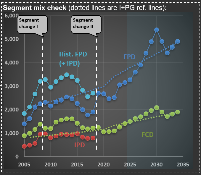
This past week, $FLS (Flowserve Corporation) released earnings that clearly illustrate how the AI race and associated mania can spill over into even traditional companies, particularly in the industrial sector. Flowserve is a classic industrial company that sells technical equipment to its corporate clients. It specializes in precision-engineered equipment that manages the movement, control, and protection of industrial fluids and gases in critical infrastructure applications. The company operates through two primary business segments: the Flowserve Pumps Division (FPD), which focuses on highly custom-engineered pumps, and the Flow Control Division (FCD), which designs, manufactures, and services industrial valves.
The first chart shows sales over the two main segments. But you can also see a line that ends abruptly—that is their IPD (Industrial Products Segment; the red dotted line in the chart), which was merged into FPD. It isn’t uncommon for companies to change segments—Flowserve did so twice in the past 20 years. I find it challenging when this happens, as it makes it harder to track the progression of sales and margins over the years.
A case in point is what happened when they released their earnings for 3Q 2025. Shares jumped more than 30%. This is more than three times what was observed during earnings releases when the company surprised the market positively over the past decade. The reason: the focus on nuclear energy. At the end of the post, you see the cover of their earnings release presentation—that is a nuclear power plant.
The word “nuclear” was mentioned 25 times in its earnings presentation and 59 times during the conference call transcript. And the market was excited with phrases like “we believe that nuclear flow control opportunity set could be $10-billion-plus over the next decade,” pushing share prices up abnormally. Now, do you know how much nuclear-related sales Flowserve has? They sold $160 million in pumps and valves in 2024, somewhat related to nuclear facilities. This is 3.5% of their sales (of $4.6 billion). So, do you think that a company that isn’t relevant in the nuclear space should increase in value by more than 30% because they mentioned the word “nuclear” in their earnings release?
Because of AI’s high electricity consumption, there is widespread speculation that countries like the US will reignite their nuclear power programs. First, a long-term renewed interest in nuclear energy is already a speculative assumption. Second, nuclear facilities construction takes years (usually measured in decades) to complete. And even if it does happen, the chances of Flowserve meaningfully participating are small.
The mere mention of a word in a release leading to significant share price appreciation reminds me of 1999, when companies were adding “.com” to their names and instantly increasing in value. What happened with Flowserve might be something similar. A company that only tangentially touches the nuclear space increased its valuation by disproportionately associating itself with this field. This is what a mania looks like.

$FLS and the New Oil Order: Why Middle East Turmoil Might Have a Smaller Impact Than Before
As part of my ongoing analysis of $FLS (Flowserve Corporation), a global leader in the design, manufacture, and service of flow control systems—including pumps, valves, seals, automation, and related services for the oil and gas, chemical, power, and water industries—it’s essential to understand the broader energy market context in which the company operates.
The first chart compares the price of oil in both nominal terms (blue line) and inflation-adjusted terms (red line). A striking feature of the chart is the dramatic spike in oil prices during mid-2008, when the inflation-adjusted price of oil exceeded $220 per barrel. In contrast, current oil prices are significantly lower, both in nominal and real terms, highlighting how much less expensive oil is today compared to that historic peak.
Turning to the second chart, we see the evolution of land and offshore rig counts in North America. Historically, geopolitical tensions in the Middle East have had a pronounced impact on the US economy, mainly due to the country’s reliance on imported oil. However, the shale revolution has fundamentally altered this dynamic. The 2000s saw a substantial increase in the number of rigs operating in the US, coinciding with significant advancements in hydraulic fracturing (fracking) technology. This surge in domestic production has reduced the US economy’s vulnerability to external oil shocks and has been a key driver of energy independence.
Interestingly, the most recent spike in oil prices did not result in a proportional increase in rig count, as seen in previous cycles. This could suggest several things:
- Higher Break-Even Prices: Many fracking wells now require higher oil prices to be economically viable, as the most accessible reserves were tapped during the initial fracking boom.
- Productive Well Inventory: A substantial inventory of productive wells may still exist, reducing the immediate need for new drilling activity.
- Industry Caution: Operators may be exercising greater capital discipline, focusing on maximizing returns from existing assets rather than aggressively expanding capacity.
For Flowserve, these dynamics are highly relevant. The company’s growth prospects are impacted by capital spending cycles in the oil and gas sector, which are influenced by both oil prices and geopolitical stability. While current Middle East tensions have injected fresh volatility into the market, the structural resilience provided by U.S. shale production and a more cautious approach to new drilling may temper the impact on equipment demand in the near term.


$PCAR Update: Where Are We in the Heavy Truck Market Cycle?
I’ve just finished updating my analysis on $PCAR (Paccar), a leading heavy truck manufacturer in the US. Much like my earlier post on Volvo trucks (here), $PCAR’s performance tends to mirror broader economic cycles.
Take a look at the chart below:
The red line tracks monthly retail sales of heavy-weight trucks (in thousands of units, left axis). Because monthly figures can be quite volatile, I also include a rolling 12-month (LTM) sales figure—shown as the blue dashed line on the right axis (annualized, in thousands)—to help clarify the underlying cycle.
The green line represents PACCAR’s own industry data (also right axis). This closely follows the LTM sales trend, though there’s some divergence since PACCAR uses a slightly narrower market definition. Still, the correlation between the LTM data and PACCAR’s data is an impressive 97%, underscoring how similarly they reflect industry cycles.
Where does that leave us in the current cycle? The purple dashed line shows the units per capita index (left axis), which adjusts for population growth and offers a normalized view of demand over time. I’ve also marked the median value of this index on the chart, providing a useful benchmark to gauge whether current sales are running above or below historical norms.
At present, we’re in the second year of a downturn that began in late 2023. The pandemic era saw trucking companies enjoy strong profits, which led to a mini-boom in truck sales. Now, as we wait for 2Q 2025 earnings (due out in July), it will be interesting to see how the latest round of tariffs impacts the industry. Stay tuned.

How Policy Shapes Tractor Sales: Insights from $DE (Deere)
As Congress debates a new bill that includes stimulus measures for farmers, I thought it would be timely to share a chart from my recent analysis of $DE (Deere). The chart breaks down tractor sales into four distinct categories. To better understand industry dynamics, I’ve converted all units into a “Compact” equivalent index (referring to 40-100 HP machines).
What stands out in the chart is the significant impact government policies can have on this industry—sometimes even distorting sector activity. Notice the sharp rise in tractor sales in the early 2000s, coinciding with the introduction of the “ethanol mandate.” Back in the late 1990s, less than 5% of the corn crop was used for ethanol production (a very inefficient process, when compared with ethanol produced with sugarcane). By 2015, that figure had climbed to nearly 40%. This shift contributed to a substantial bubble in agricultural commodities during that period.
More recently, you’ll see another notable spike in sales, which is only now beginning to subside. Among the broad pandemic-era stimulus efforts was a direct cash payment to farmers. Ironically, agricultural activity—which doesn’t require close contact—was not significantly disrupted. Yet, the result was another artificial boost in tractor sales, disproportionately benefiting companies like $DE.
Let’s see what new distortions might emerge as the agricultural lobby weighs in on the current bill.

Railcar Manufacturing: Why 2025 Forecasts Are Pointing Down
It always amazes me how volatile railcar manufacturing in the US can be. The chart below tracks railcar deliveries (blue line), with additional lines representing moving averages and cumulative deliveries over different periods. This data is from my ongoing analysis of $TRN (Trinity Industries), which manufactures, leases, and manages freight and tank railcars for sectors like agriculture, energy, construction, and consumer products.
If you look at the chart, you’ll notice that the first forecast year (2025) shows a substantial decline compared to 2024. This drop is based on the midpoint of TRN management’s guidance for 28,000 to 33,000 deliveries in 2025-a figure released on May 1, 2025, after recent tariff changes had already taken effect. For context, just a few weeks earlier-in February-Greenbrier (TRN’s main competitor) projected 38,000 industry-wide deliveries for the year.
So, why the nearly 20% drop in expected units? TRN’s management addressed this on their last conference call:
“Market uncertainty in the first quarter continued to slow conversion of inquiries to orders… Inquiry levels at the beginning of 2025 were the highest they’ve been in several years. But customers are taking longer to make capital decisions… We delivered 3,060 new railcars in the quarter and received orders for 695 railcars, evidence of the delayed investment decisions I have previously acknowledged and the lumpiness of orders quarter-to-quarter.”
This is a familiar pattern: when policymakers make abrupt changes to the rules, companies often pause before making new investments. Most CEOs and decision makers prefer to wait for clarity before committing to capital expenditures. Consumers can behave similarly. I expect to post more evidence here in the future about the noise created by the recent economic shifts we’re seeing in the US. Some of these changes may prove beneficial over time, but the probability of a short-term slowdown has clearly increased.

Watching $WAB: Rail Metrics and the Ripple Effects of Tariff Policy
I’m finishing up my update on $WAB (WabTec). The company operates in two main segments: Freight-which provides locomotives, components, and digital solutions for freight railroads-and Transit, which supplies components and services for passenger transit systems. Its core products include diesel-electric locomotives, braking systems, doors, electronics, and aftermarket rail parts. $WAB serves railroads and transit agencies worldwide.
The chart below highlights three key drivers for their long-term sales:
Blue line: Public transit rides per person (unlinked trips per person, monthly). Notice that this metric still hasn’t returned to pre-pandemic levels.
Red line: Freight carloads per 1,000 people (including intermodal). The ongoing decline in coal usage has had a pronounced impact on this trend.
Green line: Intermodal-only ton-miles per 1,000 people. Much of the prior growth here reflected a shift in the type of cars used-intermodal is heavily tied to international trade.
Of these, I’ll be watching the green line most closely. It should provide a clear read on how the evolving tariff landscape is affecting rail volumes. Updating these charts is always a useful exercise, even if the monthly data arrives at a glacial pace compared to the rapid moves we see in the stock market. It’s a good reminder that the real economy moves much more slowly than prices or headlines suggest.

Gauging the Downturn: Volvo, $SAIA, $ODFL, $PCAR, and the State of US Trucking
I’ve just finished updating my analysis for Volvo (the truck manufacturer-not the car company). While Volvo isn’t American (most RIM companies are US-based, with only two exceptions), I follow it closely because it owns Mack, one of the leading truck brands in the US.
Take a look at the chart below, which shows truck deliveries across Volvo’s major regions. The first thing to note is the industry’s cyclical nature-transportation companies tend to move as a herd when it comes to ordering more (or fewer) trucks. You’ll see that we’ve been in a downturn recently (just before the vertical dotted white line). But here’s what Volvo’s CEO said during the latest conference call, just a few days ago:
“…the increased hesitation among customers in North America to place orders given uncertainty in general. We are, therefore, as we speak, adjusting production levels for group trucks North America to minimize the under-absorption in production going forward.”
In other words, the recent shake-up in economic and market conditions has made Volvo’s customers more cautious. It doesn’t help that today, shares of $SAIA (a major LTL* operator in the US and competitor to $ODFL, which is part of RIM’s CofC**) dropped more than 30% after missing earnings estimates by a wide margin.
I’ll be watching Volvo’s truck deliveries closely-they’ll provide a useful signal for how deep this current downturn might get. This will also help me calibrate my ongoing analysis of $PCAR, another major player in the US and European truck manufacturing market.
(*) LTL = Less Than Truckload (**) CofC = Circle of Competence

Farm Cash Flow: The Hidden Driver of Agricultural Equipment Sales
As I delve into my $AGCO [AGCO Corporation] analysis today, I’m reminded of the fascinating relationship between farm economics and agricultural equipment sales. The agricultural sector’s financial health, particularly U.S. farm cash receipts (or net cash income), has historically been a key indicator of agricultural capital expenditures.
Take a moment to examine the first chart below. It beautifully illustrates the strong correlation between tractor sales and cash receipts, highlighting the direct impact of farm profitability on equipment purchases.
Even more intriguing is how we can use U.S. farm cash receipts as a proxy for global trends. Despite AGCO and other agricultural equipment companies operating on a global scale, the interconnected nature of agricultural commodity markets allows for this simplification. The second chart demonstrates this phenomenon, showing remarkably similar sales dynamics between U.S. and non-U.S. regions.
In my forecasting work, which includes $DE [Deere & Co.], I’ve found the USDA’s projections of U.S. farm cash receipts to be invaluable for predicting long-term revenue trends in the agricultural equipment sector. This approach has consistently yielded accurate results, providing a solid foundation for investment decisions.


Market Prices vs. Fair Value: Why Today’s Quote Isn’t the Full Story
When assessing a company’s long-term value, certain metrics can be misleading—and today’s share price often tops the list. Take $GNRC [Generac] as an example. Since its IPO, short-term earnings estimates (red lines in the first chart below) have closely tracked its share price (blue line). While markets are “correct” on average over time, valuations at any given moment frequently stray far from rational estimates of fair value.
The second chart, from Odysseus (RIM’s portfolio management tool), highlights this disconnect. The blue line shows the market price deviation from RIM’s fair value calculation. At $500/share in late 2021, Generac traded at a staggering 300% premium to its intrinsic value—a vivid reminder that asking “what is the market telling me?” can lead to flawed conclusions.
Key Takeaways:
- Extreme price deviations are common, driven by short-term sentiment rather than long-term fundamentals.
- Systematic strategies thrive on these dislocations, using disciplined triggers to enter long/short positions.
- RIM’s approach focuses on exploiting these gaps rationally, avoiding emotional reactions to market noise.
By anchoring decisions to intrinsic value—not fleeting price swings—investors can turn volatility into opportunity.


Stanley Black & Decker: Sales Slump and Margin Collapse in the Post-Stimulus Reality
The first picture below shows sales for $SWK (Stanley Black & Decker) - see how it is now below the mid-trendline (which includes the impact from inflation + population growth). The second picture shows margins - it is amazing how strongly impacted their margins were when it became clear that management misinterpreted the excessive stimulus of 2020/2021.


Stanley Black & Decker's Balance Sheet Battle: Unwinding Pandemic-Era Inventory Excesses
I’m working on $SWK [Stanley Black & Decker] today. It is incredible to see what the pandemic did to key lines of companies' balance sheets. The chart shows a massive drop in “inventory turns” (red line) in 2021, meaning that the company overproduced (and ordered excessively from manufacturing partners) tools and whatever it sold. They are bringing inventory to more normal levels, but it will be a multi-year exercise. Accounts Payable (blue line) are close to normal levels but look at the massive peak during the pandemic.
