
Macro - economy - population - trends
CHIPS Act, Data Centers, and the Shape of Policy-Driven Construction Booms
In July of last year, I did a post on construction spending in the USA due to an abnormal spike in manufacturing (here). I thought it would be interesting to complement that analysis now that I’ve added another layer of data.
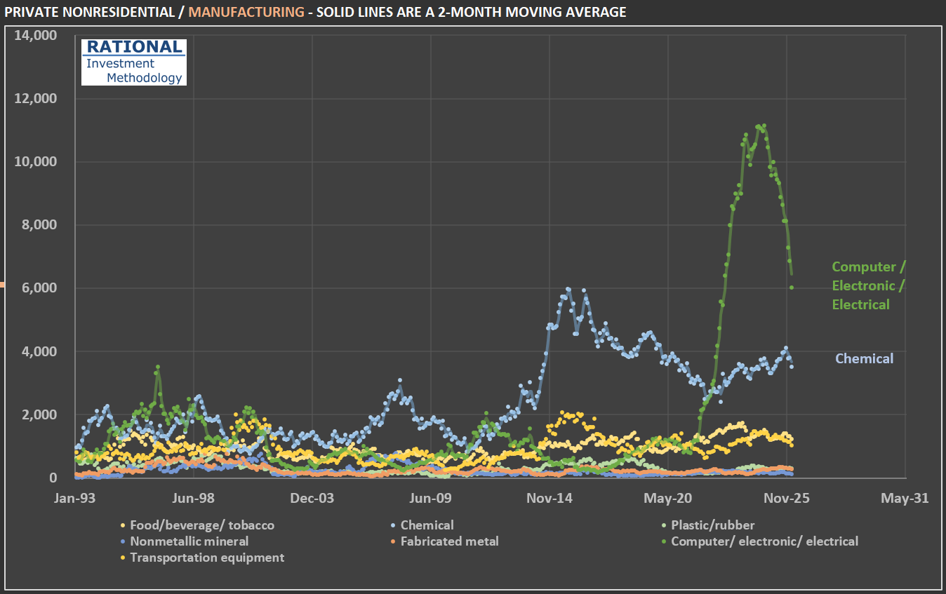
The figure that caught my attention at the time was the spike in construction related to Manufacturing. The first chart shows a further split of this category. Note that the recent spike was mostly in the Computer / electronic / electrical sub-segment. Why is it so concentrated in this segment? And why was there such rapid growth followed by a steep decline?
The shape you see — a near-vertical spike followed by a rapid pullback — is the signature of a massive, concentrated, policy-driven investment wave: billions in subsidies triggered hundreds of billions in commitments, construction broke ground on dozens of mega-projects nearly simultaneously, and then spending naturally rolled off as the largest projects progressed beyond the heavy-construction phase, compounded by political uncertainty around future subsidies. In other words, this is the shape of the CHIPS Act incentives, ironically directed at an industry that is making billions in abnormal profits due to the AI boom.
Also notice the (older) spike in Chemical investments. After the shale gas revolution - in the mid-2010s - made US ethane reliably cheaper than oil-based feedstocks used in Asia and Europe, chemical makers embarked on the largest building boom in the industry’s history. Cheap natural gas serves both as fuel (for heat-intensive processes like cracking) and as feedstock (ethane → ethylene → polyethylene and other derivatives). The industry rule of thumb is that when the ratio of international oil prices to local natural gas prices exceeds about 10, ethane-based chemical producers enjoy a significant cost advantage — and that ratio surged above 40 by 2012 and stayed above 20 for much of the decade.
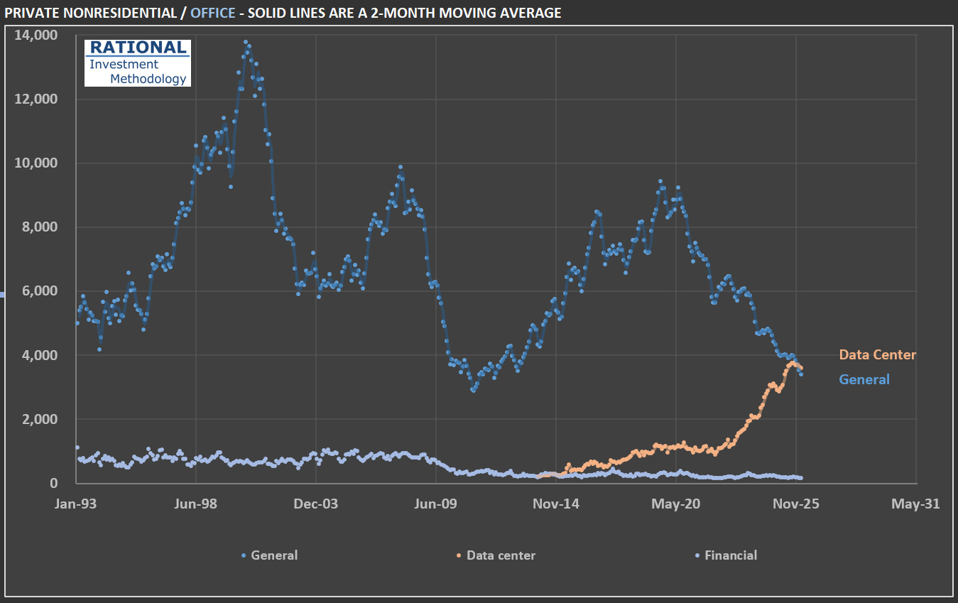
However, the most interesting data from the additional breakdown is in the office segment. Office spending, given the impact from the “work from home” phenomenon, appeared suspiciously stable. Therefore, I also split this segment. Notice on the second chart that core office investments (labeled “General” in the chart) have in fact collapsed. However, “Data centers,” which have historically been categorized alongside office construction, have increased dramatically due to the AI boom. Time will tell if there was an overinvestment in this asset class. History is full of examples of overinvestment in new technologies — not because they were useless; it is quite the contrary. Precisely because they are economy-changing events (think railroads and the internet) that overinvestment followed.
Last, note that construction-related investment in Data centers pales in comparison to overall construction spending. The USA invests close to $185 billion a month in construction. Data centers, even at this new historical peak, represent slightly above 2% of the total. In other words, the money spent on Data centers is in the computers inside them, not the buildings themselves. But that doesn’t prevent CEOs of companies that sell aggregates, for instance, from mentioning data centers multiple times in their earnings calls!
PS: all figures are adjusted for (i) inflation and (ii) population. The inflation adjustment is by far the biggest. But adjusting for population also gives a better idea of construction activity “as if the country has had the same population”. In series that spans for such a long time (more than 30 years in this case), it also makes a difference.
Government Spending and Mortgage Rates: Understanding the Connection That Matters
One of the key variables for the housing market is the 30-year mortgage rate. It isn’t uncommon to see posts on social media about the movement of such a rate in a single day. However, rates like this need to be viewed over a much longer timeframe. Below is a chart showing key series over three decades. In green is the 30-year mortgage rate. Note how it maintains a particular spread from the 10-year Treasury note (in magenta). Also interesting is the blue line—the Fed Funds Rate—which shows a more step-like pattern as the Federal Reserve uses it to achieve its dual mandate of inflation control and employment.
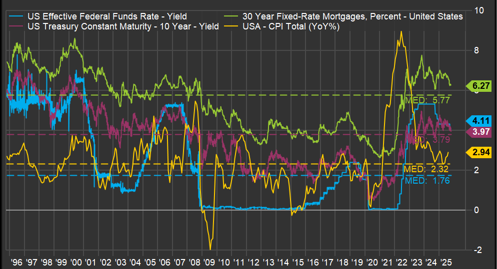
But the most critical line is the yellow one: inflation. A spike in inflation drove the jump in the 30-year mortgage rate, which had a profound impact on the existing home sales market, as I discussed in a previous post (here). But what caused such a sudden spike in inflation? The ferocious money-printing during the pandemic years.
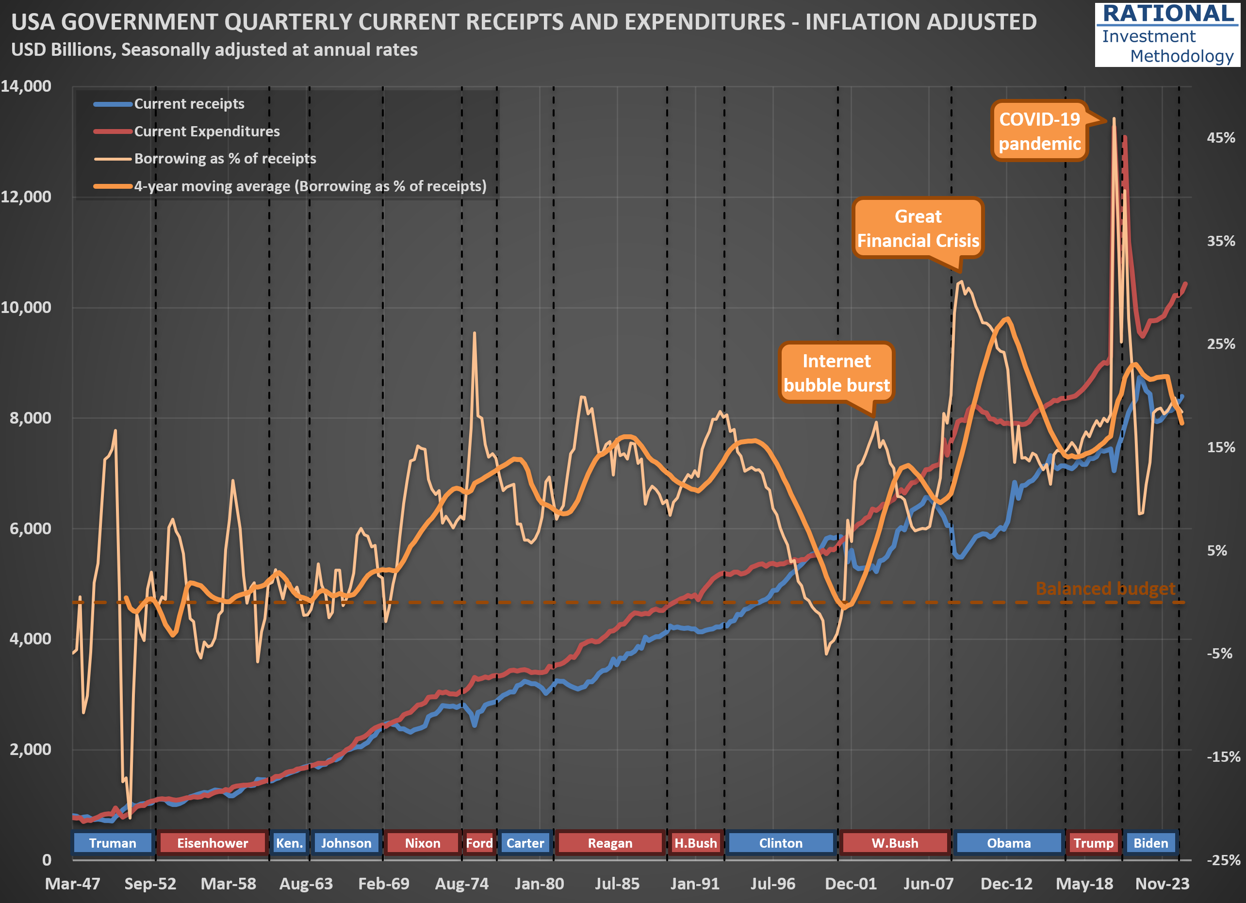
The question one needs to answer regarding the 30-year mortgage rate isn’t what it will do today, or even next year. The driver of all the lines you see in the first chart is how much the US government continues spending above its tax receipts. And the trend isn’t encouraging. The second chart shows (in orange) how much the US government has borrowed to cover its expenses, which include all transfers—think Social Security, Medicare, and Medicaid. Note how spending increases with each crisis, with a massive 47% ratio (meaning the government spent 47% above its income) during the acute phase of the COVID-19 pandemic.
What is particularly concerning is that, apart from the late years of the Clinton administration when receipts increased substantially due to the internet bubble, the US has largely ignored fiscal discipline since the 1970s. One might argue, “Well, the US can do it because its currency is the global reserve.” However, no government in history has managed to abuse the monetary system indefinitely. The question is not “if” but “when” we will see stress on government bond yields. When that happens, the housing market will suffer significantly, and we will likely embark on another recession led by the housing market—which, as I’ve shown, has been part of many US economic crises (see here).
So what should an investor do? Focus on companies that, over decades, have navigated crises and emerged fully operational on the other side. Not necessarily unscathed—it is common for a company’s earnings to suffer during a recession—but healthy enough to continue business as usual after the storm passes. That is what I work on every day (for the past 20 years), spending countless hours running company-specific analyses. It isn’t fun or easy, but it is necessary.
When “Hedges” Hurt: Lessons from $GLD and $SLV Cycles
Clients, friends, and anyone who knows I work with investments often ask for a view on the price of gold. The answer is consistent: not much, because gold prices sit outside my circle of competence. To have a view on any commodity, it is essential to know who the suppliers are, how much they can produce, and at what cost—in other words, to build a cost curve for the commodity in question. Without that information, any allocation to such a commodity could be too speculative, even if the true intention is to provide a hedge against inflation or as a diversification within a broader portfolio.
However, a long-term perspective on how gold prices (and their often-mentioned companion, silver) behaved—particularly during the U.S. inflation run-up in the 1970s and 1980s—can still be useful; look at the chart, which shows gold (dark blue), gold adjusted for inflation (light blue), silver (dark green), and silver adjusted for inflation (light green).
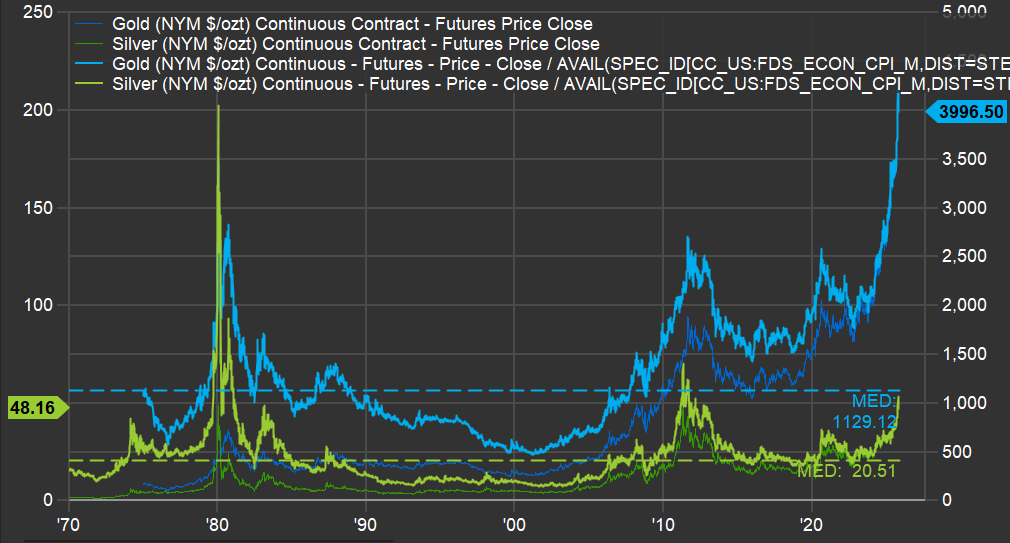
First, on gold: when inflation was rampant in the late 1970s, gold, in today’s dollars, reached roughly $2,800 per ounce; today’s level sits about 43% above that prior peak. However, that peak was 45 years ago, implying a real return close to 1% per year since then. What followed should give current gold holders pause: prices declined for roughly 20 years, reaching around $500 per ounce in the early 2000s—an 82% drawdown, leaving about 18% of the original investment two decades later.
Silver is even more extreme. It is around $50 per ounce today, after having surpassed $200 per ounce (in today’s dollars) in 1980; by the 2000s, it traded near $8 per ounce—a roughly 96% decline from that earlier level. Imagine looking at an “inflation hedge” bucket and finding only 4% of it remained.
That’s as far as this analysis goes for these two precious metals: invest with care, recognizing that prices can always rise, but extended speculative phases can produce negative returns for decades. In silver’s case, the closest it came to its 1980 record was about $60 per ounce in the early 2010s—still roughly 70% below the peak.
Census Bureau’s 2023 Data Points to Weaker Household Growth—A Closer Look
I’ve incorporated the US Census Bureau’s 2023 National Population Projections (you can explore the full dataset here) into my estimates of new household formation in the US. Typically, these revisions are minor—but not this time. Back in February, I highlighted the shrinking cohort of young families when discussing challenges for Carter’s ($CRI) in this post. The new projections, however, point to a broader slowdown in household formation.
The chart below reflects these updates. First, you’ll notice a spike in “noise” around the 2022 figures (and a much smaller one in 2016). Although the data was published in 2023, the Census Bureau sometimes revises prior-year numbers—and I always use the most recent figures available, even for past years.
The key takeaway is that new household formation will grow much more slowly than it has over the past 25 years. That suggests future New Home Starts (green dots) may be lower than in recent decades. Even with subdued starts, any lingering home‐building deficit from the Global Financial Crisis will shrink significantly—so there won’t be a significant unmet demand waiting to be filled.
In my models, I’ve adjusted the normalized New Home Starts assumption from 1.5 million per year to 1.3 million per year. That change implies slightly lower long-term sales for housing‐related materials. While the valuation impact is modest—given how gradually this trend unfolds—it’s crucial to incorporate these shifting demographics when projecting decades‐ahead performance. I will also eagerly wait for data revisions given recent changes in immigration dynamics, as scenarios the US Census Bureau calls “low immigration” and “zero immigration” might become the new reality.

Seeing Through Currency Noise: Interpreting $PEP Sales Trends
In many of my sales charts for companies with significant international exposure, I include a “USD index”—like the orange line on the chart below. In this case, the chart is for $PEP (PepsiCo). The annotations and text box on the chart highlight periods of substantial change in the USD’s value versus a currency basket (I use the DXY, which includes the EUR, JPY, GBP, CAD, SEK, and CHF). The accompanying table below the chart details the specific dates and quantifies the total and annual appreciation or declines during each cycle.
The index is “inverted,” so it moves higher as foreign currencies strengthen against the USD. It means that when the orange line rises, companies like Pepsi—which report sales in USD—get a boost from currency translation on their international sales. Conversely, when the line declines, it acts as a headwind for reported international sales.
I don’t use this chart to make predictions. Instead, it’s a tool for context. If international sales, reported in USD, look strong, it’s worth checking whether this is due to real underlying growth or simply a weaker dollar. That was certainly the case in the early 2000s. But since mid-2008, the USD has strengthened considerably against other major currencies, so international sales growth, in USD terms, has slowed or even reversed.
Last, there’s been plenty of commentary in 2025 about the “unprecedented” weakness of the USD. While there’s some truth to that, the DXY index is not far from its late-2016 peak—and, in fact, the USD only reached a higher high (represented by a lower point for the orange line) in 2022.
The takeaway? It’s essential to maintain a long-term perspective on FX rates. As the table below demonstrates, cycles of appreciation and depreciation can persist for many years (see the years and months for each cycle listed in the table).


The Cass Transportation Index: Interpreting the New Wave of Red
A few months ago, I introduced you to the Cass Transportation Index. If you’d like a refresher on the various time series Cass releases, you can revisit my earlier post here.
Today, I’m turning the spotlight to the shipments series—take a look at the chart below. The line in blue tracks shipments and has now logged its 29th consecutive negative year-over-year print. For this update, I opted to display the series as-is (in my previous chart, I had multiplied it by three) to emphasize the significant inflation we’ve seen in U.S. transportation services. Simply put, shipment volumes have increased far less than costs (as illustrated by the red line). The primary factor here is the sharp rise in the “inferred rate,” which reflects the actual price that shippers are paying to move goods.
You’ll also notice on the blue series: whenever the data runs above the trendline, the gap turns green. When it dips below, the area is filled with red. Historically, when the red area became substantial, it coincided with recession—think early 1990s, late 2000s, and the coronavirus pandemic period. Conversely, a dominant green area marked periods of above-trend economic activity, most notably in the early/mid-2000s during the first housing bubble.
So, what should we make of the fact that the red area is now so pronounced? Is this recession territory? If so, why don’t GDP figures show a slowdown? At first, you could argue it’s the economy “working off” the excesses of the pandemic. But this red patch is already much larger than the green area seen when government stimulus was being poured out. Even if we start to see a recovery in transportation volumes, the size of the red area will continue to grow for some time yet.
As earnings season gets underway, I’ll be watching closely for commentary from companies regarding overall activity levels. I sense that few will sound especially optimistic about the landscape in their sector.

Consumer Weakness and Tariff Pressures: Inside $HELE’s Latest Results
Yesterday brought the first quarterly earnings release from $HELE (Helen of Troy), and the impact of tariffs was unmistakable. The company reported its 1QFY26 results[*], and the numbers were sobering. Excluding the effect of its recent acquisition, sales declined 17.3% year-over-year (see picture below).
Helen of Troy markets a range of consumer goods through brands you likely recognize. In their Home & Outdoor segment, they own OXO, Osprey, and Hydro Flask. In Beauty & Wellness, they own or have the rights to brands such as Revlon, Honeywell, Vicks, Braun, Olive & June, and others. If you’re curious, you can browse their products here.
What stands out from the report is the company’s ability to pinpoint sales lost directly to tariffs. Some clients deliberately held off on orders, hoping to ride out the current tariff environment and replenish inventory later—ideally at a lower tariff rate, but without sacrificing sales in the meantime.
Not all of the sales decline could be tied to specific customer actions. The company also classified portions as “business volume” losses and “retail inventory” adjustments. Regardless of the breakdown, this marks the fourth consecutive year of declining sales at $HELE. The first two years could be chalked up to post-pandemic normalization. Still, the last two years reinforce a trend I’ve highlighted here before: American consumers are simply not consuming at pre-pandemic levels.
Even if, over time, imported products are replaced by domestic alternatives, the initial effect is predictably negative. For $HELE, it’s highly unlikely their contract manufacturers will relocate production to the US—labor costs are simply too high for US-based factories to compete with Asian manufacturers, even if tariffs reach triple digits.
It remains to be seen how the shifting US tariff landscape will ultimately shape the broader economy.
[*] Their fiscal quarters end in February, May, August, and November.

How Government Incentives Are Shaping $WM’s Capital Decisions
Today, I’m deep into my analysis of $WM (Waste Management). On any given day, the company’s teams collect waste and recyclables from 21 million homes and businesses, operate fleets along set routes, and move materials to processing or disposal facilities.
As I incorporate insights from the latest Investor Day, I’m reminded how influential—and sometimes questionable—regulations can be from an economic perspective. Back in 2016, nearly a decade ago, I added a note on the CapEx (capital expenditure) section of the WM’s model: “Since 2005, organic growth has been mostly negative—therefore, I will assume no Growth CapEx; this means that recent CapEx is an excellent estimate of necessary Maintenance CapEx.”
That forecast primarily held. For years, most of Waste Management’s CapEx focused on maintaining existing operations. If you look at the first chart below, you’ll see that CapEx was, until 2022, dominated by red (Maintenance CapEx), with only a modest amount in blue (Growth CapEx). But in 2022, there’s a clear uptick in growth investment. What changed?
The answer lies in the Inflation Reduction Act (IRA), which introduced a range of incentives for renewable energy. RNIs (Renewable Identification Numbers) and LCFS (Low Carbon Fuel Standard) credits now make producing RNG (Renewable Natural Gas) from landfills “economically” attractive.
Why the quotation marks around “economically”? If you dig into the actual costs of producing RNG from landfills, estimates range from $ 7.50 to $ 21.50 per MMBtu. For context, take a look at the second figure below, which shows the price of natural gas in the U.S. over the last 20 years. The green line marks the lowest cost to produce RNG—notice how it compares to market prices. In other words, without incentives, RNG production is not profitable.
The key risk for Waste Management is that if government incentives are withdrawn, these new assets could quickly become uneconomical, even if we treat the initial CapEx as a sunk cost. Time will tell whether this was a prudent long-term investment.


$FLS and the New Oil Order: Why Middle East Turmoil Might Have a Smaller Impact Than Before
As part of my ongoing analysis of $FLS (Flowserve Corporation), a global leader in the design, manufacture, and service of flow control systems—including pumps, valves, seals, automation, and related services for the oil and gas, chemical, power, and water industries—it’s essential to understand the broader energy market context in which the company operates.
The first chart compares the price of oil in both nominal terms (blue line) and inflation-adjusted terms (red line). A striking feature of the chart is the dramatic spike in oil prices during mid-2008, when the inflation-adjusted price of oil exceeded $220 per barrel. In contrast, current oil prices are significantly lower, both in nominal and real terms, highlighting how much less expensive oil is today compared to that historic peak.
Turning to the second chart, we see the evolution of land and offshore rig counts in North America. Historically, geopolitical tensions in the Middle East have had a pronounced impact on the US economy, mainly due to the country’s reliance on imported oil. However, the shale revolution has fundamentally altered this dynamic. The 2000s saw a substantial increase in the number of rigs operating in the US, coinciding with significant advancements in hydraulic fracturing (fracking) technology. This surge in domestic production has reduced the US economy’s vulnerability to external oil shocks and has been a key driver of energy independence.
Interestingly, the most recent spike in oil prices did not result in a proportional increase in rig count, as seen in previous cycles. This could suggest several things:
- Higher Break-Even Prices: Many fracking wells now require higher oil prices to be economically viable, as the most accessible reserves were tapped during the initial fracking boom.
- Productive Well Inventory: A substantial inventory of productive wells may still exist, reducing the immediate need for new drilling activity.
- Industry Caution: Operators may be exercising greater capital discipline, focusing on maximizing returns from existing assets rather than aggressively expanding capacity.
For Flowserve, these dynamics are highly relevant. The company’s growth prospects are impacted by capital spending cycles in the oil and gas sector, which are influenced by both oil prices and geopolitical stability. While current Middle East tensions have injected fresh volatility into the market, the structural resilience provided by U.S. shale production and a more cautious approach to new drilling may temper the impact on equipment demand in the near term.


Housing Starts: The COVID-19 Blip and What Comes Next
As I work on valuations for $HD (Home Depot) and $LOW (Lowe’s), I regularly update my broader analysis of the housing sector. While I have a wealth of charts on this topic, including all of them in one post would make it far too lengthy. For now, I’ll share just a couple of key charts—more will follow in future posts.
The first chart below is one of the earliest I created on this subject, dating back nearly 20 years. It tracks U.S. housing starts at an annualized rate, calculated by multiplying monthly figures by 12. Housing starts in the United States exhibit significant seasonal variation, particularly in regions with harsh winters. To smooth this out, the red line represents a 1-year moving average.
Take a moment to review the annotations on the chart—they highlight major economic events over time. Notably, every significant economic crisis in the U.S., with the possible exception of the 2001-2002 recession, has either originated in or been closely tied to the housing sector. The most recent event marked is what I call the “COVID-19 blip,” when zero interest rates and aggressive stimulus measures triggered a surge in new home construction.
The second chart illustrates one of the unintended consequences of this “blip.” The blue line represents housing starts minus completions, while the red line shows a 12-month cumulative total (scale on the left). What stands out is that we’ve just come through a period where more houses were being completed than started.
In 2024 alone, approximately 250,000 more homes were completed than initiated. This mismatch has had ripple effects across numerous companies tied to RIM’s CofC (Circle of Competence), particularly those in the building materials sector, which have reported weak or declining sales as a result.
Here’s where it gets interesting: as discussions about a potential recession heat up, this particular drag on the economy is nearing its end. By April 2025 (yes, tomorrow!), the blue line is expected to turn positive again. This shift will remove one of the most significant headwinds for the economy, given housing’s outsized influence on overall economic activity. To be clear, this doesn’t mean we’re on the cusp of another housing boom—but it does suggest that the lingering effects of the “COVID-19 blip” will finally fade.
That said, history suggests that boom-bust cycles in housing are far from over. So, while this particular drag may be dissipating, don’t get too comfortable assuming stability in this sector—it’s always full of surprises.


Is Sleep Number ($SNBR) Feeling the Weight of Consumer Recession?
When analyzing a company, understanding the industry it operates in is essential. Today, I’m focusing on $SNBR (Sleep Number Corporation), a company whose valuation history over the past 20 years has been remarkably volatile. This volatility stems from the cyclical nature of the mattress manufacturing and retailing industry, compounded by decisions made by two consecutive CEOs to leverage the company ahead of major industry downturns.
While the leverage applied in both cases wasn’t excessive, Sleep Number operates with a naturally leveraged business model due to its reliance on rented stores, which adds fixed costs to its P&L. During the Great Financial Crisis (GFC), the company nearly collapsed despite carrying only a modest debt load (but eventually managing to pay down all its debt). Fast forward to recent years: the outgoing CEO—who earned nearly $80 million during her tenure—chose to leverage the company again by authorizing $1.6 billion in share buybacks. The result? Sleep Number now faces significant financial strain with $550 million in debt.
The chart below provides a visual overview of Sleep Number’s sales (in red) over the past 20 years and projects a base-case scenario for future sales. It also compares these figures to unit sales for the entire mattress industry (in blue). Unsurprisingly, the two are closely correlated—any shifts impacting the broader industry inevitably affect Sleep Number. The dotted light-blue/red lines adjust these figures for population dynamics. For the overall mattress industry, I use the total population. However, for Sleep Number, I focus on individuals aged 30+ years who are more likely to purchase their premium mattresses.
Several reference lines on the chart offer additional context. One highlights industry sales levels during 2009, which we’re approaching but haven’t quite reached yet. If mattress unit sales decline by another million in 2025, per capita mattress sales will align with GFC levels—a concerning benchmark. Another line (light blue) illustrates cumulative under- or over-purchasing trends within the industry. Even if recent declines reflect a correction from prior excesses, seeing per capita sales nearing 2009 levels is striking. This aligns with broader indications that American consumers are facing recessionary pressures—a topic I’ve explored in previous posts.

What Trucking Tonnage Tells Us About Market Crashes and Recessions
I was recently asked if a market crash can trigger a recession. In short: yes, it certainly can—and it did in the early 2000s.
The chart below should look familiar to RIM’s clients. It shows trucking tonnage data from the ATA (American Trucking Association). The thin-dotted blue line represents monthly figures, which tend to be volatile due to weather seasons and holidays. I’ve added a thick blue line showing the Last Twelve Months (LTM) moving average to better identify trends.
Every turn in this LTM line has a story behind it—economies typically grow until something disrupts them. That’s why you’ll see annotations on the chart marking significant events: sharp oil price spikes, declines in housing starts, rising interest rates, banking crises, market crashes, and even a global pandemic (I never imagined I’d be adding that one!).
Take a closer look at the early 2000s. Trucking tonnage began declining around March 2000—exactly 25 years ago—coinciding with the internet bubble bursting. While the tragic events of September 11th certainly disrupted economic activity further, the downturn had already begun well before then. However, the market crash was clearly the initial trigger.
Could we be experiencing something similar today? Nobody knows, but there’s no point obsessing over it. Unless, of course, you invest in companies for which it is challenging—if not impossible—to predict long-term sales and profitability. These types of companies are the core protagonists—in terms of how much they decline—during bubble bursting years.
As equity investors, our focus should remain on thoroughly understanding a select group of companies and accurately modeling their financials based on company- and industry-specific data. Then, when the market inevitably overreacts to short-term news or temporary EPS fluctuations, we’re ready to act decisively. If you’ve been following RIM’s approach, you know that’s exactly what I do every single day.

What Harley-Davidson's Financing Data Reveals About the US Consumer
$HOG (Harley-Davidson) operates as two distinct businesses: a motorcycle manufacturer and a consumer financing provider. In fact, Harley-Davidson Financial Services financed over 70% of the motorcycles sold in 2024. Like any company offering financing, it must set aside provisions for potential credit losses.
The chart below illustrates these credit loss provisions (in basis points) relative to their total outstanding receivables portfolio. Notice the significant spike in 2009 during the Great Financial Crisis (GFC)—a severity that’s tough to surpass. (You might also spot my 2018 comment, noting future cycles would come, though likely not as extreme as the GFC.)
But more importantly, observe how elevated these provisions have been over the past two years (and likely continuing into 2025). Those surprised by recessionary signals today simply haven’t been paying attention to the right indicators. As I’ve mentioned in previous posts, the US consumer has already exhibited recessionary behavior for some time.

US Census Bureau Revisions Shrink America's Youngest Population: Implications for Carter's Future Market
When I’m working on $CRI [Carter’s], I need to update the forecasted population growth for the “zero to 5” segment in the US (done by the US Census Bureau), as they are the company’s core “clients.” The first chart below shows—per various group ages—how many millions of people the US has had and is expected to have over the next few decades.
The yellow arrow highlights the “zero to 5” group. Just below it is the “6 to 10” group. Note that the US Census Bureau drops the number of young children in the US with each dataset revision. The second chart gives you an idea of how much: in 2022, the “zero to 5” group’s estimate was reduced by almost 9%!

