
From the 50th to the 83rd Percentile: Four Decades of Gasoline Prices
The chart below comes out of my work on $AAP (Advance Auto Parts), and it exists to answer one question: does the price of gasoline visibly change how much Americans drive?
That is not an idle question for an auto parts retailer. Miles driven are the raw input to the entire aftermarket — brake pads, filters, batteries, wiper blades, struts. I have shared the underlying miles-driven series here before (here), noting that miles per person peaked in 2005, two decades ago. What I want to do today is overlay the price at the pump on top of it and see whether the relationship people assume exists actually shows up in forty years of data.
Fair warning, as always: this is a working chart, not a presentation chart. It is busy on purpose. Take a minute with it.
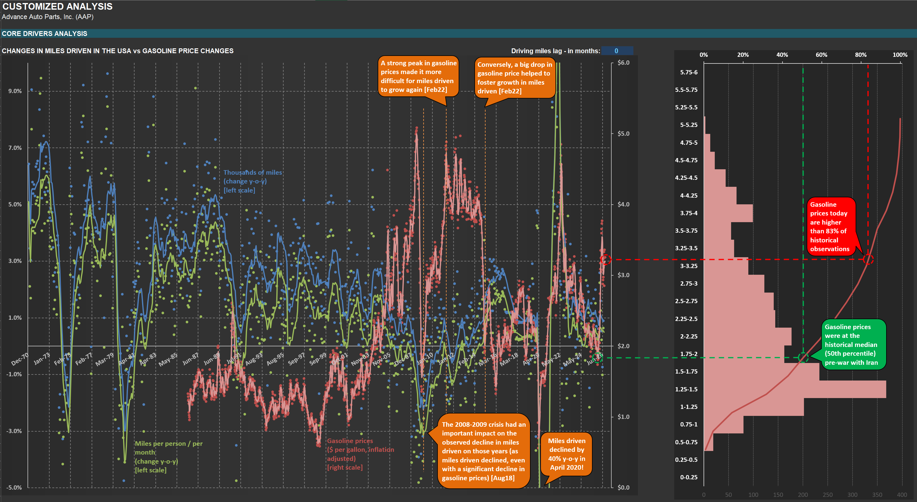
What you are looking at
Start with the panel on the left, and with the three sets of dots, because they are the honest version of the data. Every dot is an actual reading. The blue dots are the year-over-year change in total miles driven in the United States. The green dots are the same figure on a per-person, per-month basis — which matters, because a country whose population is growing will naturally drive more miles in aggregate even if each individual drives less. The red dots are the price of gasoline, in dollars per gallon, adjusted for inflation, on the right-hand scale.
Now look at how much those dots scatter. Monthly readings of this kind are dominated by weather, holidays, the number of weekend days in a month, and revisions. Trying to read a trend off the raw prints is close to hopeless. That is why each series also carries a line: a 12-month moving average for the two miles-driven series (blue and green), and a 6-month moving average for gasoline prices (the pink line). The lines are what I actually read; the dots are there so I never forget how much noise sits underneath them.
One clarification on the price series, because it will otherwise trip up anyone who compares it to what they paid this morning. The gasoline price here is the spot quote at New York Harbor — a wholesale benchmark, not a pump price. What you pay at the station sits well above this line, since it carries federal and state excise taxes, distribution, and the retailer’s margin. But the correlation between the two is effectively 100%, so for the purpose of changes — which is what this chart is about — the benchmark does the job, and it has the advantage of a long, clean, daily history.
What the chart cannot show you: the 1970s
The first thing to acknowledge is a limitation. The miles-driven data begins in December 1970. The gasoline series does not — it starts in the mid-1980s, which is why the red dots simply do not exist on the left third of the chart.
That is a genuine loss, because the left third contains the two most dramatic collapses in the entire miles-driven history. You can see them plainly: a sharp fall in 1974, and an even more violent one running from 1979 into 1981, where the green line touches roughly minus 4.5% — the worst reading anywhere on the chart outside of April 2020. Had the price series reached back that far, it would have drawn two enormous spikes sitting directly on top of those declines: the Arab oil embargo of 1973–74, and the Iranian Revolution of 1979. Those are the two textbook oil shocks, and they are exactly where a gasoline-price explanation of driving behavior looks strongest.
But I want to be careful here, because there is a second explanation for those same two dips, and it has nothing to do with the pump. Housing construction collapsed in both episodes. Housing starts fell by more than half between 1972 and 1975, and then again between 1978 and 1982, when Paul Volcker took the Fed Funds rate toward 20%. Both periods were deep recessions. Fewer construction sites, fewer jobs, fewer deliveries, fewer commutes — and therefore fewer miles, regardless of what a gallon cost. I have made the broader point before that nearly every significant US downturn either began in housing or ran through it (here).
Two decades of cheap gasoline
From the late 1980s through the early 2000s, the pink line does something remarkable: almost nothing. For roughly fifteen years it oscillates in a narrow band, mostly between $1.25 and $1.75 a gallon in today’s money, with only brief interruptions — a spike around the first Gulf War, a dip to the series' lows in 1998 when Asia’s crisis knocked out demand.
This was the era of visible OPEC spare capacity. The demand destruction that followed the second oil shock, combined with new non-OPEC supply from the North Sea and Alaska, left the cartel sitting on millions of barrels a day of unused capacity for the better part of two decades. Prices behaved accordingly.
And what did miles driven do in that benign stretch? They grew — steadily, unremarkably, with the blue line running between roughly 1% and 3% for years on end and the green per-capita line comfortably positive. Cheap gasoline coincided with growth in driving. So far, so intuitive.
The mid-2000s, and a lesson about which variable wins
Then the pink line breaks out. Beginning around 2004 and accelerating through the late stages of the housing boom, real gasoline prices climb from under $2 toward $5 a gallon by mid-2008 — the highest sustained levels in the entire series. This is the same episode I have discussed from the crude side, when inflation-adjusted oil briefly exceeded $220 per barrel (here).
Miles driven decelerated through those years, and the per-capita line went negative well before the crisis. Advocates of the simple story will point at this and rest their case.
But then look at what happened next, because this is the single most instructive passage on the chart. Gasoline prices collapsed — from near $5 to below $2 in the space of six months, one of the fastest declines on record. And miles driven fell anyway. The blue line went to roughly minus 3%, the worst reading since 1980. Cheapest fuel in years, and Americans drove less.
That is the Great Financial Crisis overwhelming the price signal. When people lose jobs, they do not commute. When freight stops moving, trucks stay parked. When construction halts, the pickup does not leave the yard. The price of the fuel becomes a second-order consideration.
Now set that against the recession that preceded it, and the contrast is instructive in the opposite direction. The Internet bubble burst in March 2000 and the economy went into recession in 2001 — and you essentially cannot find it on the left panel. The blue line stays positive throughout. Miles driven simply kept growing. Yet freight did respond: trucking tonnage began declining in March 2000, right as the market broke, which is the episode I used to argue that a market crash can indeed trigger a recession (here).
Two recessions, two completely different signatures. The 2001 downturn destroyed financial wealth and corporate capital spending; it did not stop households from driving to work. The 2008 downturn destroyed household balance sheets, employment, and housing all at once — and it showed up in miles driven immediately, in defiance of collapsing fuel prices. If you want a single sentence out of the left panel, it is this: gasoline prices influence driving at the margin, but economic activity decides it.
April 2020
And then the exception that dwarfs everything. In April 2020, miles driven fell 40% year over year. There is no precedent for it anywhere in fifty-five years of data — the second-worst month in the series is not remotely close. It is the only observation on this chart that a moving average cannot civilize, which is why the green line shoots vertically off the top of the panel and back again.
Gasoline, meanwhile, reached one of the lowest points in the entire series. Demand simply evaporated; for a few extraordinary days, so did the price of the crude behind it. Once again: cheapest fuel in a generation, least driving in recorded history. The price was not the variable that mattered.
Which brings us to the present, and to the panel on the right.
The histogram: what “expensive” actually means
The right-hand panel takes every gasoline price observation in the series — roughly 2,100 of them, spanning about four decades — and sorts them into 25-cent buckets, in inflation-adjusted dollars. The horizontal bars are simple counts: how many times in forty years gasoline traded in each price range. The red line running up the panel is the cumulative distribution, read against the percentage scale along the top. At any price level, it tells you what share of the historical record sat at or below that price.
The shape is worth absorbing. The single most common bucket is $1.25–$1.50, with 368 observations. Nearly a third of the entire history — 31.8% — sits below $1.50. Half of it sits below the $1.75–$2.00 range, which is where the median lands. And only about 22% of all observations in four decades were ever above $3.00 a gallon in real terms.
Now the green dashed line. Immediately before the war, gasoline was sitting almost exactly on that median — the 50th percentile of its own forty-year history. Half of the entire record was cheaper; half was dearer.
I want to dwell on this, because “the median” sounds unremarkable and is not. The comparison set includes the whole OPEC-spare-capacity era of the late 1980s and 1990s — the years that Americans, correctly, remember as cheap-energy years. Pre-war prices were within striking distance of that period. Set against the mid-2000s, against 2011–2014, against the post-pandemic spike, the American driver going into this year was paying a genuinely benign price for fuel. In terms of energy costs, the consumer had it about as good as the historical record allows.
Where we are now
The red dashed line is today. Six months into the war with Iran, and with the Strait of Hormuz reduced to a trickle, the same benchmark has moved from the 50th percentile to above the 83rd — with peaks along the way that touched roughly the 93rd, up in the $3.75–$4.00 bucket in real terms. At the pump, the national average has gone from around $2.92 a gallon in late February to over $4.09, on its way to the highest August average ever recorded.
Read that as the histogram reads it: in the space of six months, American drivers have been moved from the middle of four decades of experience to the top sixth of it. Roughly one month in six, across forty years, has been this expensive or worse. That is the move, and it is not a rounding error.
Moves like this have consequences
Here is why I care about a chart built for an auto parts retailer.
The first consequence is the consumer, and readers of this blog know I have been making this argument for a long time and from many different angles. Gasoline is the most regressive line item in the American household budget — non-discretionary, purchased weekly, and consuming a far larger share of income at the bottom of the distribution than at the top. Every dollar added to a fill-up comes out of something else: a mattress, a boat, an RV, a set of brake pads, a pizza. I have shown the American consumer behaving recessionally for well over a year now, whether through RIM’s valuation distributions, where the cheap half of my Circle of Competence reached undervaluation levels last seen in 2011 (here), or through Harley-Davidson’s credit loss provisions, which have run elevated for years (here). This is a consumer who did not need an additional dollar-a-gallon tax.
The second consequence runs a longer route, and it is the one that worries me more. Energy prices are an input to almost everything, which makes them an input to inflation. US inflation moved from 2.4% in February to 3.3% in March, driven principally by the energy shock. Inflation, in turn, is the single most important driver of the 30-year mortgage rate — I laid out that chain, from federal deficits through inflation to the 10-year note and on to mortgages, in some detail (here). And mortgage rates are what determine whether the housing market functions at all.
It does not function well at the moment. Existing home sales have been stuck at levels last seen in 1995 (here) — the product of high prices meeting mortgage rates that are elevated relative to the past decade but entirely normal against any longer history, and of the lock-in effect that keeps homeowners with sub-3% mortgages from ever putting a sign in the yard (here). Anything that pushes inflation higher pushes mortgage rates higher, and pushes the eventual thaw further out.
So the chain is: a strait in the Persian Gulf, to the price at a station in New Jersey, to the household budget, to the inflation print, to the 10-year note, to the 30-year mortgage, to whether a young couple can buy their first house. It is not a subtle chain, and it is not a new one. It is worth remembering that this same conflict is already showing up in company results in ways that have nothing to do with driving — O-I Glass, for instance, booked $50–100 million of incremental energy inflation attributable to it (here).
The honest conclusion
The chart I set out to build was meant to test whether gasoline prices move miles driven. Forty years of data give a qualified answer: yes, at the margin, in the absence of anything larger — and no, decisively, whenever anything larger is happening. In 2008 and again in 2020, the price went one way and the driving went the other. Economic activity is the dominant variable, and it is not close.
Which is precisely why the current spike is worth watching. It is not the miles-driven line I am worried about. It is that a shock of this size, sustained for this long, is itself capable of becoming the larger thing — through the consumer’s wallet, through inflation, and through the interest rates that govern the most important asset most American families will ever own.
For now, we wait, and we hope for a durable resolution to the conflict — one that arrives before the damage compounds into something that shows up not just in the price of a gallon, but in the blue line itself.