
Investment Concepts
Investment vs. Speculation: Why $AMZN's [Amazon] Whole Foods Deal Reveals the Difference
When Amazon announced its $13.7 billion acquisition of Whole Foods in June 2017, the market greeted it with the kind of excitement typically reserved for transformative events. Headlines proclaimed a “radical disruption” of retail. Analysts spun scenarios of Amazon dominating the grocery industry. The chatter was intoxicating—the sort of “super-fantastic” narrative that gets investors excited and stock prices buoyed. Eight years later, a great WSJ article (here) revealed some key figures for Whole Foods. They now operate 547 stores and employ 106,000 people. It’s time to ask a more grounded question: What did Amazon actually get for its money? This is where the distinction between speculation and investment becomes crystal clear.
The Difference Between Betting on a Story and Buying a Business
Speculation is what happens when someone hears “Amazon is buying a grocer” and immediately imagines Amazon cornering the entire grocery market, margins expanding magically, and hypercompetitive Walmart getting crushed. These narratives feel plausible. They’re seductive. They create urgency. But they’re built on imagination, not analysis.
Investment is different. It involves doing the unglamorous work of understanding what you’re actually buying. In the case of Whole Foods, that means understanding historical store productivity, typical operating margins in the organic grocery space, and whether a premium grocer can realistically achieve transformational growth in a mature, hypercompetitive market. It means calculating what return the price paid actually implies—and asking whether that return justifies the risk.
What the Numbers Suggest
Back in June 2017, I made my last update on my model of Whole Foods - I had been following the company for years (see first picture below - relevant figures highlighted by red rectangles). That model projected where the company would be in the ensuing years. The results, which have now been partially validated by eight years of reality, are instructive.
On store count, my forecast proved remarkably prescient: I projected 541 stores by September 2025; the company now operates 547. On headcount, I forecasted 112,000 employees; the current figure stands at 106,000. On sales, I modeled total growth of 42% from 2017 to 2025; Amazon reported more than 40% sales growth since the acquisition. These aren’t accidents. They reflect the reality that Whole Foods operates in a mature business in which productivity per square foot, per employee, and per store tends to fall within predictable boundaries.
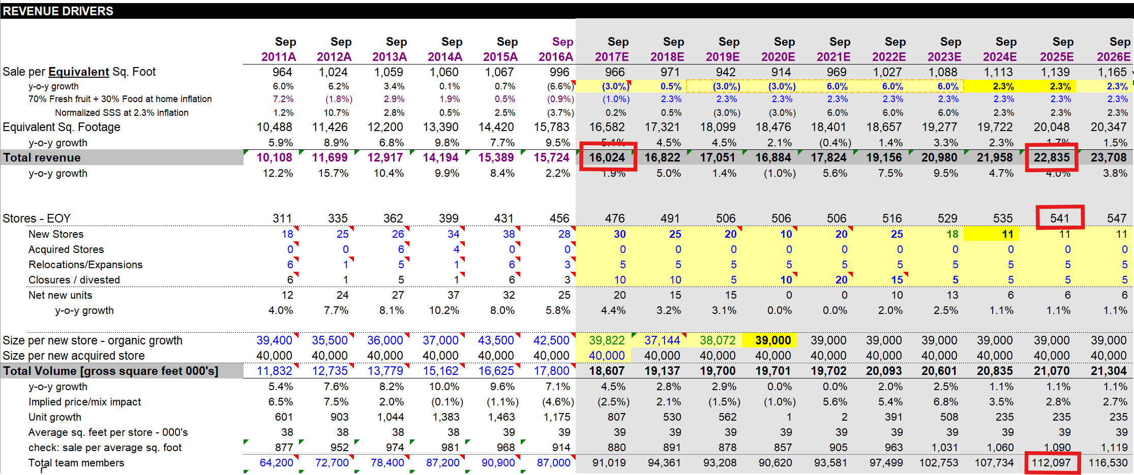
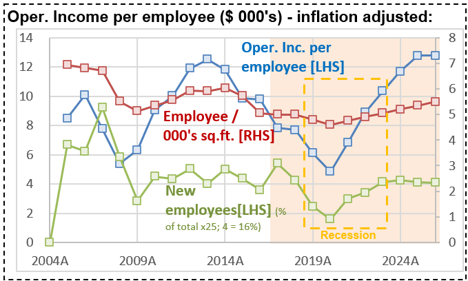
But here’s what’s remarkable: these projections also revealed something uncomfortable. When I calculated the Internal Rate of Return (IRR) that Amazon achieved on its Whole Foods investment—assuming the company’s margins remain consistent with historical patterns—the IRR comes in at approximately 8.8%. And by “historical patterns,” I meant reaching an operating profit per employee consistent with times when the company was operating very efficiently (see second chart - focus on the blue line).
Why 8.8% Should Matter
Eight point eight percent is a respectable return in many contexts. It’s better than Treasury bonds. It beats inflation. But for Amazon—a company that commands extraordinary capital and pricing power, with a cost of capital (Ke) that reflects its dominant market position—8.8% is mediocre. It’s below the historical hurdle rates that truly accretive acquisitions typically exceed.
To put it another way: Amazon paid $13.7 billion for a business that, if it performed exactly as my 2017 model suggested (and the evidence suggests it has), would compound capital at a rate that fails to fully reflect the premium one should demand for deploying that much capital in such a capital-intensive, hypercompetitive industry.
This doesn’t mean the deal was a disaster. Amazon hasn’t destroyed value. But it hasn’t also created the spectacular value-creation story that the initial narrative promised. The company moved 40% more merchandise through 547 stores and 106,000 employees—an outcome you could have forecast by looking at historical productivity metrics and applying straightforward extrapolation.
The Broader Lesson
This distinction between investment and speculation explains why some investors thrive while others repeatedly lose money. Speculators heard “Amazon buys grocery” and imagined Disney-like returns. Investors asked: Given what we know about this industry, what return does this price actually imply? And if the market is correct about Amazon’s strategic brilliance here, shouldn’t the returns exceed our cost of capital? The tragedy is that poor answers to this question have led many investors into situations far worse than Amazon’s Whole Foods deal.
Take Beyond Meat, which at its peak was valued at nearly $4 billion, pricing in a future where plant-based meat would capture vast market share and command premium margins. Those who bought at peak valuation didn’t lose 30% of their capital. They lost 95%+. The difference? Beyond Meat’s valuation required speculative assumptions about market size and profitability that had virtually no historical precedent. Whole Foods, by contrast, sits in a known market with knowable economics.
What This Means for Your Investing
When you encounter a story about a company acquiring another, a new technology, or a business entering a hot new market, resist the urge to extrapolate linearly from enthusiasm. Instead, ask yourself: What is the IRR this price actually implies? Does that IRR compensate me for the risk and the opportunity cost of deploying capital elsewhere? What assumptions about margins, growth, and competitive dynamics does this valuation require? Have those assumptions been validated by history, or am I betting on a discontinuity?
For Whole Foods, Amazon’s price implied an 8.8% IRR. That’s a fact you could have calculated the day the deal closed. Everything that followed—the 40% sales growth, the store expansion, the employee base—was largely predictable, given straightforward assumptions about retail productivity. The surprise, if you were paying attention to the math rather than the narrative, wouldn’t have been that Amazon “succeeded” with Whole Foods. The surprise would have been to discover that the deal represented anything other than a competent, if uninspiring, deployment of capital into a mature, slow-growth business.
That distinction—between imagining what might happen and calculating what should happen given your purchase price—is the difference between speculation and investing. Amazon, for all its brilliance, chose the latter path on Whole Foods. And it got what 8.8% annual returns suggest you should expect: a reasonable but unremarkable business.
How This Relates to My 2017 Model
I want to emphasize something important for anyone reading this: my 2017 Whole Foods forecast was built on understanding store economics, not on believing in a transformational narrative. The model assumed:
- Whole Foods would add stores at rates consistent with past expansion plans
- Per-store productivity would remain within historical bands
- Margins would not dramatically improve (a conservative assumption, but crucial to disciplined valuation)
- Growth would be gradual, not exponential
Eight years later, nearly every projection has held. I wasn’t prescient—I was simply careful about what I assumed. And that carefulness is what separates the investors who sleep well at night from the speculators who wake up wondering where their Beyond Meat investment went.
$FLS Share Price Surge: Nuclear Hype Meets AI Mania
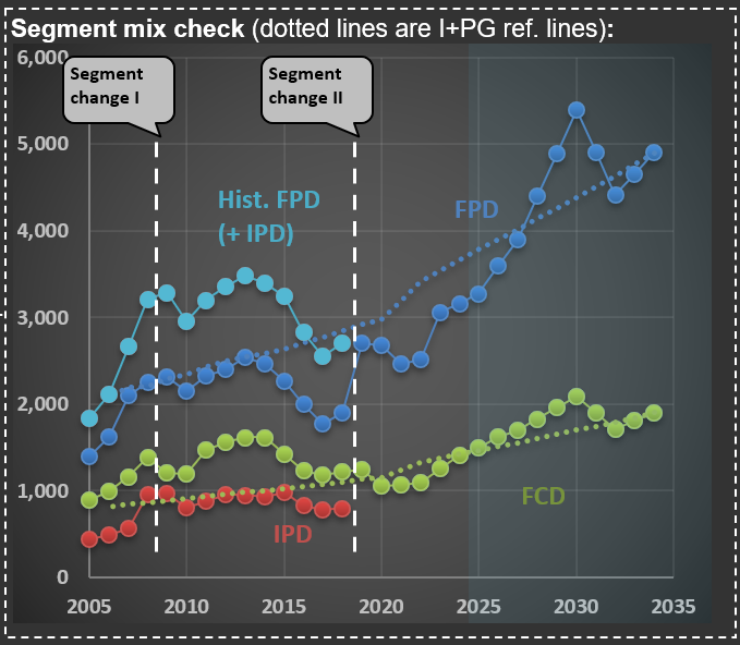
This past week, $FLS (Flowserve Corporation) released earnings that clearly illustrate how the AI race and associated mania can spill over into even traditional companies, particularly in the industrial sector. Flowserve is a classic industrial company that sells technical equipment to its corporate clients. It specializes in precision-engineered equipment that manages the movement, control, and protection of industrial fluids and gases in critical infrastructure applications. The company operates through two primary business segments: the Flowserve Pumps Division (FPD), which focuses on highly custom-engineered pumps, and the Flow Control Division (FCD), which designs, manufactures, and services industrial valves.
The first chart shows sales over the two main segments. But you can also see a line that ends abruptly—that is their IPD (Industrial Products Segment; the red dotted line in the chart), which was merged into FPD. It isn’t uncommon for companies to change segments—Flowserve did so twice in the past 20 years. I find it challenging when this happens, as it makes it harder to track the progression of sales and margins over the years.
A case in point is what happened when they released their earnings for 3Q 2025. Shares jumped more than 30%. This is more than three times what was observed during earnings releases when the company surprised the market positively over the past decade. The reason: the focus on nuclear energy. At the end of the post, you see the cover of their earnings release presentation—that is a nuclear power plant.
The word “nuclear” was mentioned 25 times in its earnings presentation and 59 times during the conference call transcript. And the market was excited with phrases like “we believe that nuclear flow control opportunity set could be $10-billion-plus over the next decade,” pushing share prices up abnormally. Now, do you know how much nuclear-related sales Flowserve has? They sold $160 million in pumps and valves in 2024, somewhat related to nuclear facilities. This is 3.5% of their sales (of $4.6 billion). So, do you think that a company that isn’t relevant in the nuclear space should increase in value by more than 30% because they mentioned the word “nuclear” in their earnings release?
Because of AI’s high electricity consumption, there is widespread speculation that countries like the US will reignite their nuclear power programs. First, a long-term renewed interest in nuclear energy is already a speculative assumption. Second, nuclear facilities construction takes years (usually measured in decades) to complete. And even if it does happen, the chances of Flowserve meaningfully participating are small.
The mere mention of a word in a release leading to significant share price appreciation reminds me of 1999, when companies were adding “.com” to their names and instantly increasing in value. What happened with Flowserve might be something similar. A company that only tangentially touches the nuclear space increased its valuation by disproportionately associating itself with this field. This is what a mania looks like.

Why “Simple” Numbers Lie: Lessons from $FDX and the Art of Financial Analysis
Why do I devote so much effort to detailed financial analysis of the companies in RIM’s CofC(*)? It’s because companies are constantly evolving, and off-the-shelf calculations like “sales growth” or “margin trends” frequently become meaningless in the real world.
Take $FDX (FedEx) as an example. In the picture below, you’ll see how FedEx has reported ADV (Average Daily Volume) and ADP (Average Daily Packages) for their Express segment over the last 20 years, along with “base case scenario” forecasts for the coming decade.
First, notice the significant jump in ADP in 2017. That spike came right after the acquisition of TNT Express—a major European operator. The timing, however, was unfortunate: only months later, FedEx was hit by the NotPetya ransomware attack, which severely impacted TNT’s IT systems. Nearly every hub, facility, and depot had to have its systems rebuilt from scratch. The recovery was extensive, and FedEx estimated immediate losses of at least $300 million due to reduced shipping volumes, lost revenue, and higher remediation costs.
Fast-forward to recent years, and the numbers became complicated again. FedEx has merged its Ground and Express segments, moving closer to the model used by UPS (which already operates a unified network) and adjusting to changing parcel volumes after the ecommerce surge. Although no new company was acquired this time, the way FedEx reports its numbers has changed—once again making direct year-over-year comparisons challenging.
That’s why I continuously adapt my valuation models to account for these reporting changes. If I don’t understand exactly what changed (and when), the risk of producing misleading forecasts rises dramatically. Back to the model…
(*) CofC = Circle of Competence

The Magnificent-7 and the Rest: What History Suggests for Investors
As some broad indexes (like the Nasdaq and S&P 500) approach all-time highs, I wanted to share a few thoughts on what’s driving these moves. We’re living through a highly unusual period, where a small group of companies have achieved extraordinary scale, profitability, and market valuations. I’m referring to the Magnificent-7 ($AAPL, $MSFT, $GOOGL, $AMZN, $NVDA, $META, and $TSLA), whose performance has had an outsized impact on the indexes mentioned above.
The first chart below highlights just how significant this has been: it shows the cumulative performance of the Magnificent-7 compared to the other 493 companies currently in the S&P 500(*). The gap is remarkable—since 2005, the Magnificent-7 have outperformed the rest by a factor of 13.7. It’s easy to forget how difficult it would have been to predict, twenty years ago, just how dominant these businesses would become. But what about more recently? Take a look at the second chart, which starts the clock in January 2020. Even over this shorter period, the Magnificent-7 outpaced the rest of the S&P 500 by 3.7 times—surpassing their outperformance during the entire prior 15 years (which was 3.6 times).
I’m not here to tell you whether these companies are overvalued—that’s outside my “Circle of Competence,” and I have no stake in whether their valuations are justified. However, I do worry about the potential consequences if their valuations were to come under pressure. The best parallel I can draw is with what happened after the Internet Bubble burst in 2000.
The third chart below compares two groups. In blue, the “Internet Darlings”: Amazon, eBay, Microsoft, Cisco Systems, Intel, Oracle, Apple, Qualcomm, Adobe, and Priceline (now Booking Holdings). These are all survivors—I’ve excluded any high-flyers that later imploded, which actually improves the group’s performance. The grey line represents 50 companies that could be considered “value names”—think Coca-Cola, Pepsi, Home Depot, Walmart, Pfizer, and so on. I’ve even included some companies in this group that were expensive at the time (as I discussed in a previous post here), so the comparison is not stacked in their favor.
The results are striking. Over the next two and a half years, the Internet Darlings declined by 70%. Meanwhile, holders of the more “mundane” companies saw their investments appreciate by 11%—not spectacular, but certainly preferable to being left with only 30% of your capital. Will history repeat itself? There’s no way to know for sure. Still, I find some comfort in knowing that my investments today are much more closely aligned with the kinds of companies represented by the gray line in the early 2000s.
(*) All calculations are performed using Python—let me know if you’d like a copy of the code. All figures include dividends.


When Costs Surge: Units Impact and Counterintuitive Profitability Outcomes
To provide additional context for the Portfolio Action [PA]* I recently shared with RIM clients, I wanted to explore a counterintuitive example of how a company’s operating profit can be impacted when (i) there is a sudden increase in Cost of Goods Sold (COGS) and (ii) customer budgets remain unchanged in USD terms. For reference, you can find the link to the PA here.
Below, you’ll find two tables illustrating this concept. The first table outlines the economics of a company selling a specific product (let’s use tennis shoes as an example). The second table shows the scenario after the company experiences a sudden increase in COGS, perhaps due to an import tariff hike.
In the initial case, customers allocate $100 per year for tennis shoes. Each pair costs $200 because the seller applies a 100% markup—buying the shoes for $100 and selling them for $200. This means customers purchase one pair every two years. As shown in the first table, the company generates $50 in operating profit per pair sold.
Now let’s examine the second case: COGS rises from $100 to $150 per pair. If the company maintains its standard markup, the selling price increases to $300 per pair. A quick note on this practice: many companies I follow are remarkably disciplined about preserving gross margins during significant COGS fluctuations, passing on these costs to consumers.
What happens to purchase frequency? If customers stick to their $100-per-year budget (a key assumption since sticker shock could alter behavior), they will now buy a pair every three years instead of every two. Despite this reduced frequency, operating profit per unit could still rise—even with SG&A (Sales, General & Administrative expenses) increasing from $50 to $75 per unit in this scenario. In fact, as shown in the second table, operating profit grows to $75 per unit.
Over six years, when both cases complete their respective cycles, here’s what we observe: In the first case, three units are sold, generating $150 in total operating profit. In the second case, only two units are sold—but total operating profit remains identical at $150. This phenomenon, where absolute USD profits stay consistent despite lower unit sales, often surprises me—and I’ve seen it play out multiple times in real-world scenarios.
The key takeaway here—especially relevant to the PA concerning a transportation company—is that a sudden rise in tariffs typically leads to reduced volumes for products affected by higher COGS and selling prices.
From there, several financial dynamics come into play. For example:
Will typical customers maintain their annual budgets? If their income is negatively impacted, budgets may shrink.
If the product is essential and purchased regularly, budgets might even increase over time in USD terms—potentially boosting profits for sellers.
On the other hand, demand for non-essential products could decline significantly.
In some cases, companies might switch to sourcing locally produced goods. While unlikely for tennis shoes, this scenario could apply to industrial products made with heavy automation where local production costs are competitive with international suppliers. In such cases, neither companies nor customers would experience significant changes.
One thing is certain: a sudden increase in COGS creates shockwaves. Given the potential magnitude of current cost pressures, volume dislocation risks are high—and these effects will not be evenly distributed across companies or industries. This underscores why fundamental analysis remains critical for understanding how these dynamics will impact specific businesses.
For further insights related to this example and its connection to our PA, please refer back to that communication.
(*) A PA is a message sent to RIM clients whenever a position enters or exits our portfolio.

Why Valuation Always Matters: Lessons from $WMT, $KO, and $HD
During a recent conversation with an investor, he said: “I’m not concerned about the high valuation of the company I’m buying today because it’s a great company that’s growing and has good margins, and I plan to hold it for a very long time." What is your first instinct when hearing such a statement?
If you have doubts about whether this approach is wise, take a moment to examine the three charts below for $WMT (Walmart), $KO (Coca-Cola), and $HD (Home Depot). These charts show returns (indexed to 100 as of January 1, 2000) through December 2014—a span of 15 years. The blue line represents stock prices, but since these companies pay dividends, the “Total Return” line (red) is the one you should focus on. Two other lines are included for comparison: one in yellow for the Russell 2000 and another in green for the S&P 500. Pay close attention to how much better small, mundane companies (represented by the Russell 2000) performed compared to the broader index that participated in the bubble (the S&P 500).
The US equity market was in a bubble in 2000—a fact that hindsight makes clear. But here’s what’s curious: there was no definitive event that caused the bubble to burst in March 2000. Concerns existed, but no single trigger led to the collapse. This highlights how difficult—if not impossible—it is to predict when a bubble will pop.
What we can observe from the charts below is that each of these companies—despite their success in subsequent years in terms of sales growth, margins, and earnings—delivered poor stock performance during this period. Why? Eventually, investors evaluate their returns on investment, and if future prospects are too low relative to the price paid, share prices adjust. I’ve discussed this tendency—to seek reasonable internal rates of return (IRRs)—in this post.
Consider Walmart: around that time, its price-to-earnings ratio (P/E) ranged from 40 to 50—not unlike its recent peak above 40 times earnings. It took until late 2011—12 years—for investors to recover their money in nominal terms. Adjusted for inflation, it took even longer. Along the way, investors faced a painful drawdown of 37%.
How about Coca-Cola? Surely its stable business made it safer, right? In some ways, yes—but investors still had to wait nine and a half years to break even. While its drawdown was slightly smaller than Walmart’s (34% versus 37%), it was still significant.
And then there’s Home Depot—a case of even greater suffering due to its exposure to the housing crisis during the Great Financial Crisis (GFC). Investors didn’t recover their principal until mid-2012—a grueling wait of 13 and a half years. Worse still, they endured a staggering drawdown of 70%. How many investors could resist panic-selling under such conditions?
What ties all these stories together is one common factor: abnormally high valuations at the time of purchase. Despite these companies’ eventual growth in sales and margins—and even their ability to achieve high valuations again later—paying too much upfront led to years of poor returns and significant volatility. This brings us back to the statement at the beginning: Buy highly priced companies at your own risk. Even if their prospects are excellent, valuation matters—and it always will.


Where Did the Cash from Operations Go?
Today, I’m diving into my analysis of $PKG (Packaging Corporation of America), a company that offers an interesting case study in how businesses deploy their cash beyond dividends and share buybacks. One common strategy is acquiring other businesses, typically within the same industry. This approach aligns with the broader trend in the U.S., a country I often refer to as “the land of oligopolies,” where many industries are dominated by a handful of major players. However, not all acquisitions are created equal—some management teams venture outside their area of expertise, attempting to diversify into uncorrelated industries. These moves frequently result in losses.
In contrast, PKG’s management opted for a more logical and focused strategy. In late 2013, they acquired Boise Inc., another paper and packaging company, for $1.3 billion. Since then, PKG has made additional acquisitions within its core industry, albeit at smaller scales.
The two charts below illustrate the impact of the Boise acquisition on PKG’s financials. The first chart highlights a notable surge in sales growth over the two years following the deal’s closure. This increase reflects the integration of Boise’s sales into PKG’s financials. The second chart shows a significant negative Free Cash Flow (FCF) margin during this period. FCF margin is calculated as (i) Net Cash from Operating Activities minus (ii) Net Cash from Investing Activities, divided by (iii) Sales.
The $1.3 billion spent on Boise is captured under “Net Cash from Investing Activities” pushing the total figure into negative territory. The key question is whether this acquisition will ultimately pay off—a question that demands detailed valuation work. After assessing the rationale behind a deal, it’s essential to adjust future projections to account for the new assets and business operations.
Getting this process right increases your chances of buying or selling a company at prices aligned with your investment thesis—whether long or short. Missing critical details or skipping a robust forecast can lead to mediocre performance at best. And if you happen to make money despite a flawed forecast? Recognize it for what it is: luck.
At its core, the job of an investment manager is to minimize reliance on luck by rigorously analyzing and projecting logical outcomes. Yet even when your analysis is spot on, patience and discipline are vital—it can take years for your thesis to play out fully.

Understanding Implicit IRRs: The Core of Rational Investing
When you buy shares in a company, the price you pay carries an implicit Internal Rate of Return (IRR). Essentially, anyone who purchases shares—and is willing to hold them indefinitely—locks in a certain IRR, determined by two factors: (i) the price paid and (ii) all future cash flows the company will provide to its owners. These returns typically come either as dividends or as a lump sum (usually cash) if the company gets acquired.
This concept applies universally to all companies—even those operating in sectors like technology, where expectations for rapid sales and margin growth are common. However, because shares can be traded easily and frequently, investors often mistakenly focus on market timing. In reality, collectively, investors always end up receiving the IRR described above—someone is always holding shares of each publicly traded company.
From my experience—supported by extensive data and proprietary tools(*)—the Market does attempt to value companies based on their future cash flow prospects. It isn’t just a random walk detached from fundamentals. Yet, the Market suffers from short-term bias: it tends to overly emphasize current earnings, causing prices to fluctuate far more than they would if investors consistently took into account earnings across full economic and industry cycles.
This short-term bias creates opportunities for active portfolio management. By carefully selecting investments based on long-term cash flow potential rather than short-term earnings fluctuations, we aim not only for strong long-term returns but also for the comfort of knowing our investments are fundamentally sound—backed by real cash flows rather than speculative hopes that someone else will pay more later.
Every company entering RIM’s portfolio on the long side has an “above normal” expected IRR, while those on the short side have “below normal” expected IRRs. To illustrate what “normal” looks like within RIM’s Circle of Competence (CofC), see the table below. It shows cumulative real returns—how many times your initial investment would grow—after a given number of years based on the observed IRR at purchase.
I’ve selected the 10-year mark as a practical proxy for “long term.” For instance, if you bought something today with an implied IRR between 10% and 11%, after ten years, your investment would grow—in real terms—to between 2.06x and 2.26x your original investment (highlighted in yellow). This range represents the average observed returns over very long cycles (20+ years) for companies within RIM’s CofC.
The green box highlights the typical IRRs (14% to 15.5%) at which we initiate long positions. Conversely, the red box shows typical IRRs (5.5% to 7%) at which we initiate shorts. In practical terms, when RIM initiates a long position in a company, we expect cumulative dividends (and/or cash payment for the business) equivalent to roughly 3.2x our initial investment; shorts typically offer only about 1.4x—a significant 120% difference in expected returns.
Ultimately, regardless of personal hopes or beliefs, the Market collectively prices companies based on expected future cash flows available to shareholders. Therefore, successfully investing requires both skill and discipline: skill in accurately forecasting long-term earnings prospects and discipline in buying when earnings—and thus prices—are unusually low (and shorting when they’re unusually high). This disciplined approach is precisely what I practice every day at RIM.
(*) My insights are built upon 67 detailed valuation models I’ve meticulously developed and refined over the past two decades. Additionally, I rely heavily on Odysseus—RIM’s custom-built portfolio management, trading, and reporting tool—which I developed using Python and some of today’s fastest computational libraries.

Fundamental Analysis Spotlight: $OI and Market Mispricing
I attended the $OI (OI-Glass) investor day event and wanted to share some interesting insights. Look at the first chart below, which I pulled from their extensive 91-page presentation. Notice the projections for 2029: management targets EBITDA margins in the “mid 20s,” so let’s call it “around 25%.”
Now, check out the second image—this one shows my base-case scenario for OI-Glass. By 2029, my estimated EBITDA margin stands at 16.8%. I’m slightly more conservative in calculating EBITDA than management, as I leave some expenses on my calculations that they might exclude. So let’s round up my estimate to 17%.
But here’s the impressive part: OI-Glass appears substantially undervalued even using my conservative margin of 17% (or 8 percentage points below management’s target). Historically, the market has valued companies similar to OI-Glass—assuming my base-case scenario—at around 4 to 5 times today’s valuation. It would be much more with EBITDA margins of 25%!
This is a perfect illustration of market inefficiencies. The market isn’t fully pricing future profitability improvements implied by OI-Glass management’s expectations. Instead, share prices often reflect current EPS disproportionately. This is precisely where fundamental analysis adds value. If you’re skilled at (and have the time to dedicate to) understanding businesses and accurately forecasting long-term earnings potential, you’ll be well-positioned to identify opportunities (long or short) that eventually get recognized by the Market’s mechanical pricing heuristics.
Hence, I focus on first understanding what companies do and in which context (e.g., their competitive environment). Only after that do I spend time modeling a company in excruciating detail (also a necessary step to quantify your understanding of the business). With such an approach, I hope to be an “investor” and not a “speculator " (who blindly hopes that share prices move in their favor).


What Trucking Tonnage Tells Us About Market Crashes and Recessions
I was recently asked if a market crash can trigger a recession. In short: yes, it certainly can—and it did in the early 2000s.
The chart below should look familiar to RIM’s clients. It shows trucking tonnage data from the ATA (American Trucking Association). The thin-dotted blue line represents monthly figures, which tend to be volatile due to weather seasons and holidays. I’ve added a thick blue line showing the Last Twelve Months (LTM) moving average to better identify trends.
Every turn in this LTM line has a story behind it—economies typically grow until something disrupts them. That’s why you’ll see annotations on the chart marking significant events: sharp oil price spikes, declines in housing starts, rising interest rates, banking crises, market crashes, and even a global pandemic (I never imagined I’d be adding that one!).
Take a closer look at the early 2000s. Trucking tonnage began declining around March 2000—exactly 25 years ago—coinciding with the internet bubble bursting. While the tragic events of September 11th certainly disrupted economic activity further, the downturn had already begun well before then. However, the market crash was clearly the initial trigger.
Could we be experiencing something similar today? Nobody knows, but there’s no point obsessing over it. Unless, of course, you invest in companies for which it is challenging—if not impossible—to predict long-term sales and profitability. These types of companies are the core protagonists—in terms of how much they decline—during bubble bursting years.
As equity investors, our focus should remain on thoroughly understanding a select group of companies and accurately modeling their financials based on company- and industry-specific data. Then, when the market inevitably overreacts to short-term news or temporary EPS fluctuations, we’re ready to act decisively. If you’ve been following RIM’s approach, you know that’s exactly what I do every single day.

Valuation Distributions: Why 'Is the Market Cheap?' is the wrong question and how to use it to spot recessions
Frequently I’m asked if I think “The Market” is expensive or cheap. I know the person asking the question wants a yes/no answer. Still, I must explain that - although you could provide a single number - it would be a very incomplete as any market is a distribution of under/over valuations of all the companies in that market. So if you want to know if the S&P500 is cheap/expensive, you have to have an assessment of the under/over valuation of 500 companies!
What I do day in and day out at RIM is to update and polish reference fair values for all the companies on my CofC (Circle of Competence). By normalizing these fair values to $100/share, I can build the histogram in the first picture below. So for “RIM’s market”, the average company is undervalued by ~10% (see figure circled in blue on the chart). But this is an average. Reality is much more complex - some companies are cheap while others are expensive. Hence, it is crucial to see the data in a histogram.
But we can do better (as long as you have a sophisticated tool like Odysseus - RIM’s portfolio construction, trading and reporting tool). Take a moment to review the second chart below. It shows the averages, over time, of all companies (in blue), the expensive ones (in red—they are also in red in the histogram), and the cheap ones (in green—they correspond to the ones also in green in the histogram).
I want to bring to your attention the green line—cheap companies are now undervalued by 40%! See the -40 figure circled on the right side of the chart. This is more extreme than what was observed in the summer of 2011 (period circled in green). Can it get worse (i.e., more undervalued)? Of course - the second chart starts in 2010 because I want to exclude 2009, as undervaluation at that period was almost surreal. But understand this - the US is in a full-blown recession for some industries. Look at the post I did for $BC (Brunswick) here and $HOG (Harley Davidson) here. Sales figures at these industries (per capita) are at 2009 levels. The same is true for anything discretionary, from mattresses to toasters.
So, are we in a recession? I won’t debate potential distortions to broad GDP figures—that define whether the country is in a recession or not—with its multiple adjustments, as macro-economics is not my specialty. However, the American consumer is definitely in a recessionary mood. That is why we have so many cheap stocks (and by an uncommon amount) - they are primarily in the consumer/housing segments.
Last, you can see that the red line on the second chart is still relatively high. That is because some industrial names, which have a delayed cycle compared to consumers, are only now showing a substantial correction in sales and margins. However, valuations in the sector will eventually reflect the harsh reality for some companies in this group.
So what should one do out of this long blog? I hope it will help by reminding you to discuss more precisely what it means to say “the market is expensive” (or cheap). I want you to think about distributions. Moreover, also to think about the possibility of someone really having an assessment for all the companies that are part of whatever market they are referring to. So next time someone tells you “I think the S&P500 will go up” (implying they think it is cheap), you can tongue-in-cheek say “Wow, I didn’t know you had 500 valuations!” Otherwise, any opinion is nothing more than a blind guess.


Market Prices vs. Fair Value: Why Today’s Quote Isn’t the Full Story
When assessing a company’s long-term value, certain metrics can be misleading—and today’s share price often tops the list. Take $GNRC [Generac] as an example. Since its IPO, short-term earnings estimates (red lines in the first chart below) have closely tracked its share price (blue line). While markets are “correct” on average over time, valuations at any given moment frequently stray far from rational estimates of fair value.
The second chart, from Odysseus (RIM’s portfolio management tool), highlights this disconnect. The blue line shows the market price deviation from RIM’s fair value calculation. At $500/share in late 2021, Generac traded at a staggering 300% premium to its intrinsic value—a vivid reminder that asking “what is the market telling me?” can lead to flawed conclusions.
Key Takeaways:
- Extreme price deviations are common, driven by short-term sentiment rather than long-term fundamentals.
- Systematic strategies thrive on these dislocations, using disciplined triggers to enter long/short positions.
- RIM’s approach focuses on exploiting these gaps rationally, avoiding emotional reactions to market noise.
By anchoring decisions to intrinsic value—not fleeting price swings—investors can turn volatility into opportunity.

