Consumer Confidence and RV Sales: Insights from Thor Industries ($THO)
I just finished updating my analysis of $THO (Thor Industries), the largest manufacturer of RVs (Recreational Vehicles) in the US. The U.S. RV market is dominated by a few major players, often called the “Big 3”: Thor, Forest River (a Berkshire Hathaway company), and Winnebago, an iconic name in the RV world.
Thor’s management shared in their latest earnings release that retail demand has generally aligned with expectations, despite some challenges in the first half of FY25 (August 2024 to January 2025). While there was improvement in the second half, it was less than initially anticipated, prompting a revision of prior guidance. The slight increase in consumer confidence in May 2025 is a positive sign for retail demand through the end of FY25 (July 2025). However, aggressive tariff policies could weigh on demand in the latter half of the calendar year if their impact on Average Sales Prices (ASPs) is not effectively managed industry-wide. They also expect the first quarter of fiscal 2026 (June to August 2025) to be challenging.
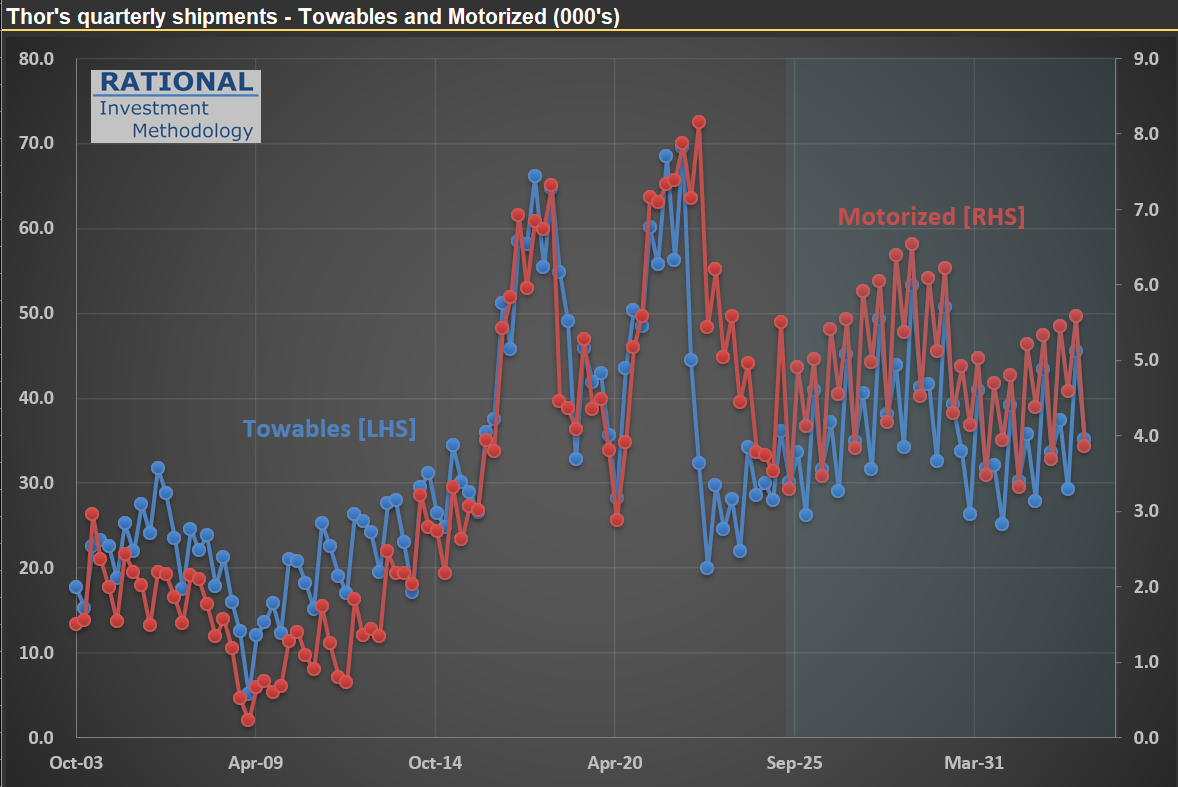
The main reason for this cautious outlook? Tariff uncertainties. Now, consider that Thor has already been navigating significant fluctuations in demand—see the picture below. The blue line illustrates quarterly deliveries in their “towables” segment, the company’s largest. Imagine running a production line that must handle between 20,000 and 70,000 units every three months, without knowing in advance when demand will be strong or weak.
Thor sells highly discretionary products—you don’t really need an RV! Because of this, their sales levels serve as a strong indicator of real consumer confidence. I’ll be watching their numbers closely as we move through what remains an unnecessarily volatile economic and operational environment.
$PCAR Update: Where Are We in the Heavy Truck Market Cycle?
I’ve just finished updating my analysis on $PCAR (Paccar), a leading heavy truck manufacturer in the US. Much like my earlier post on Volvo trucks (here), $PCAR’s performance tends to mirror broader economic cycles.
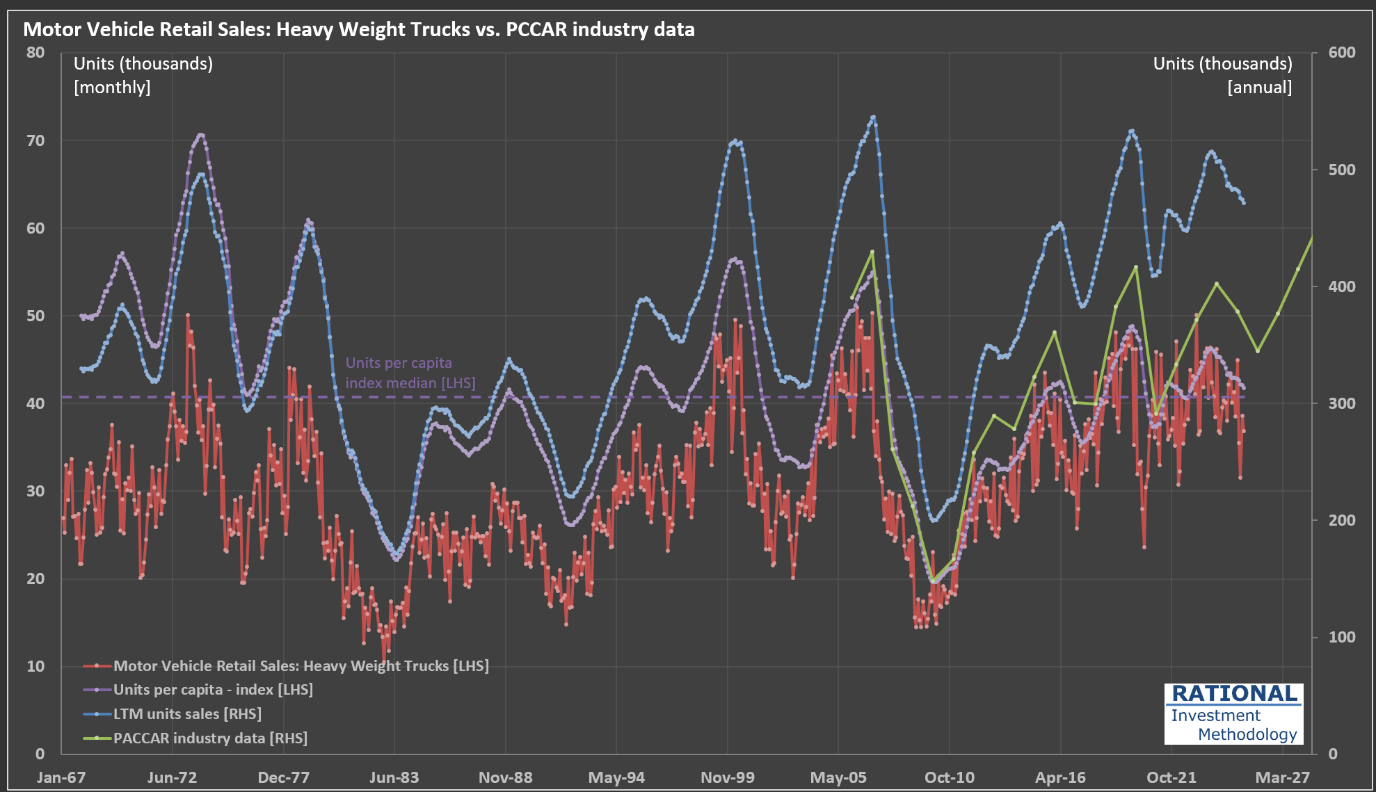
Take a look at the chart below:
The red line tracks monthly retail sales of heavy-weight trucks (in thousands of units, left axis). Because monthly figures can be quite volatile, I also include a rolling 12-month (LTM) sales figure—shown as the blue dashed line on the right axis (annualized, in thousands)—to help clarify the underlying cycle.
The green line represents PACCAR’s own industry data (also right axis). This closely follows the LTM sales trend, though there’s some divergence since PACCAR uses a slightly narrower market definition. Still, the correlation between the LTM data and PACCAR’s data is an impressive 97%, underscoring how similarly they reflect industry cycles.
Where does that leave us in the current cycle? The purple dashed line shows the units per capita index (left axis), which adjusts for population growth and offers a normalized view of demand over time. I’ve also marked the median value of this index on the chart, providing a useful benchmark to gauge whether current sales are running above or below historical norms.
At present, we’re in the second year of a downturn that began in late 2023. The pandemic era saw trucking companies enjoy strong profits, which led to a mini-boom in truck sales. Now, as we wait for 2Q 2025 earnings (due out in July), it will be interesting to see how the latest round of tariffs impacts the industry. Stay tuned.
How Policy Shapes Tractor Sales: Insights from $DE (Deere)
As Congress debates a new bill that includes stimulus measures for farmers, I thought it would be timely to share a chart from my recent analysis of $DE (Deere). The chart breaks down tractor sales into four distinct categories. To better understand industry dynamics, I’ve converted all units into a “Compact” equivalent index (referring to 40-100 HP machines).
What stands out in the chart is the significant impact government policies can have on this industry—sometimes even distorting sector activity. Notice the sharp rise in tractor sales in the early 2000s, coinciding with the introduction of the “ethanol mandate.” Back in the late 1990s, less than 5% of the corn crop was used for ethanol production (a very inefficient process, when compared with ethanol produced with sugarcane). By 2015, that figure had climbed to nearly 40%. This shift contributed to a substantial bubble in agricultural commodities during that period.
More recently, you’ll see another notable spike in sales, which is only now beginning to subside. Among the broad pandemic-era stimulus efforts was a direct cash payment to farmers. Ironically, agricultural activity—which doesn’t require close contact—was not significantly disrupted. Yet, the result was another artificial boost in tractor sales, disproportionately benefiting companies like $DE.
Let’s see what new distortions might emerge as the agricultural lobby weighs in on the current bill.

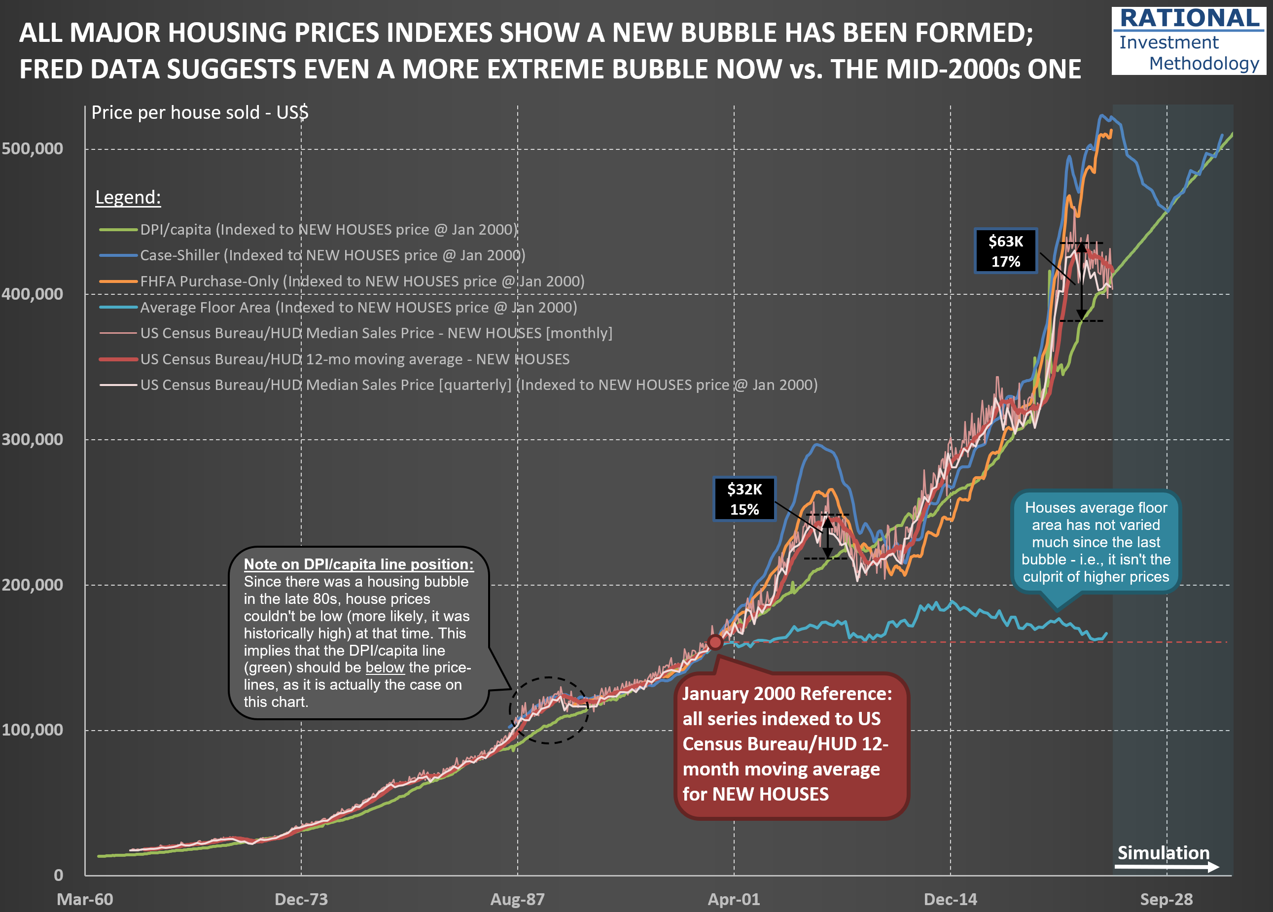
Housing Bubble 2.0: How the Lock-in Effect Is Shaping an Unprecedented Market Divergence
The housing market in the United States presents a fascinating case study of how interest rate policy can create significant distortions in asset prices. The chart below reveals a telling story about our current housing market.
The US Census Bureau/HUD Median Sales Price lines for houses (represented by the red lines - the darker ones for new homes; the light pink for all houses) have recently begun reverting toward the green DPI/capita reference line. This indicates that new home prices are returning to historically normal levels relative to disposable personal income. However, simultaneously, the Case-Shiller and FHFA Purchase-Only indices (blue and orange lines, respectively) remain significantly elevated compared to historical norms.
What explains this divergence? The answer lies in the dramatic difference in transaction volume and pricing dynamics between new homes and existing homes. The primary driver of this market distortion is what economists call the “lock-in effect.” As of early 2025, 82.8% of homeowners with mortgages still have an interest rate below 6%. Many of these homeowners refinanced during 2020-2021 when rates hit historic lows, securing fixed-rate mortgages often below 3%.
With current mortgage rates hovering near 7%, these homeowners face a powerful disincentive to sell. Consider the math: trading a 2.75% mortgage for a new one at 7.00% often means paying significantly more each month for a comparable or even smaller living space. Even if a homeowner could pocket some equity in such a transaction (if downsizing), the prospect of a substantially higher monthly payment creates a psychological and financial barrier few are willing to cross.
This lock-in effect has had profound implications: Existing home sales in 2024 dropped to levels last seen in 1995. New home prices are touching the DPI/capita reference line because builders must price their products at levels the market can bear-they have no choice but to adjust to current affordability metrics. Meanwhile, the relatively few existing homes that do come to market in mature neighborhoods command premium prices due to their scarcity.
Despite the powerful lock-in effect, there are forces that will eventually bring existing home prices back toward the DPI/capita line. These are what I call the “four Ds”:
- Death: Estate settlements often necessitate home sales regardless of interest rate considerations
- Divorce: Marital dissolution frequently requires liquidating shared assets
- Displacement: Job relocations or other major life changes that force moves
- Debt: Financial hardship that makes maintaining mortgage payments untenable
We’re already seeing early evidence that these forces are gradually eroding the lock-in effect. As of early 2025, the percentage of homeowners with mortgage rates at or above 6% has increased to 17.2%, up nearly five percentage points from 12.3% in the third quarter of 2023. The price adjustment process is taking its time to play out. I will later post another chart showing the difference in price deflation now vs. the bubble in the mid-2000s.
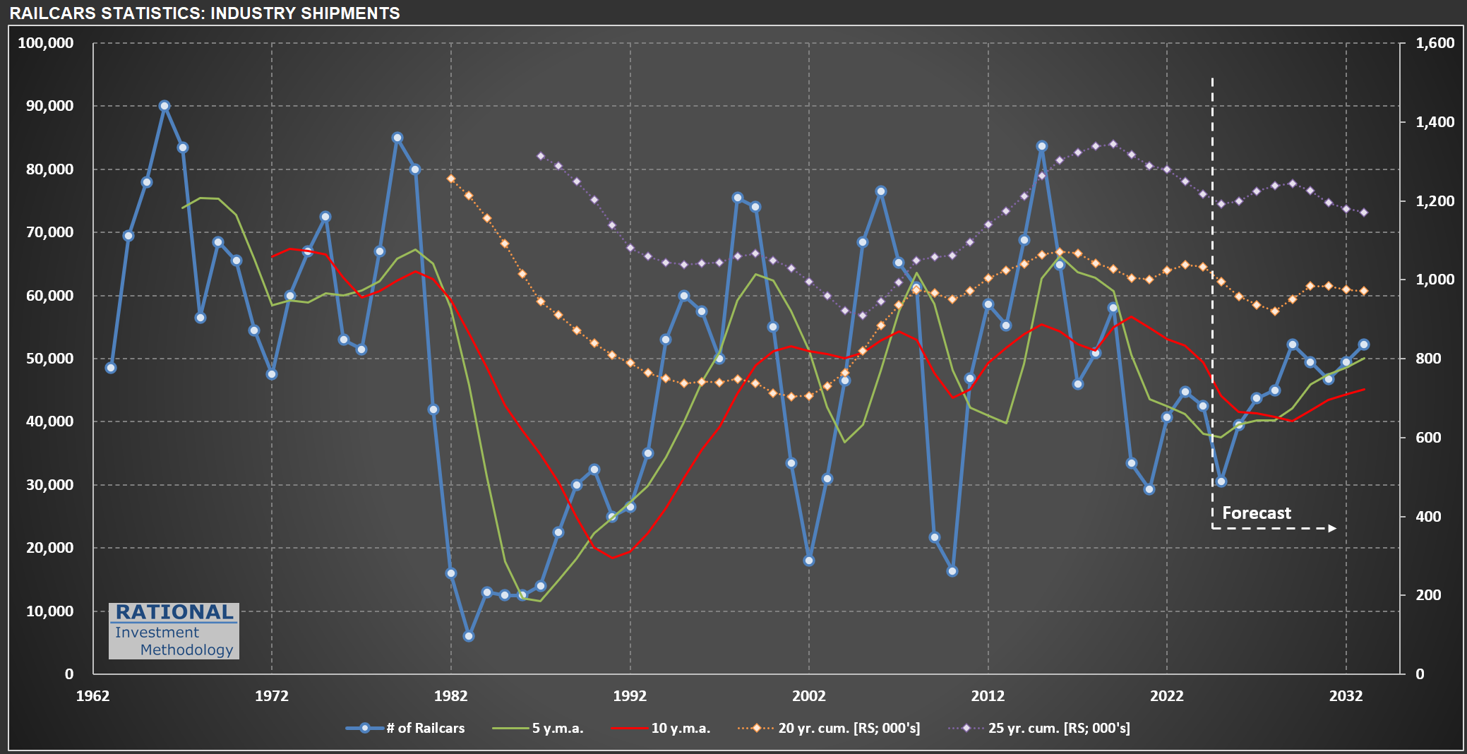
Railcar Manufacturing: Why 2025 Forecasts Are Pointing Down
It always amazes me how volatile railcar manufacturing in the US can be. The chart below tracks railcar deliveries (blue line), with additional lines representing moving averages and cumulative deliveries over different periods. This data is from my ongoing analysis of $TRN (Trinity Industries), which manufactures, leases, and manages freight and tank railcars for sectors like agriculture, energy, construction, and consumer products.
If you look at the chart, you’ll notice that the first forecast year (2025) shows a substantial decline compared to 2024. This drop is based on the midpoint of TRN management’s guidance for 28,000 to 33,000 deliveries in 2025-a figure released on May 1, 2025, after recent tariff changes had already taken effect. For context, just a few weeks earlier-in February-Greenbrier (TRN’s main competitor) projected 38,000 industry-wide deliveries for the year.
So, why the nearly 20% drop in expected units? TRN’s management addressed this on their last conference call:
“Market uncertainty in the first quarter continued to slow conversion of inquiries to orders… Inquiry levels at the beginning of 2025 were the highest they’ve been in several years. But customers are taking longer to make capital decisions… We delivered 3,060 new railcars in the quarter and received orders for 695 railcars, evidence of the delayed investment decisions I have previously acknowledged and the lumpiness of orders quarter-to-quarter.”
This is a familiar pattern: when policymakers make abrupt changes to the rules, companies often pause before making new investments. Most CEOs and decision makers prefer to wait for clarity before committing to capital expenditures. Consumers can behave similarly. I expect to post more evidence here in the future about the noise created by the recent economic shifts we’re seeing in the US. Some of these changes may prove beneficial over time, but the probability of a short-term slowdown has clearly increased.
How Tariffs and U.S. Housing Trends Shape $MHK’s Outlook
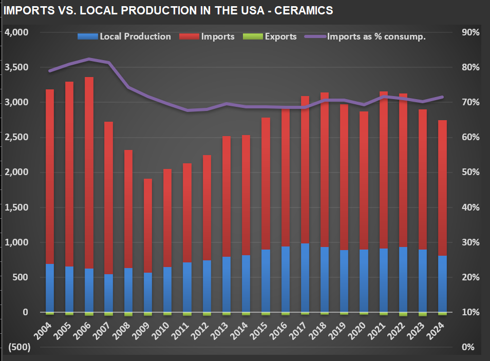
I’ve just finished updating my analysis on $MHK (Mohawk Industries), the world’s largest flooring manufacturer. $MHK produces and distributes a broad range of flooring products-including ceramic tile, carpet, laminate, luxury vinyl tile, wood, and stone-serving both residential and commercial markets globally.
Let’s start with the first chart below, which tracks local production, imports, and exports of ceramic tiles in the U.S. For over two decades, imports have accounted for more than 70% of total U.S. ceramic tile consumption. If tariffs remain at current levels, the purple line (imports as a percentage of consumption) should show a pronounced decline, as higher prices would likely reduce demand and volume.
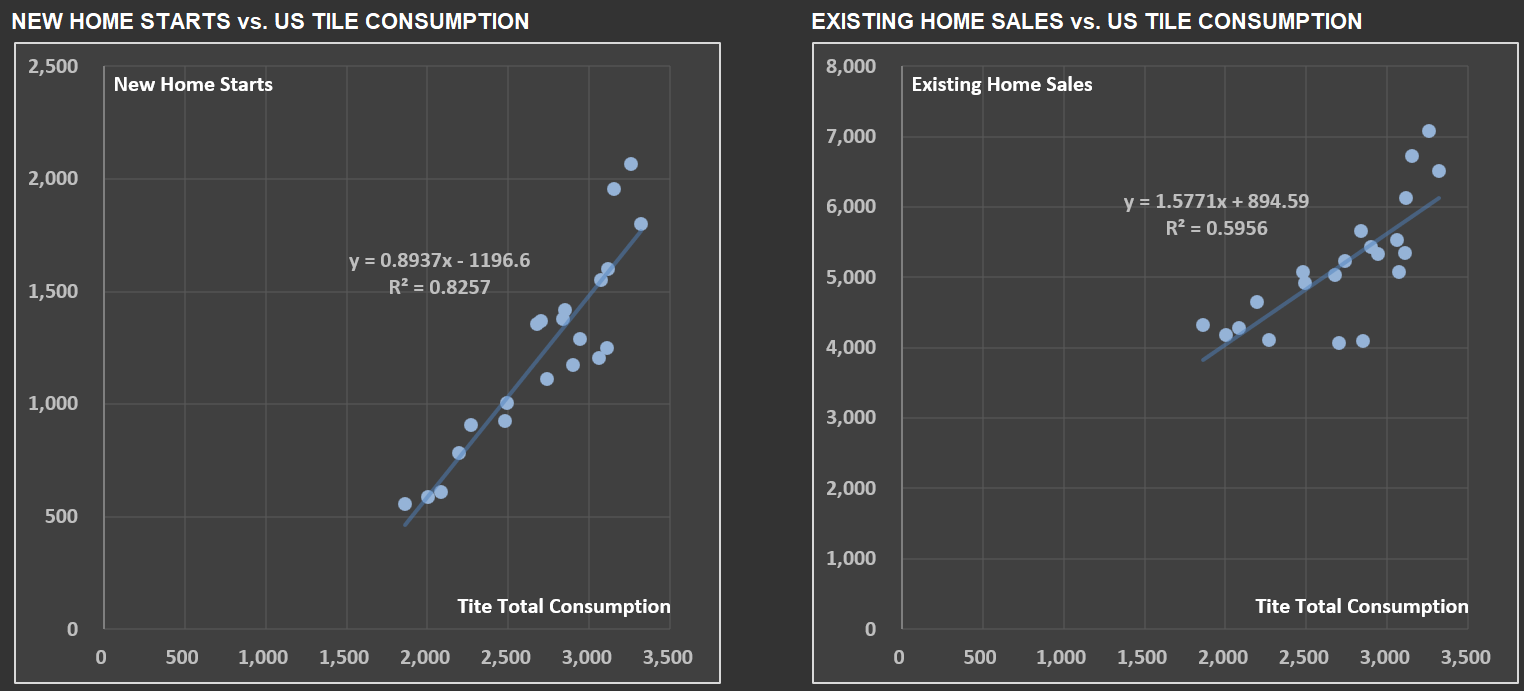
Next, take a look at the two scatter-plot charts. These illustrate the relationship between U.S. tile consumption and two key housing metrics: New Home Starts and Existing Home Sales. As you might expect, tile usage is more closely tied to new construction-hence the higher correlation with New Home Starts (about 83%) compared to Existing Home Sales (around 60%). When new homes are built, more tile is installed; existing home sales, while relevant, have a more modest effect.
Correlations like these are precisely why I analyze not just the operations of companies within RIM’s Circle of Competence (CofC), but also the broader industries they operate in-housing being a prime example. For those interested in a deeper dive, I’ve previously shared posts on New Home Starts and on Existing Home Sales, which provide additional context.
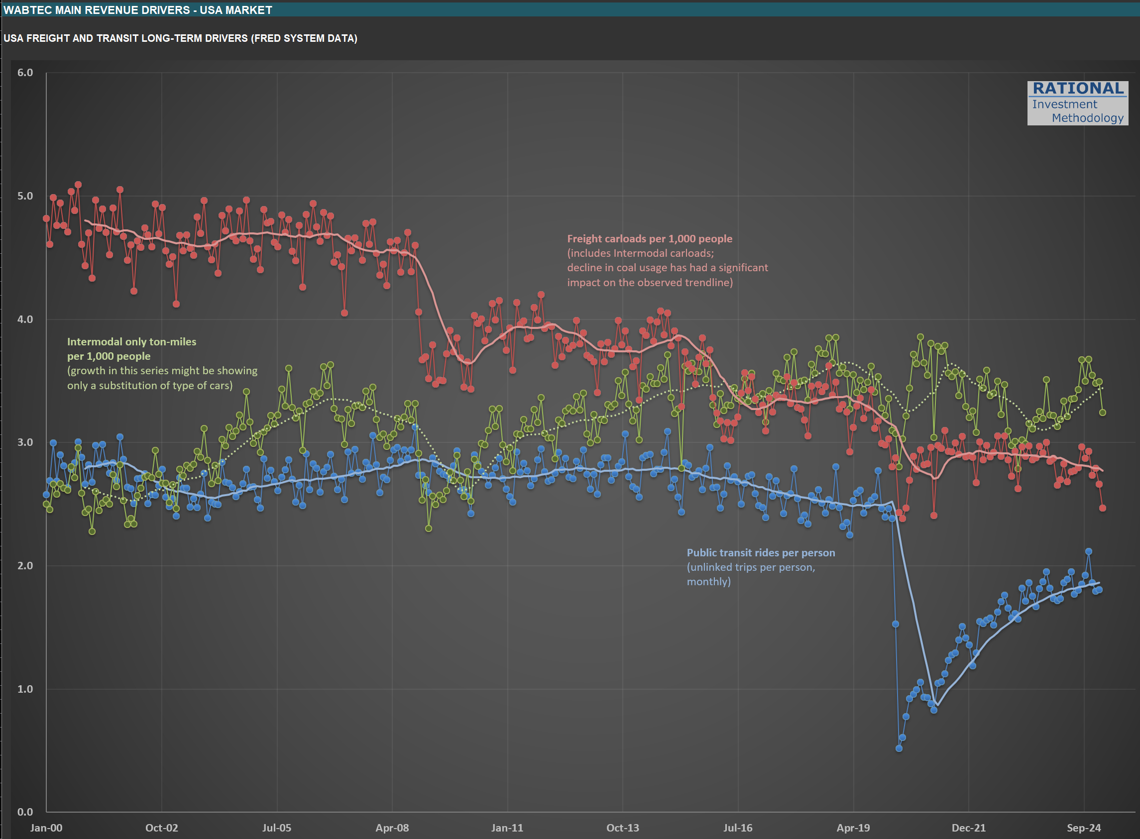
Watching $WAB: Rail Metrics and the Ripple Effects of Tariff Policy
I’m finishing up my update on $WAB (WabTec). The company operates in two main segments: Freight-which provides locomotives, components, and digital solutions for freight railroads-and Transit, which supplies components and services for passenger transit systems. Its core products include diesel-electric locomotives, braking systems, doors, electronics, and aftermarket rail parts. $WAB serves railroads and transit agencies worldwide.
The chart below highlights three key drivers for their long-term sales:
Blue line: Public transit rides per person (unlinked trips per person, monthly). Notice that this metric still hasn’t returned to pre-pandemic levels.
Red line: Freight carloads per 1,000 people (including intermodal). The ongoing decline in coal usage has had a pronounced impact on this trend.
Green line: Intermodal-only ton-miles per 1,000 people. Much of the prior growth here reflected a shift in the type of cars used-intermodal is heavily tied to international trade.
Of these, I’ll be watching the green line most closely. It should provide a clear read on how the evolving tariff landscape is affecting rail volumes. Updating these charts is always a useful exercise, even if the monthly data arrives at a glacial pace compared to the rapid moves we see in the stock market. It’s a good reminder that the real economy moves much more slowly than prices or headlines suggest.
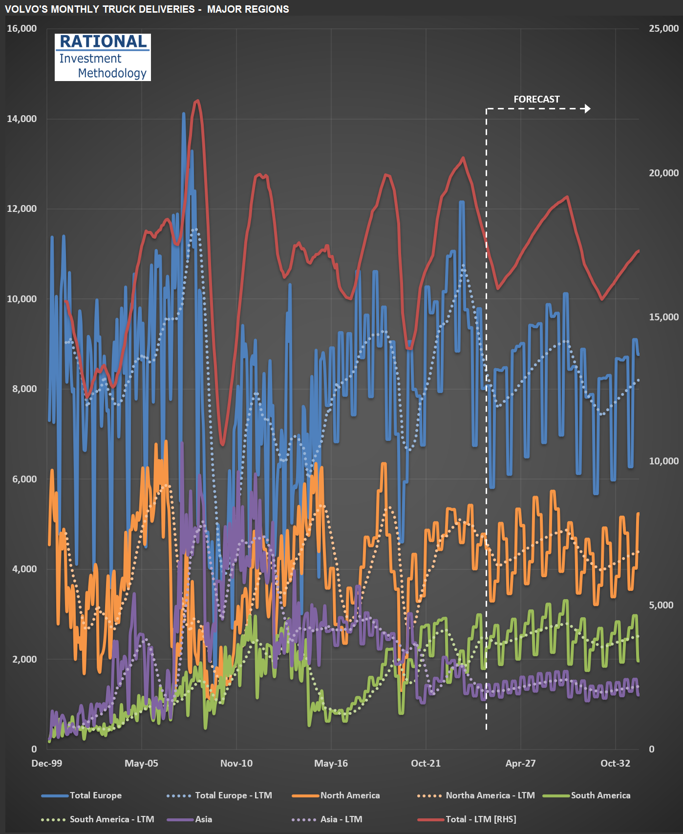
Gauging the Downturn: Volvo, $SAIA, $ODFL, $PCAR, and the State of US Trucking
I’ve just finished updating my analysis for Volvo (the truck manufacturer-not the car company). While Volvo isn’t American (most RIM companies are US-based, with only two exceptions), I follow it closely because it owns Mack, one of the leading truck brands in the US.
Take a look at the chart below, which shows truck deliveries across Volvo’s major regions. The first thing to note is the industry’s cyclical nature-transportation companies tend to move as a herd when it comes to ordering more (or fewer) trucks. You’ll see that we’ve been in a downturn recently (just before the vertical dotted white line). But here’s what Volvo’s CEO said during the latest conference call, just a few days ago:
“…the increased hesitation among customers in North America to place orders given uncertainty in general. We are, therefore, as we speak, adjusting production levels for group trucks North America to minimize the under-absorption in production going forward.”
In other words, the recent shake-up in economic and market conditions has made Volvo’s customers more cautious. It doesn’t help that today, shares of $SAIA (a major LTL* operator in the US and competitor to $ODFL, which is part of RIM’s CofC**) dropped more than 30% after missing earnings estimates by a wide margin.
I’ll be watching Volvo’s truck deliveries closely-they’ll provide a useful signal for how deep this current downturn might get. This will also help me calibrate my ongoing analysis of $PCAR, another major player in the US and European truck manufacturing market.
(*) LTL = Less Than Truckload (**) CofC = Circle of Competence
Tracking $EXPD Through the Global Tariff Storm
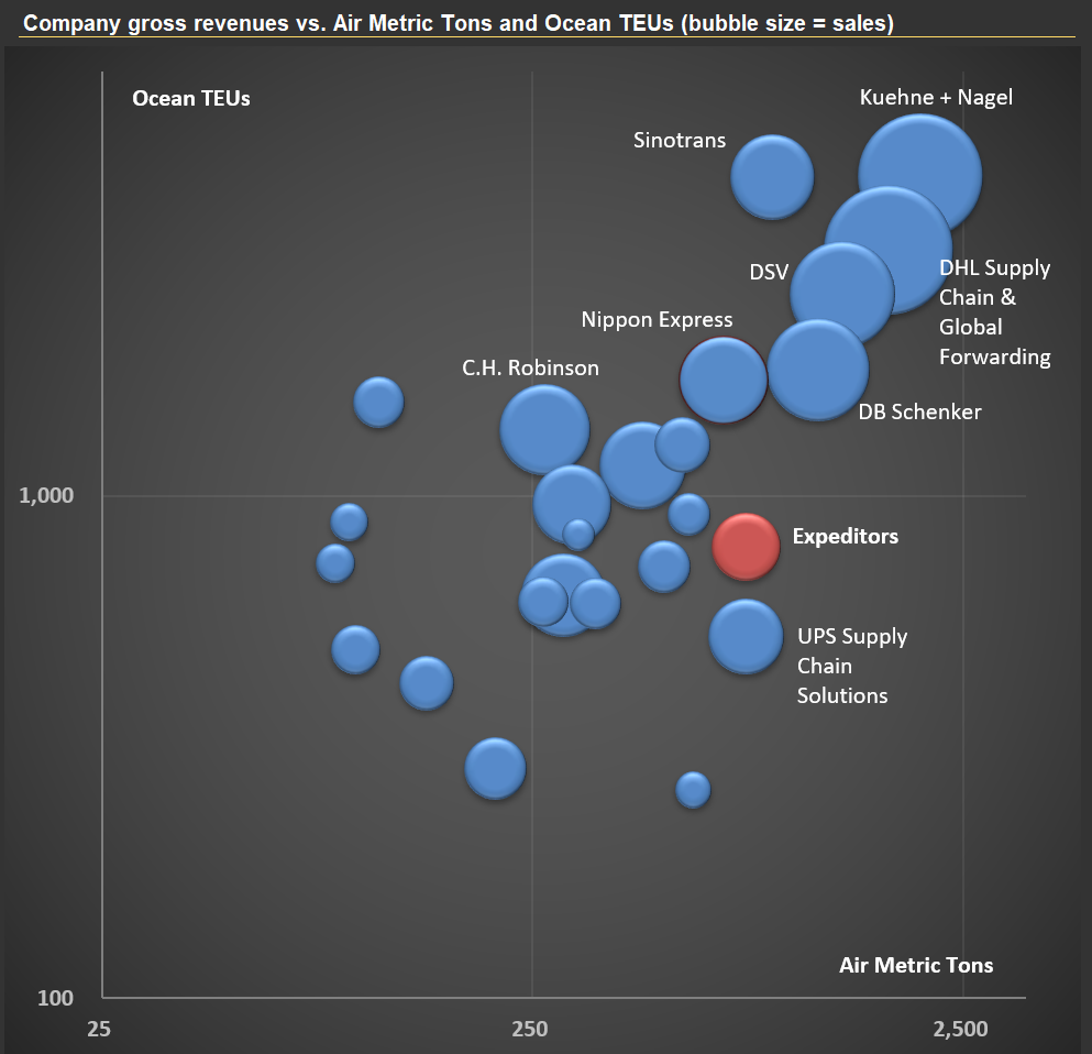
I’m working on Expeditors International of Washington, Inc. ($EXPD) today. $EXPD is a Fortune 500, non-asset-based logistics company providing highly customized global supply chain solutions—including air and ocean freight forwarding, customs brokerage, warehousing, and distribution—through a network of more than 340 offices in over 100 countries. The company employs around 18,000 people.
The “non-asset-based” model in logistics means that $EXPD does not own the trucks, ships, planes, or warehouses used to move and store goods. Instead, it acts as an intermediary, leveraging a broad network of third-party carriers and service partners to coordinate and manage logistics operations for clients. This approach offers flexibility and scalability, allowing $EXPD to tailor solutions, adapt quickly to changing demands, and often reduce costs by avoiding the burden of maintaining its own fleet or facilities. In the first picture below, you’ll see the top 25 players in the global logistics sector, with $EXPD highlighted in red.
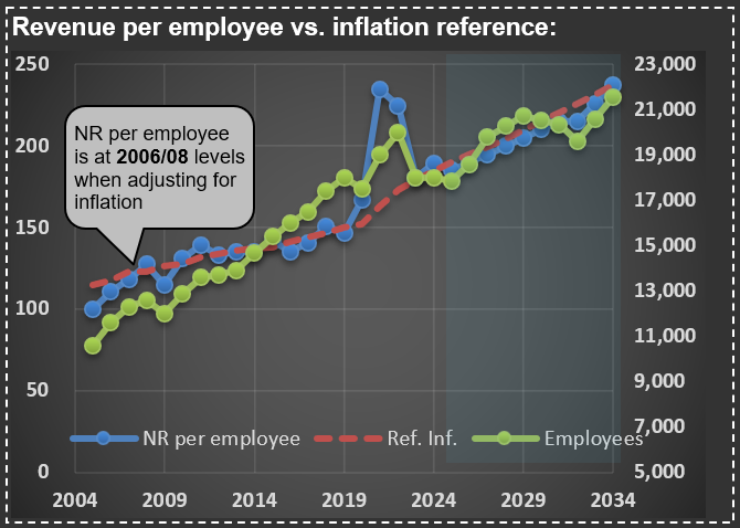
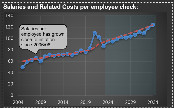
One aspect of $EXPD’s business that stands out—see the next two charts—is how little its “Net Revenue” (revenue excluding pass-through transportation costs) and employee compensation have changed in real terms over the past 20 years. Adjusted for inflation, both metrics are essentially at the same level as they were two decades ago. Intuitively, I would have expected costs per employee to decline, given the advances in computing power and process automation during this period.
The lesson: trust your intuition less, and make sure you have enough information to understand what’s actually driving a company’s revenue and costs. I’ll be watching $EXPD and its competitors closely—they’re at the center of the ongoing global tariff disputes, and their financials should eventually reflect the consequences of any shifts in the rules of the game
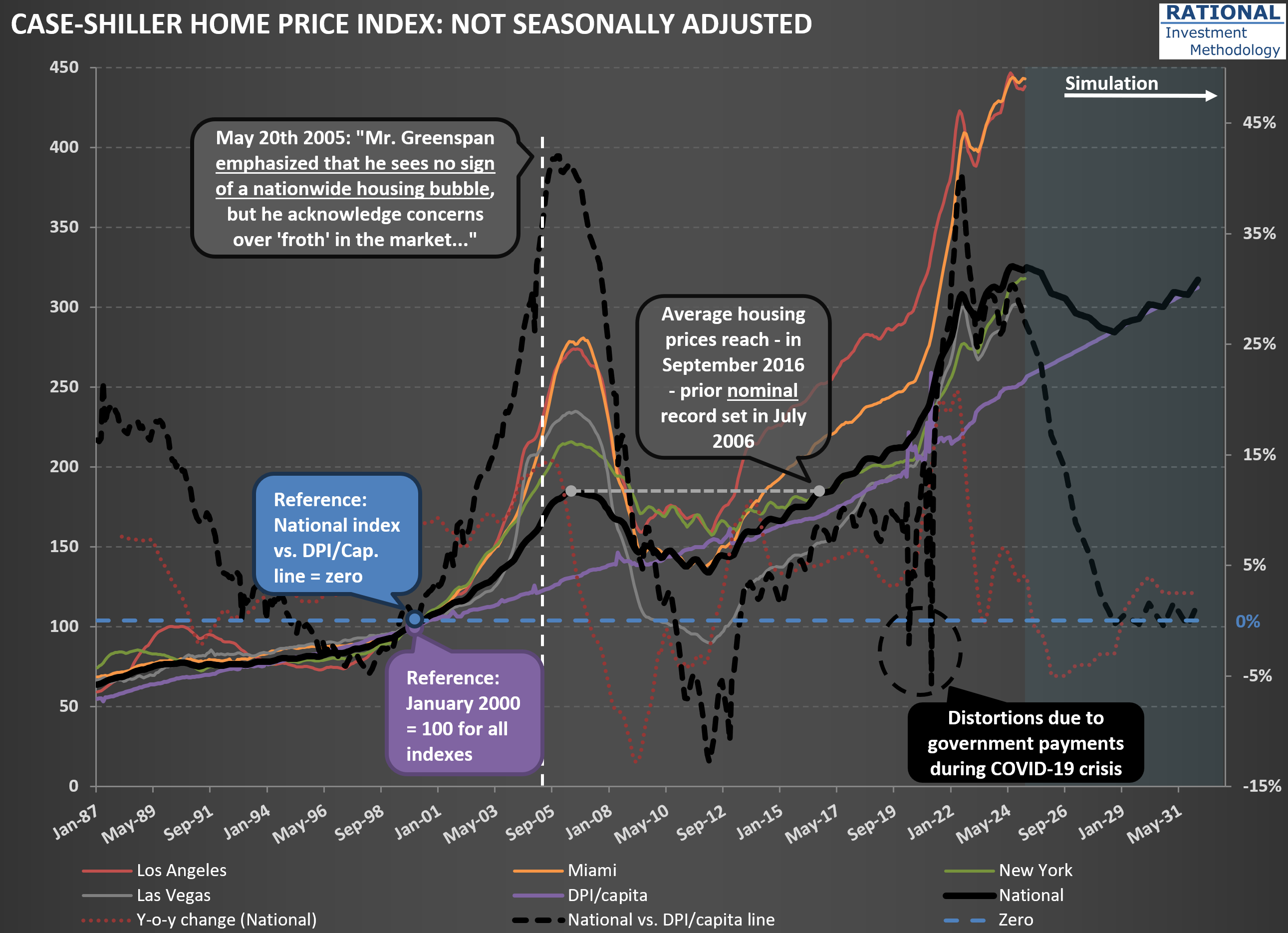
Why Existing Home Sales Are Stuck at 1995 Levels
I’ve just updated my charts with the latest US housing price data. I’m sharing one here that highlights some key trends—see the first chart below. As usual, there are plenty of lines, but let’s focus on a few important ones. The solid black line represents the National Case-Shiller index. You’ll also notice other indices in color, tracking New York, Las Vegas, Miami, and Los Angeles.
Pay particular attention to the purple line, which shows disposable personal income (DPI) per capita. Since home purchases ultimately depend on what’s left after covering essentials, this is a crucial metric. The gap between the Case-Shiller index and DPI per capita is shown by the dashed black line. This makes the mid-2000s housing bubble and the pandemic peak stand out clearly. Currently, the delta between house prices and DPI/capita sits at 27%—a significant spread.
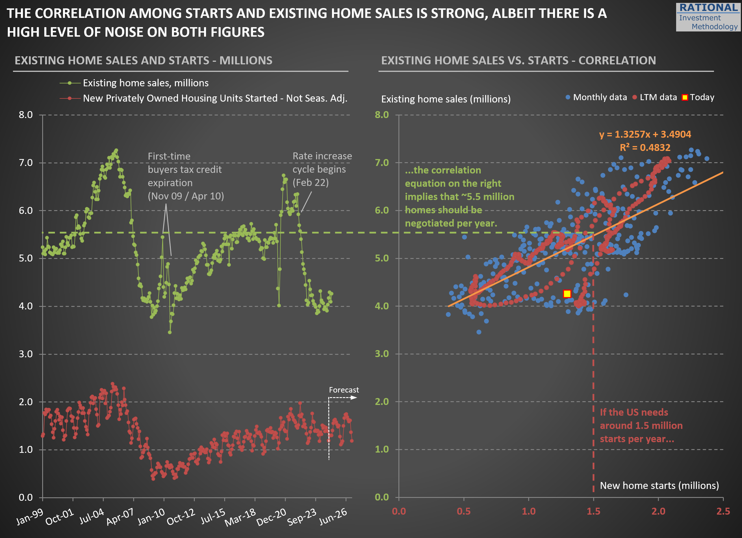
Now, take a look at the second chart. On the left, you’ll see two key figures: new home starts (in red) and existing home sales (in green). What stands out is how low existing home sales are. In 2024, the number of homes sold in the US dropped to levels last seen in 1995.
What’s driving this? It’s a combination of (i) high home prices—in most, though not all, regions—and (ii) mortgage rates that have returned to more typical levels. Together, these factors make it tough for first-time buyers, such as new couples, to enter the market. At the same time, many current homeowners are “locked in” to their low-rate mortgages. For example, trading a 2.75% mortgage for a new one at 7.00% often means paying more each month for a smaller place. Even if you pocket the difference in home values, the prospect of a higher payment for less space is a tough psychological hurdle. As a result, supply remains tight and market activity is subdued.
If tariff issues persist and inflation picks up—pushing mortgage rates even higher—we could see this slow pace in existing home sales drag on. That would be a headwind for the broader economy.
When Costs Surge: Units Impact and Counterintuitive Profitability Outcomes
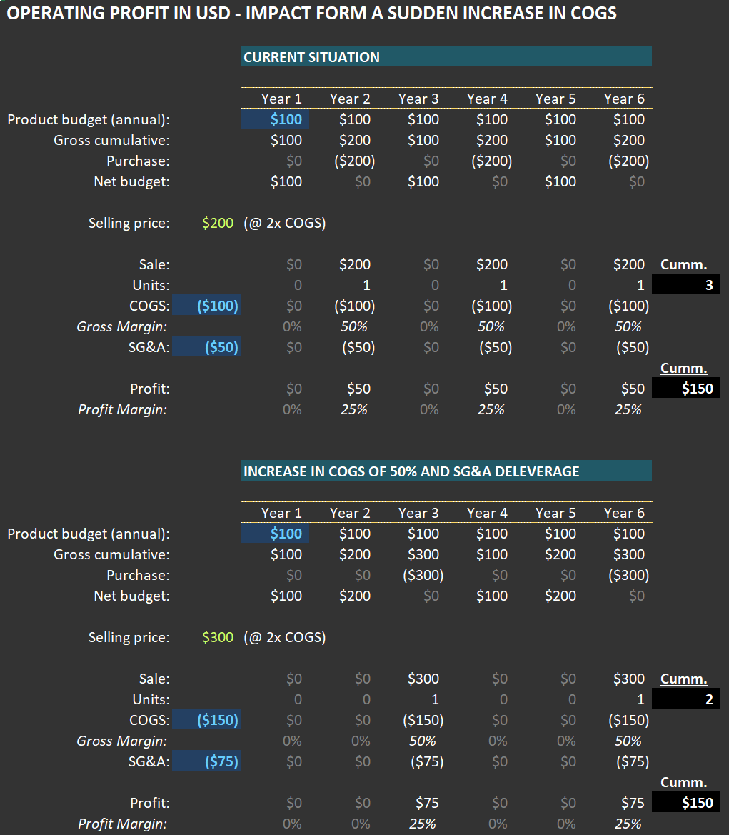
To provide additional context for the Portfolio Action [PA]* I recently shared with RIM clients, I wanted to explore a counterintuitive example of how a company’s operating profit can be impacted when (i) there is a sudden increase in Cost of Goods Sold (COGS) and (ii) customer budgets remain unchanged in USD terms. For reference, you can find the link to the PA here.
Below, you’ll find two tables illustrating this concept. The first table outlines the economics of a company selling a specific product (let’s use tennis shoes as an example). The second table shows the scenario after the company experiences a sudden increase in COGS, perhaps due to an import tariff hike.
In the initial case, customers allocate $100 per year for tennis shoes. Each pair costs $200 because the seller applies a 100% markup—buying the shoes for $100 and selling them for $200. This means customers purchase one pair every two years. As shown in the first table, the company generates $50 in operating profit per pair sold.
Now let’s examine the second case: COGS rises from $100 to $150 per pair. If the company maintains its standard markup, the selling price increases to $300 per pair. A quick note on this practice: many companies I follow are remarkably disciplined about preserving gross margins during significant COGS fluctuations, passing on these costs to consumers.
What happens to purchase frequency? If customers stick to their $100-per-year budget (a key assumption since sticker shock could alter behavior), they will now buy a pair every three years instead of every two. Despite this reduced frequency, operating profit per unit could still rise—even with SG&A (Sales, General & Administrative expenses) increasing from $50 to $75 per unit in this scenario. In fact, as shown in the second table, operating profit grows to $75 per unit.
Over six years, when both cases complete their respective cycles, here’s what we observe: In the first case, three units are sold, generating $150 in total operating profit. In the second case, only two units are sold—but total operating profit remains identical at $150. This phenomenon, where absolute USD profits stay consistent despite lower unit sales, often surprises me—and I’ve seen it play out multiple times in real-world scenarios.
The key takeaway here—especially relevant to the PA concerning a transportation company—is that a sudden rise in tariffs typically leads to reduced volumes for products affected by higher COGS and selling prices.
From there, several financial dynamics come into play. For example:
Will typical customers maintain their annual budgets? If their income is negatively impacted, budgets may shrink.
If the product is essential and purchased regularly, budgets might even increase over time in USD terms—potentially boosting profits for sellers.
On the other hand, demand for non-essential products could decline significantly.
In some cases, companies might switch to sourcing locally produced goods. While unlikely for tennis shoes, this scenario could apply to industrial products made with heavy automation where local production costs are competitive with international suppliers. In such cases, neither companies nor customers would experience significant changes.
One thing is certain: a sudden increase in COGS creates shockwaves. Given the potential magnitude of current cost pressures, volume dislocation risks are high—and these effects will not be evenly distributed across companies or industries. This underscores why fundamental analysis remains critical for understanding how these dynamics will impact specific businesses.
For further insights related to this example and its connection to our PA, please refer back to that communication.
(*) A PA is a message sent to RIM clients whenever a position enters or exits our portfolio.
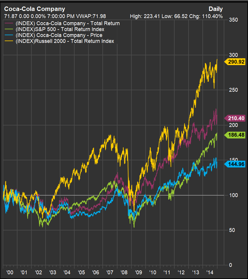
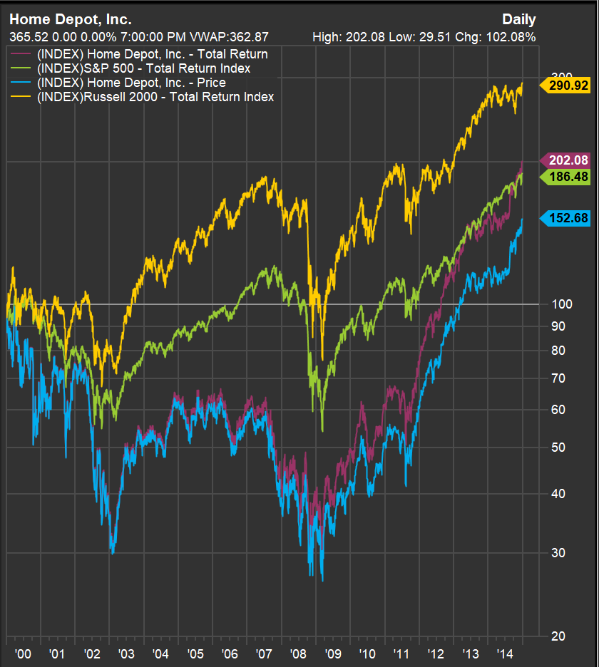
Why Valuation Always Matters: Lessons from $WMT, $KO, and $HD
During a recent conversation with an investor, he said: “I’m not concerned about the high valuation of the company I’m buying today because it’s a great company that’s growing and has good margins, and I plan to hold it for a very long time." What is your first instinct when hearing such a statement?
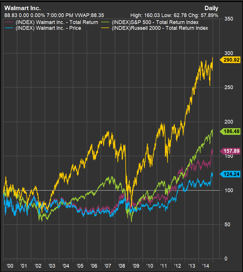
If you have doubts about whether this approach is wise, take a moment to examine the three charts below for $WMT (Walmart), $KO (Coca-Cola), and $HD (Home Depot). These charts show returns (indexed to 100 as of January 1, 2000) through December 2014—a span of 15 years. The blue line represents stock prices, but since these companies pay dividends, the “Total Return” line (red) is the one you should focus on. Two other lines are included for comparison: one in yellow for the Russell 2000 and another in green for the S&P 500. Pay close attention to how much better small, mundane companies (represented by the Russell 2000) performed compared to the broader index that participated in the bubble (the S&P 500).
The US equity market was in a bubble in 2000—a fact that hindsight makes clear. But here’s what’s curious: there was no definitive event that caused the bubble to burst in March 2000. Concerns existed, but no single trigger led to the collapse. This highlights how difficult—if not impossible—it is to predict when a bubble will pop.
What we can observe from the charts below is that each of these companies—despite their success in subsequent years in terms of sales growth, margins, and earnings—delivered poor stock performance during this period. Why? Eventually, investors evaluate their returns on investment, and if future prospects are too low relative to the price paid, share prices adjust. I’ve discussed this tendency—to seek reasonable internal rates of return (IRRs)—in this post.
Consider Walmart: around that time, its price-to-earnings ratio (P/E) ranged from 40 to 50—not unlike its recent peak above 40 times earnings. It took until late 2011—12 years—for investors to recover their money in nominal terms. Adjusted for inflation, it took even longer. Along the way, investors faced a painful drawdown of 37%.
How about Coca-Cola? Surely its stable business made it safer, right? In some ways, yes—but investors still had to wait nine and a half years to break even. While its drawdown was slightly smaller than Walmart’s (34% versus 37%), it was still significant.
And then there’s Home Depot—a case of even greater suffering due to its exposure to the housing crisis during the Great Financial Crisis (GFC). Investors didn’t recover their principal until mid-2012—a grueling wait of 13 and a half years. Worse still, they endured a staggering drawdown of 70%. How many investors could resist panic-selling under such conditions?
What ties all these stories together is one common factor: abnormally high valuations at the time of purchase. Despite these companies’ eventual growth in sales and margins—and even their ability to achieve high valuations again later—paying too much upfront led to years of poor returns and significant volatility. This brings us back to the statement at the beginning: Buy highly priced companies at your own risk. Even if their prospects are excellent, valuation matters—and it always will.
Cross-Checking Industry Trends: Lowe’s and Home Depot
The reason I follow multiple companies within the same industry is, among other things, to cross-check whether trends observed in one company are also evident in another. For example, take a look at the chart below, which illustrates $LOW (Lowe’s) sales per square foot. Focus on the green series—it represents sales adjusted for inflation and square footage growth. The adjustment for square footage growth is less significant now, as Lowe’s (and Home Depot) have largely saturated their markets. The second chart, which shows year-over-year sales per square foot, highlights the extraordinary growth in 2020—nearly 24%.
Now, compare this with what I recently wrote about $HD (Home Depot) (here). In the top chart, you’ll see a similar series for Home Depot’s sales adjusted for inflation and square footage growth (in red). Notice how closely the patterns align between the two companies?
These similarities suggest that both Lowe’s and Home Depot were impacted by the same macroeconomic trends during the pandemic. This indicates that neither company’s management was implementing uniquely effective strategies to drive sales during that period. Instead, the rapid growth was fueled by pandemic-related excesses, which are now tapering off.
Looking ahead, it’s a matter of waiting for the next unusual factor—whether positive or negative—that will influence sales. However, what truly matters when conducting meaningful analysis is finding arguments to support a long-term perspective. In the case of Lowe’s and Home Depot, understanding their market saturation is key. Spectacular growth is likely a thing of the past for both companies.

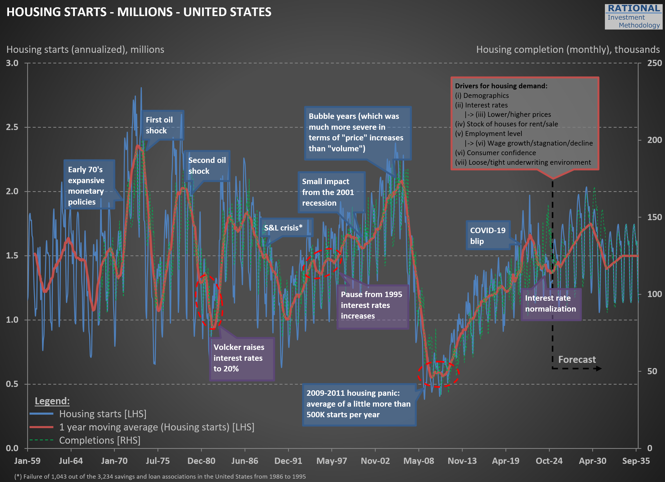
Housing Starts: The COVID-19 Blip and What Comes Next
As I work on valuations for $HD (Home Depot) and $LOW (Lowe’s), I regularly update my broader analysis of the housing sector. While I have a wealth of charts on this topic, including all of them in one post would make it far too lengthy. For now, I’ll share just a couple of key charts—more will follow in future posts.
The first chart below is one of the earliest I created on this subject, dating back nearly 20 years. It tracks U.S. housing starts at an annualized rate, calculated by multiplying monthly figures by 12. Housing starts in the United States exhibit significant seasonal variation, particularly in regions with harsh winters. To smooth this out, the red line represents a 1-year moving average.
Take a moment to review the annotations on the chart—they highlight major economic events over time. Notably, every significant economic crisis in the U.S., with the possible exception of the 2001-2002 recession, has either originated in or been closely tied to the housing sector. The most recent event marked is what I call the “COVID-19 blip,” when zero interest rates and aggressive stimulus measures triggered a surge in new home construction.
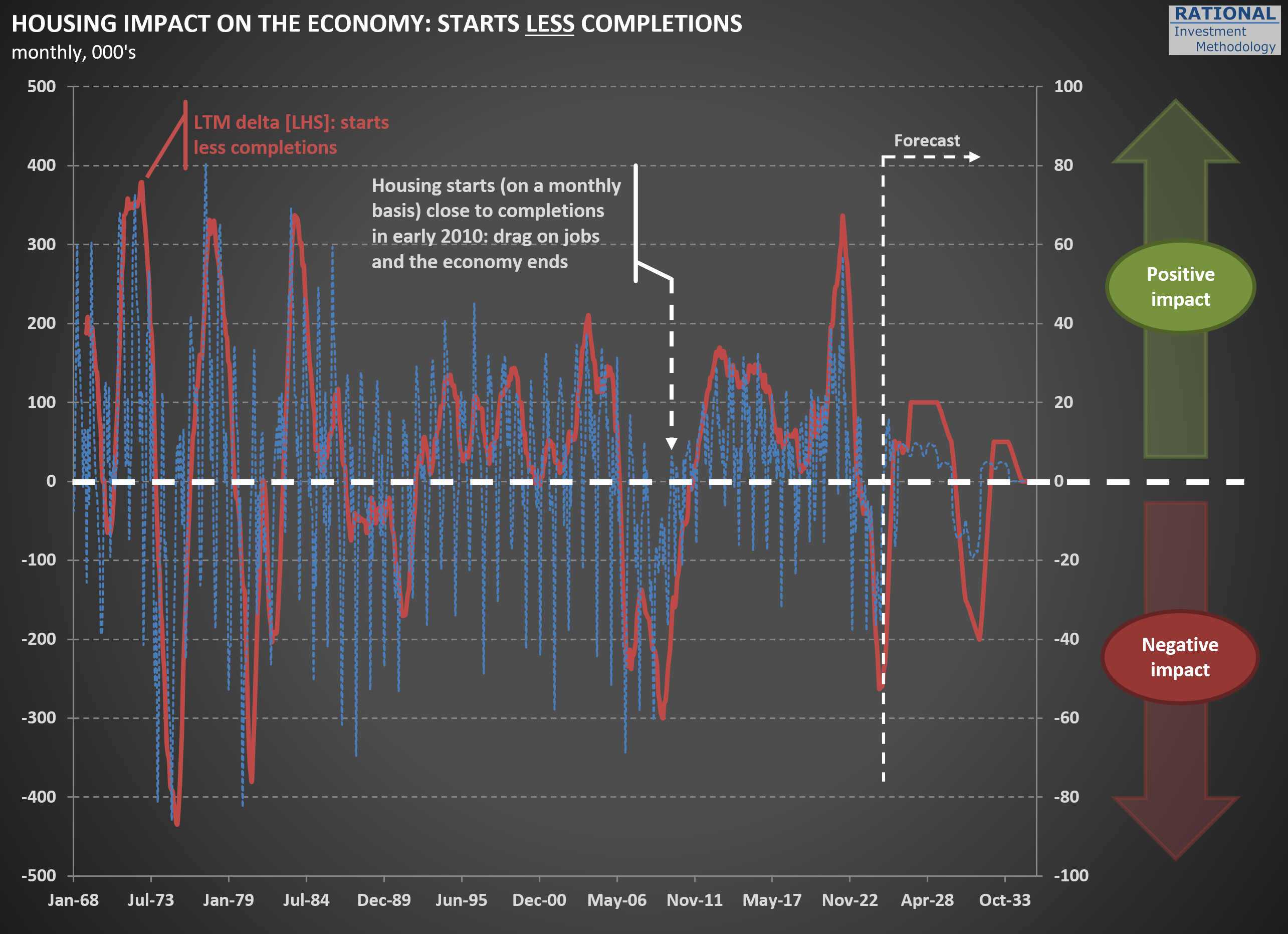
The second chart illustrates one of the unintended consequences of this “blip.” The blue line represents housing starts minus completions, while the red line shows a 12-month cumulative total (scale on the left). What stands out is that we’ve just come through a period where more houses were being completed than started.
In 2024 alone, approximately 250,000 more homes were completed than initiated. This mismatch has had ripple effects across numerous companies tied to RIM’s CofC (Circle of Competence), particularly those in the building materials sector, which have reported weak or declining sales as a result.
Here’s where it gets interesting: as discussions about a potential recession heat up, this particular drag on the economy is nearing its end. By April 2025 (yes, tomorrow!), the blue line is expected to turn positive again. This shift will remove one of the most significant headwinds for the economy, given housing’s outsized influence on overall economic activity. To be clear, this doesn’t mean we’re on the cusp of another housing boom—but it does suggest that the lingering effects of the “COVID-19 blip” will finally fade.
That said, history suggests that boom-bust cycles in housing are far from over. So, while this particular drag may be dissipating, don’t get too comfortable assuming stability in this sector—it’s always full of surprises.
Benjamin Graham's Wisdom Applied: Why I Differ on $HD
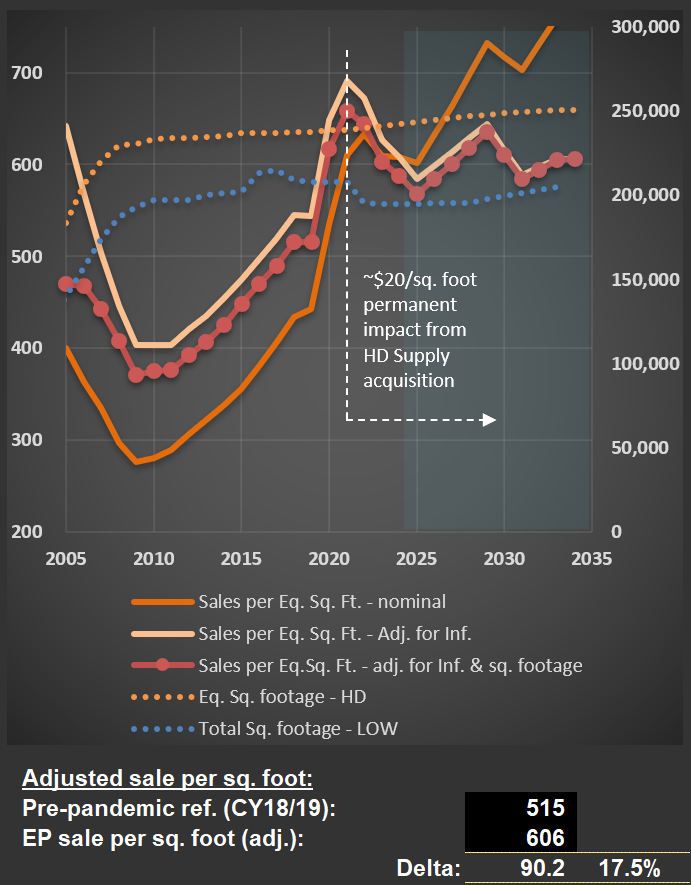
I just finished updating my analysis on $HD (Home Depot), and the outlook for 2025 suggests it will mark the fourth consecutive year of declining sales per square foot, adjusted for inflation. The last comparable period of sustained decline was between 2006 and 2009. You can see this trend clearly in the chart below—focus on the red data series with dots.
This decline reflects the normalization following the post-pandemic boom. During that period, extremely low interest rates, substantial stimulus measures, and increased time spent at home drove a surge in sales for Home Depot and $LOW (Lowe’s). Even factoring in the additional $20 per square foot from Home Depot’s acquisition of HD Supply, my analysis assumes average sales will remain about $70 higher than pre-pandemic levels (see calculations below the first chart). I also assume (not shown in the charts) that the company will maintain healthy margins. I.e., if anything, I’m being aggressive in my forecasts.
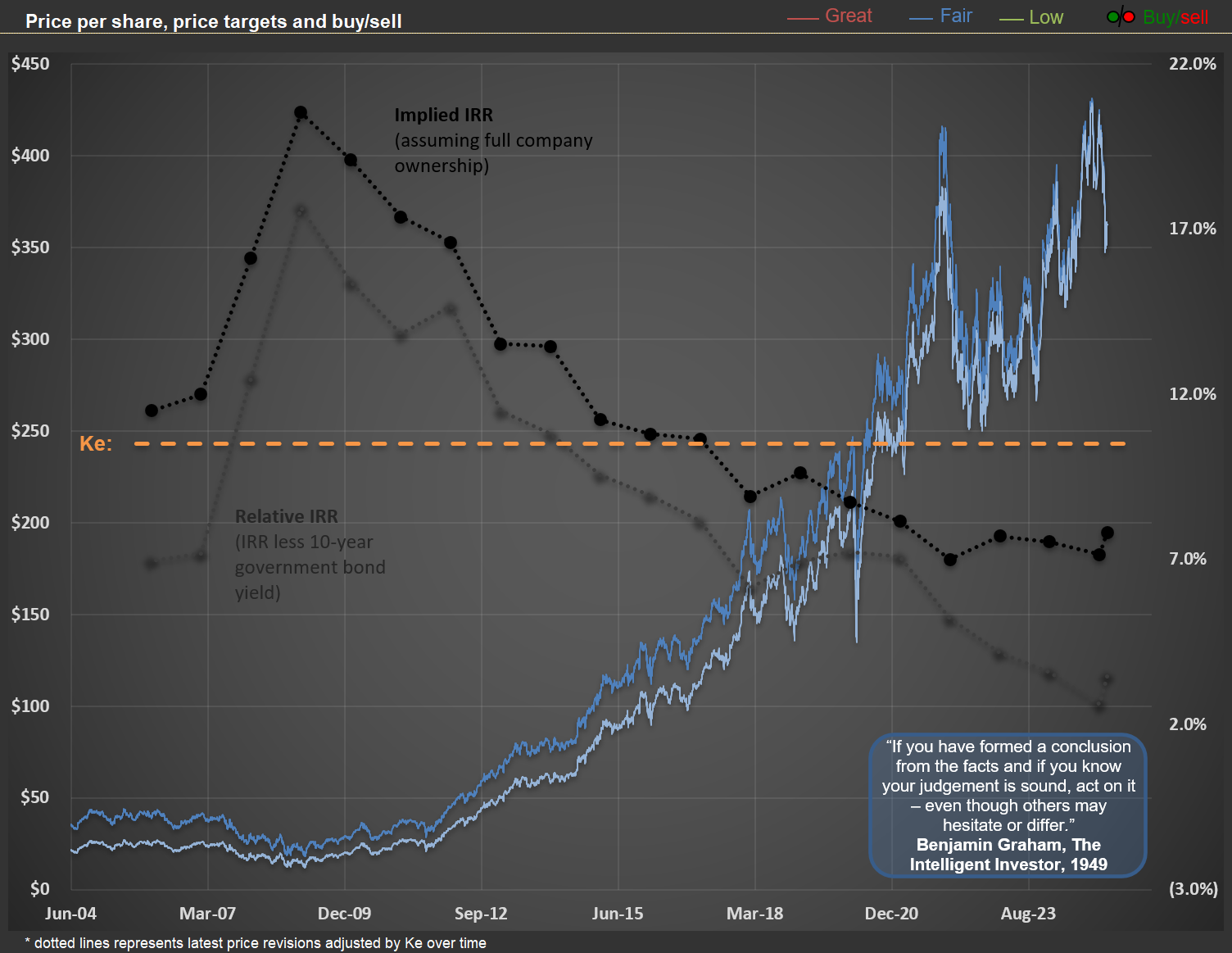
Despite this relatively optimistic assumption regarding future sales and margins, current share prices for HD suggest that long-term investors may achieve modest returns. Based on my base-case scenario, the future IRR (Internal Rate of Return) is projected to be approximately 7% per year. For context, you can read my earlier post on understanding implicit IRRs here.
The second chart below illustrates implicit IRRs for HD at 20 different year-end points. As expected, higher share prices correspond to lower IRRs—this is simply math. If your base-case scenario is well-calibrated, any given share price implies a specific IRR for long-term owners. Historically, the best time to buy HD (and LOW) shares was in 2009, when the implied IRR reached 20.5%. For perspective, this offered a real return (assuming an annual inflation rate of 2.5%) equivalent to multiplying your investment by five over a decade. I presented this analysis at a Value Investing Event in Trani, Italy, although few attendees were enthusiastic about these ideas at the time.
Today’s elevated prices prompt me to recall Benjamin Graham’s timeless advice from The Intelligent Investor, written in 1949: “If you have formed a conclusion from the facts and if you know your judgement is sound, act on it – even though others may hesitate or differ.” In contrast to many analysts nowadays, I believe $HD and $LOW are not attractive investments at current valuations. If sales continue to decline or fail to rebound meaningfully, perhaps the market will eventually acknowledge that these prices imply lower-than-deserved returns for holding these assets.
From Pizza to Tesla: When Founders Shape—and Shake—Brands
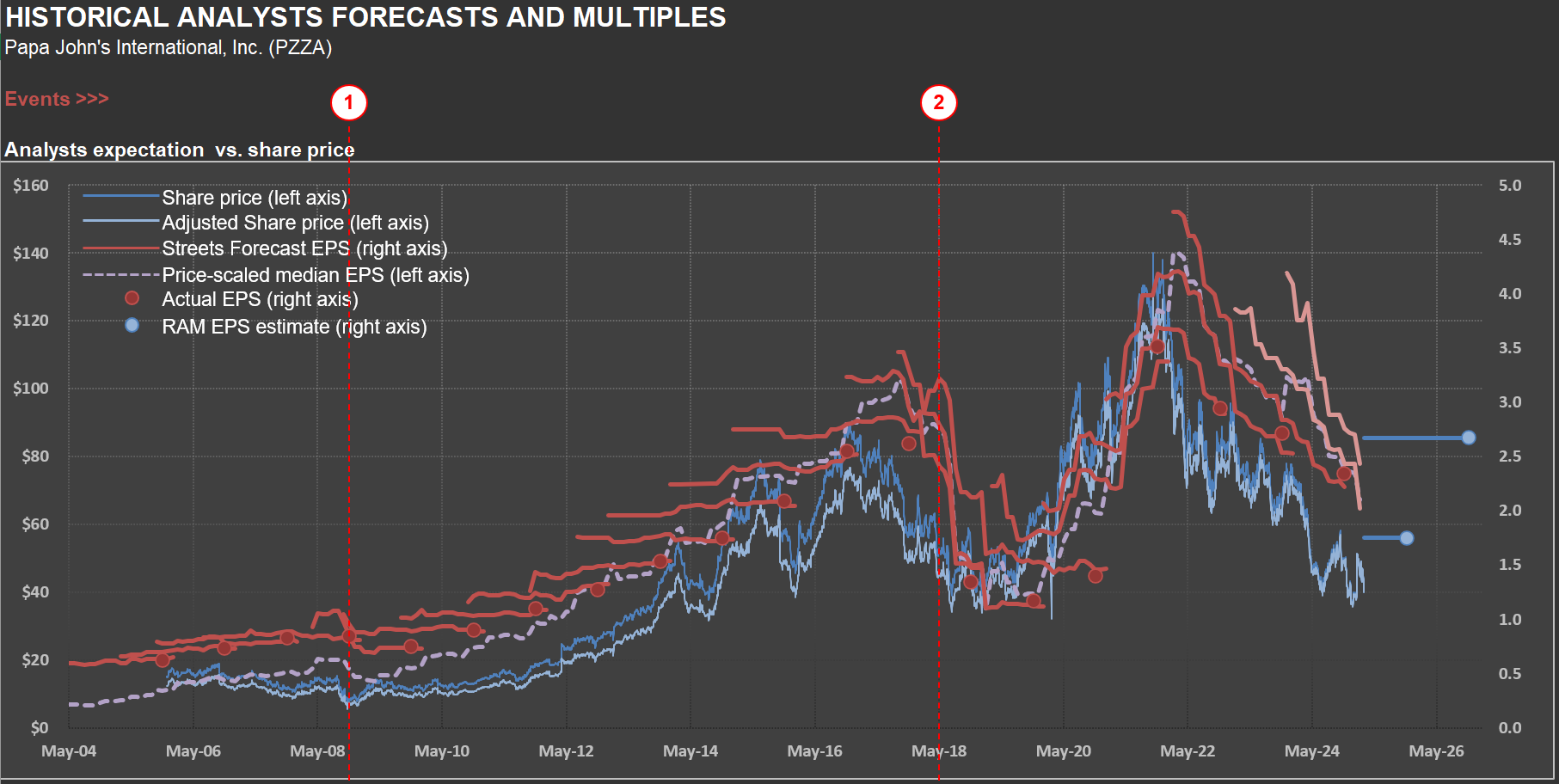
Every time I’m tempted to think a company has a straightforward business model, I revisit my analysis of $PZZA (Papa John’s). Selling pizza might seem simple, but the story behind this company proves otherwise. Below is a chart familiar to those who follow RIM’s approach, showing the correlation between share price and average sell-side analyst estimates. I’ve previously discussed how market prices are often biased by short-term EPS projections here.
Papa John’s earnings over the past decade have been anything but steady. The company was coming off a strong growth phase when its founder and former CEO, John Schnatter, made racially insensitive remarks during a May 2018 conference call. This scandal, revealed in a July Forbes article, triggered widespread backlash. Schnatter’s image was swiftly removed from the company’s branding and advertisements. Just days later, Forbes published another article detailing allegations of sexual harassment within Papa John’s offices. On the same day, Wendy’s announced it would not pursue a potential merger with Papa John’s.
Event #2 on the chart highlights the month leading up to these revelations. Sales plummeted, dragging earnings—and share prices—down with them. The company faced an uphill battle to distance itself from Schnatter’s legacy when an unexpected twist changed its fortunes: the pandemic. As restaurants closed nationwide, pizza delivery became one of the few ways people could enjoy prepared meals at home—a small slice of normalcy for many during uncertain times. Sales surged, margins improved, and EPS hit new highs. The founder’s scandal faded into history.
Fast-forward to today: Papa John’s is grappling with more challenges. Sales are normalizing after their pandemic peak, and the broader consumer environment remains weak—something I’ve touched on in recent posts about the recessionary pressures facing American consumers. Even for a seemingly simple business like pizza, there’s no such thing as “normal.”
This brings me to $TSLA (Tesla) and Elon Musk—a case study in what might be called “key man risk” on steroids. Much like Papa John’s in 2018-2019, Tesla is deeply tied to its founder’s vision and personality. Founders often drive rapid growth because they care deeply about their creations. But when their actions alienate customers—whether justified or not—the fallout can be significant. From pizzas to electric cars, businesses are far more intricate than they appear at first glance. And when emotions start influencing a brand, complexity grows exponentially.
Navigating Cycles: Insights from $OLN’s Volatile Industry
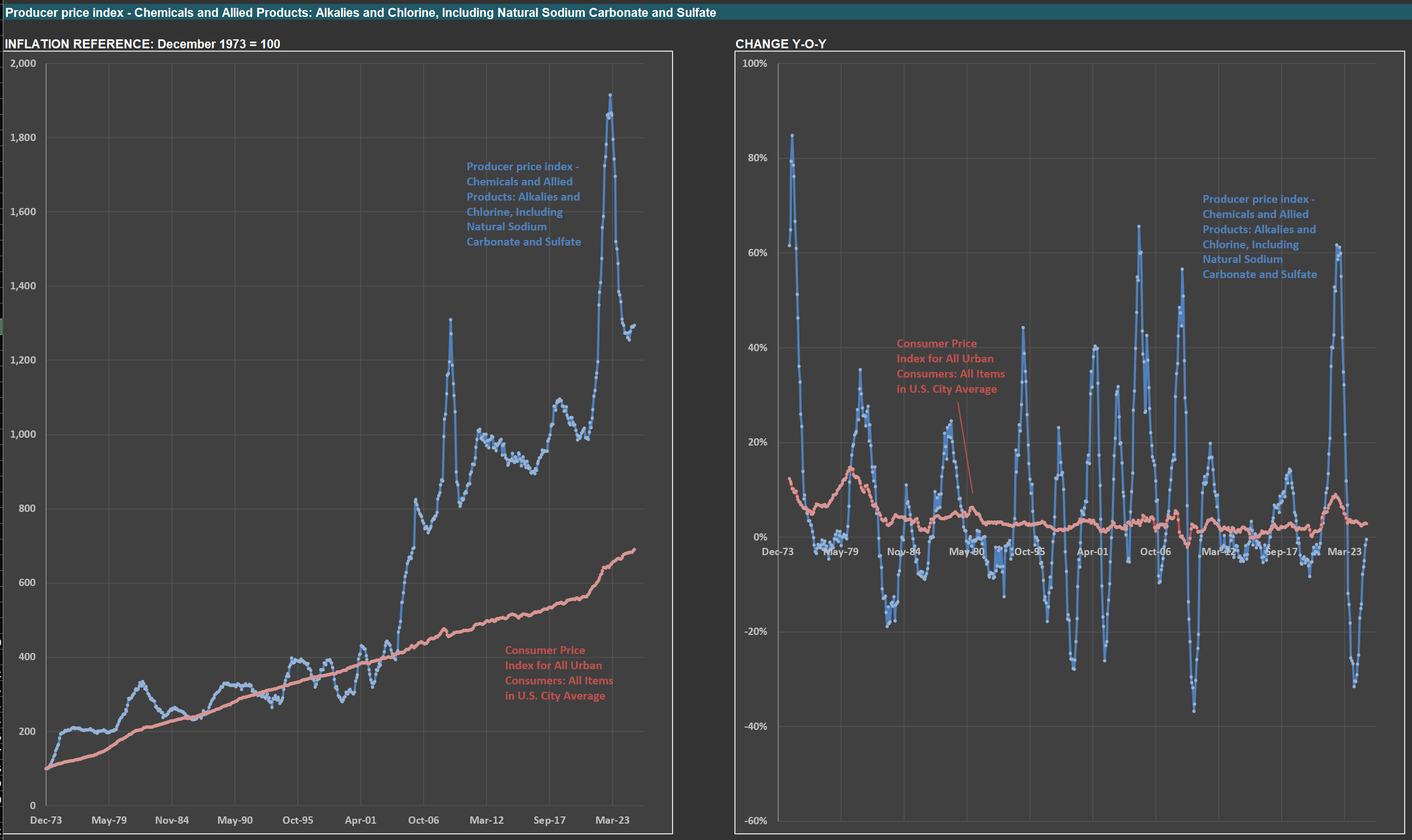
Today, I’m analyzing $OLN (Olin), a company specializing in chlorine, caustic soda, vinyls, and other chlorinated organics, as well as epoxy materials and their precursors. The charts below illustrate the challenges of operating in a cyclical industry—and what that means for investors.
On the left, you’ll see a price index for alkalies and chlorine (in blue), $OLN’s core product category, alongside a broad consumer price index (in red). On the right, the year-over-year changes for both series are displayed. The stark variability in commodity prices compared to broader price indexes is evident. The most recent spike was driven by two factors: heightened consumption during the pandemic—fueled by oversized government stimulus—and a fire at a major U.S. plant producing similar chemicals.
This volatility highlights how challenging it is to manage a business in such an environment. For investors, however, there’s an upside. These sharp price and volume swings can significantly impact $OLN’s profitability, leading to fluctuations in EPS and stock prices. For those willing to put in the work, these cycles create opportunities to buy or sell with a meaningful “margin of safety.” Of course, understanding these dynamics requires careful analysis and a great deal of patience.
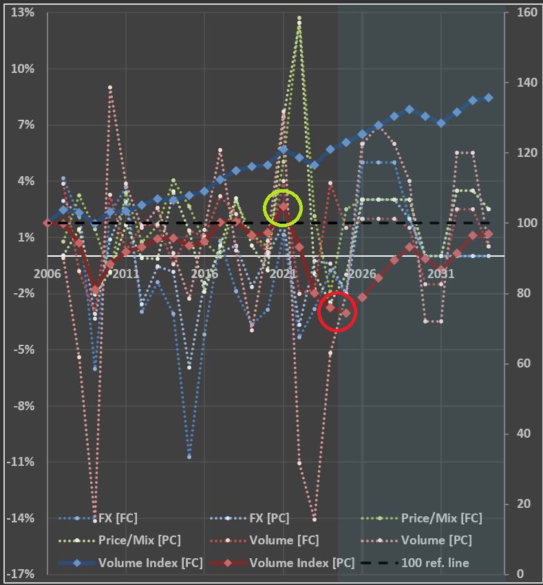
$SEE’s Product Care Segment: A Warning Sign and The Market's Overreaction
$SEE (Sealed Air) is a name you’re likely familiar with, even if you don’t realize it. They’re the company behind Bubble Wrap—the iconic packaging material that’s as fun to pop as it is practical. Beyond Bubble Wrap, SEE provides materials and machines that streamline packaging processes across industries. If you’ve purchased food or products recently, chances are they were packaged using SEE’s solutions. You can find more examples of their offerings on their website.
Take a look at the chart below, which breaks down key metrics for SEE’s two segments: Product Care [PC] and Food Care [FC]. The dotted lines represent the impact of volume, price, and foreign exchange (FX) on sales. Meanwhile, the solid lines show cumulative volume indices for both segments (2006 = 100).
The blue line for Food Care reflects stability—no major surprises there. But the dark red line for Product Care tells a different story. After recovering from the lows of 2009, there was a modest uptick in 2021 (highlighted by the green circle), driven by pandemic-era stimulus. However, the red circle draws attention to concerning figures for 2024 and projected 2025. The index for Product Care volume is around 75—25% below its 2006 level (two decades ago) and even lower than the 81 seen in 2009.
This decline raises important questions. Packaging products and equipment is undoubtedly a competitive space, but SEE remains a key player in the industry. The drop in Product Care volume seems less likely to stem from a sudden loss of market share and more likely to signal broader economic trends—perhaps another indicator of a consumer recession. Despite this, the market appears to have punished SEE’s valuation, focusing narrowly on its current depressed earnings per share (EPS). Could this reaction be overly pessimistic?
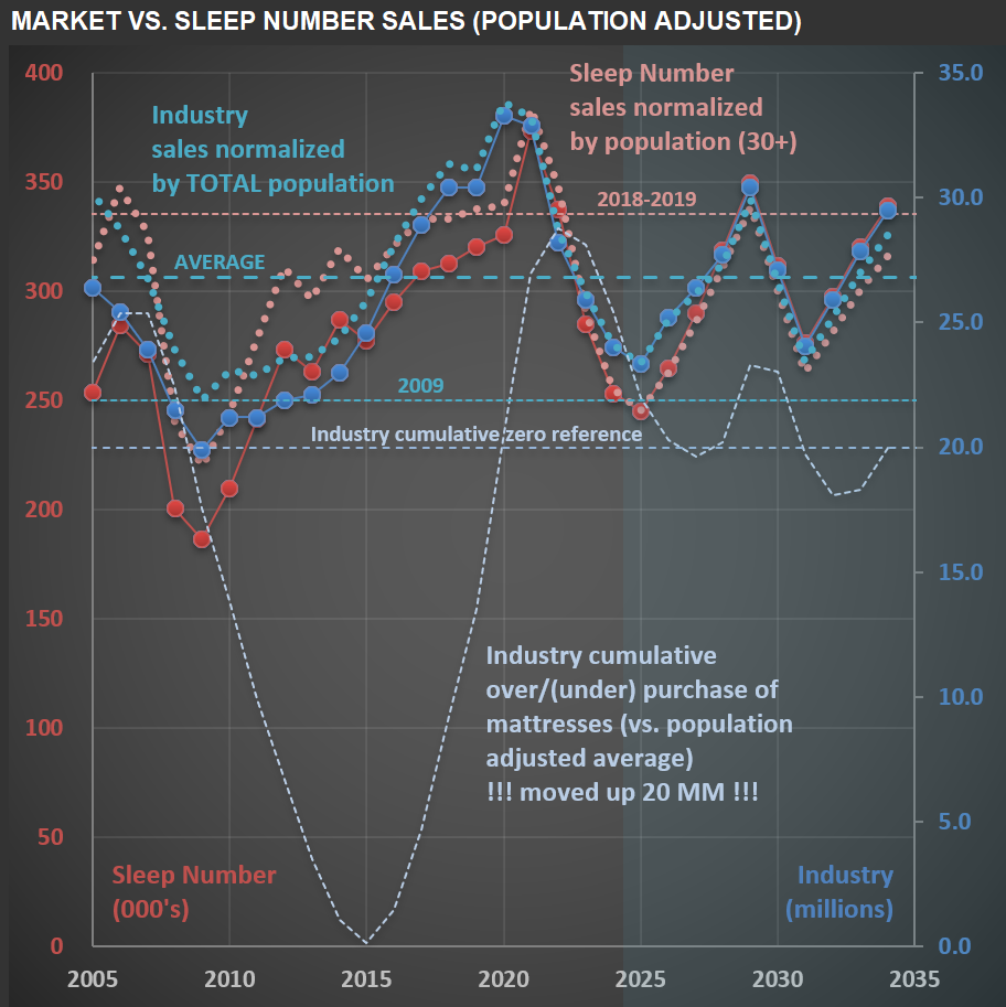
Is Sleep Number ($SNBR) Feeling the Weight of Consumer Recession?
When analyzing a company, understanding the industry it operates in is essential. Today, I’m focusing on $SNBR (Sleep Number Corporation), a company whose valuation history over the past 20 years has been remarkably volatile. This volatility stems from the cyclical nature of the mattress manufacturing and retailing industry, compounded by decisions made by two consecutive CEOs to leverage the company ahead of major industry downturns.
While the leverage applied in both cases wasn’t excessive, Sleep Number operates with a naturally leveraged business model due to its reliance on rented stores, which adds fixed costs to its P&L. During the Great Financial Crisis (GFC), the company nearly collapsed despite carrying only a modest debt load (but eventually managing to pay down all its debt). Fast forward to recent years: the outgoing CEO—who earned nearly $80 million during her tenure—chose to leverage the company again by authorizing $1.6 billion in share buybacks. The result? Sleep Number now faces significant financial strain with $550 million in debt.
The chart below provides a visual overview of Sleep Number’s sales (in red) over the past 20 years and projects a base-case scenario for future sales. It also compares these figures to unit sales for the entire mattress industry (in blue). Unsurprisingly, the two are closely correlated—any shifts impacting the broader industry inevitably affect Sleep Number. The dotted light-blue/red lines adjust these figures for population dynamics. For the overall mattress industry, I use the total population. However, for Sleep Number, I focus on individuals aged 30+ years who are more likely to purchase their premium mattresses.
Several reference lines on the chart offer additional context. One highlights industry sales levels during 2009, which we’re approaching but haven’t quite reached yet. If mattress unit sales decline by another million in 2025, per capita mattress sales will align with GFC levels—a concerning benchmark. Another line (light blue) illustrates cumulative under- or over-purchasing trends within the industry. Even if recent declines reflect a correction from prior excesses, seeing per capita sales nearing 2009 levels is striking. This aligns with broader indications that American consumers are facing recessionary pressures—a topic I’ve explored in previous posts.
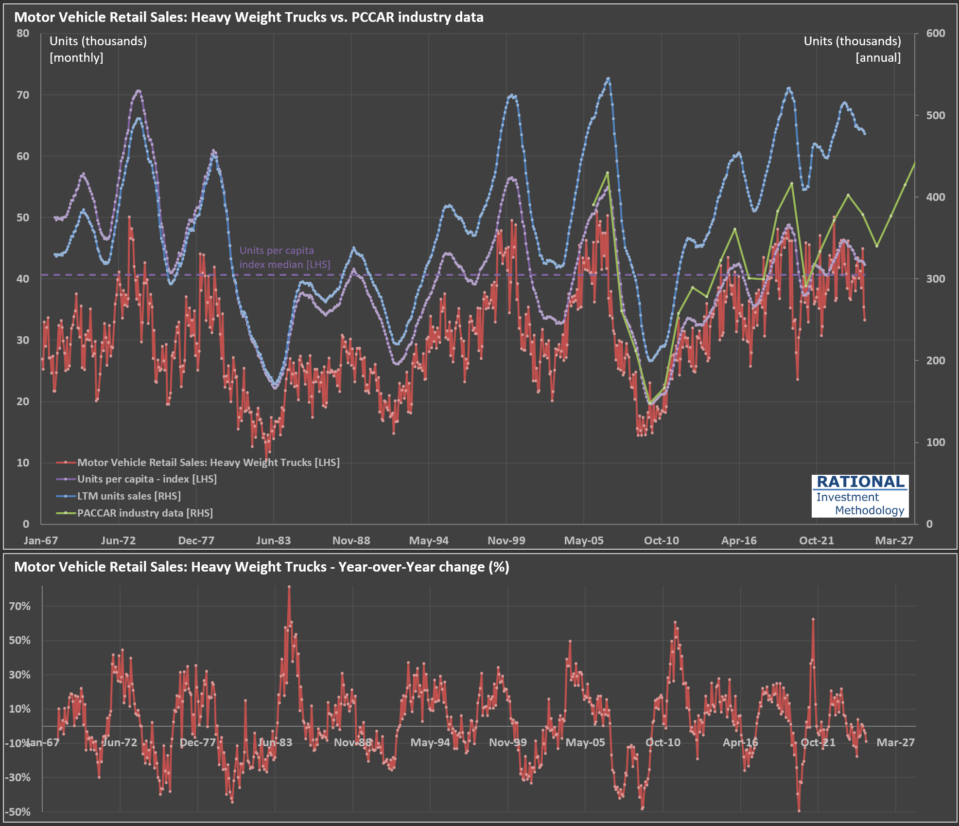
What's Driving PACCAR's ($PCAR) Recent Sales Slowdown?
I’m analyzing $PCAR (PACCAR Inc.) today, a leading trucking manufacturer in the US and Europe. Check out the chart below—it illustrates several key data series. The red line represents monthly sales of heavy-weight trucks in the US (in thousands of units; from the U.S. Bureau of Economic Analysis via the FRED system). The blue line (scale on the right) shows cumulative truck sales over the last twelve months (LTM).
Ideally, this LTM series should closely track PACCAR’s industry sales data (green line)—they are close but not equal, as the data from the FRED system encompasses a broader category of trucks. Indeed, the correlation between these two series (blue and green) is quite high at 96%. This means we can reliably use monthly U.S. Bureau of Economic Analysis data to anticipate PACCAR’s sales trends.
Recent figures indicate a slowdown following exceptionally strong post-pandemic sales. Trucking companies earned unusually high profits during the pandemic (as discussed in my previous post here), prompting them to order trucks aggressively. With freight rates normalizing and transported volumes below trend, these companies are dialing back their purchases. Consequently, manufacturers like PACCAR are experiencing declining earnings.
Interestingly, this current cycle hasn’t been particularly severe. Notice the purple dotted line—it measures truck sales per capita in the US. Over the past decade or so, sales cycles have become relatively muted, even when factoring in pandemic-related volatility (the bottom chart shows year-over-year changes clearly). Imagine how challenging it must be for manufacturers to manage operations amid such fluctuations.